A site built around two names rather than one brand
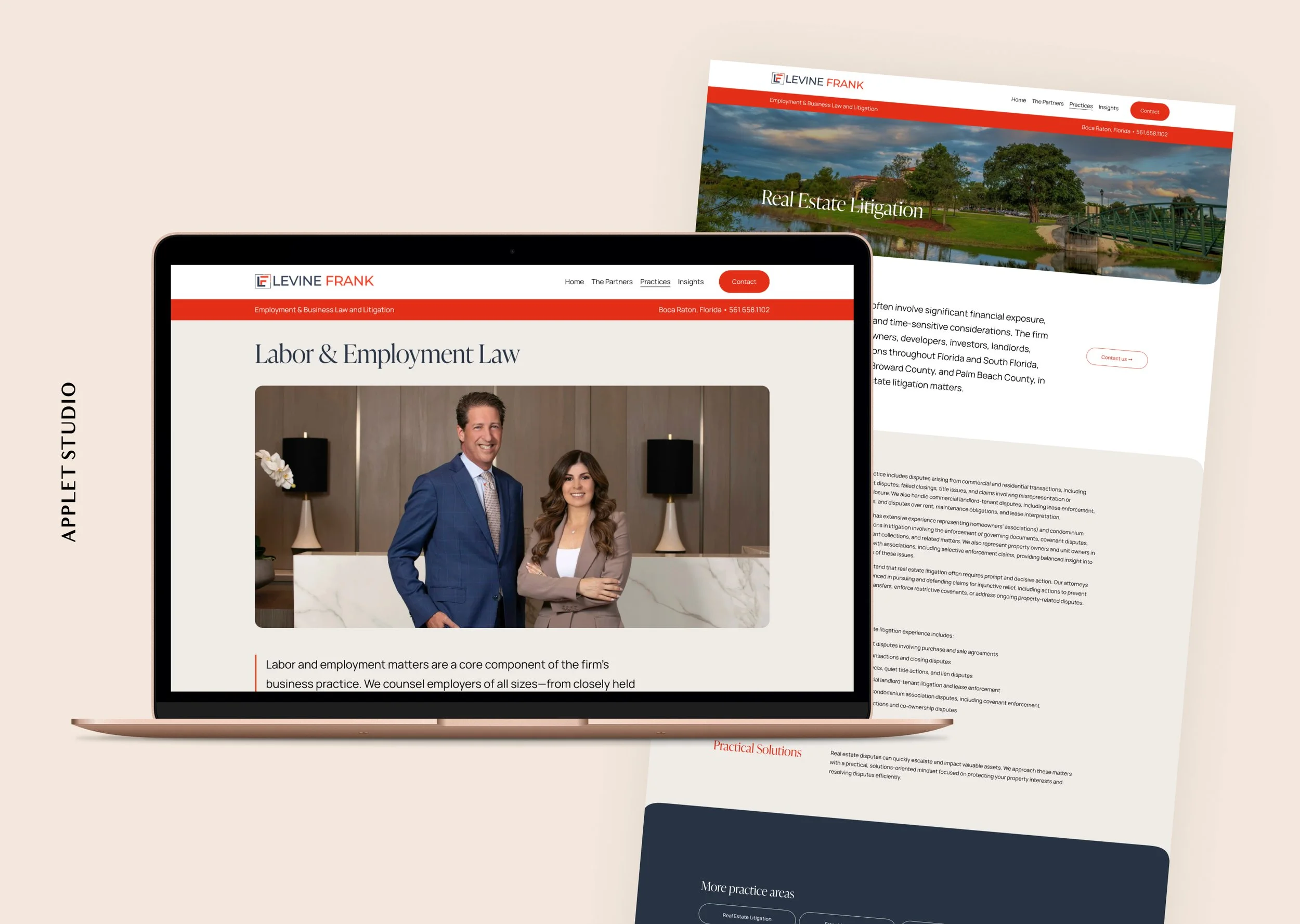
Levine Frank is an employment and business litigation firm in Boca Raton. Two partners, five practice areas, and the kind of work where a prospective client is usually in trouble before they start looking.
Law firm websites have a default setting, and it's usually grim. Navy, gray, a stock photo of columns or a gavel, and a wall of text that reads like it was written for other lawyers. Most of the decisions below came from staying out of that default while keeping the seriousness the work calls for.
Two Partners, Equal Billing
The firm's name is two names, and the site is built that way the whole way down.
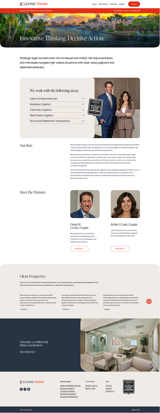
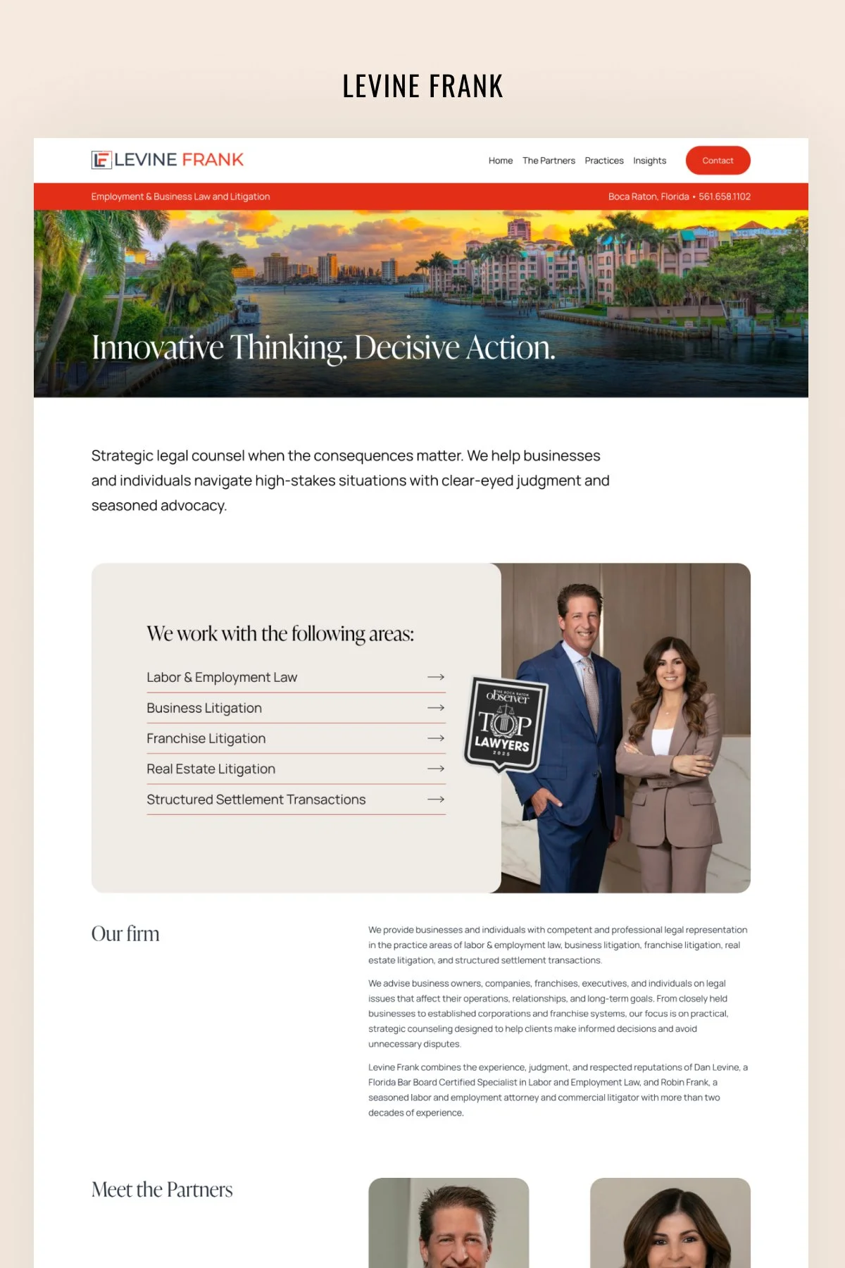
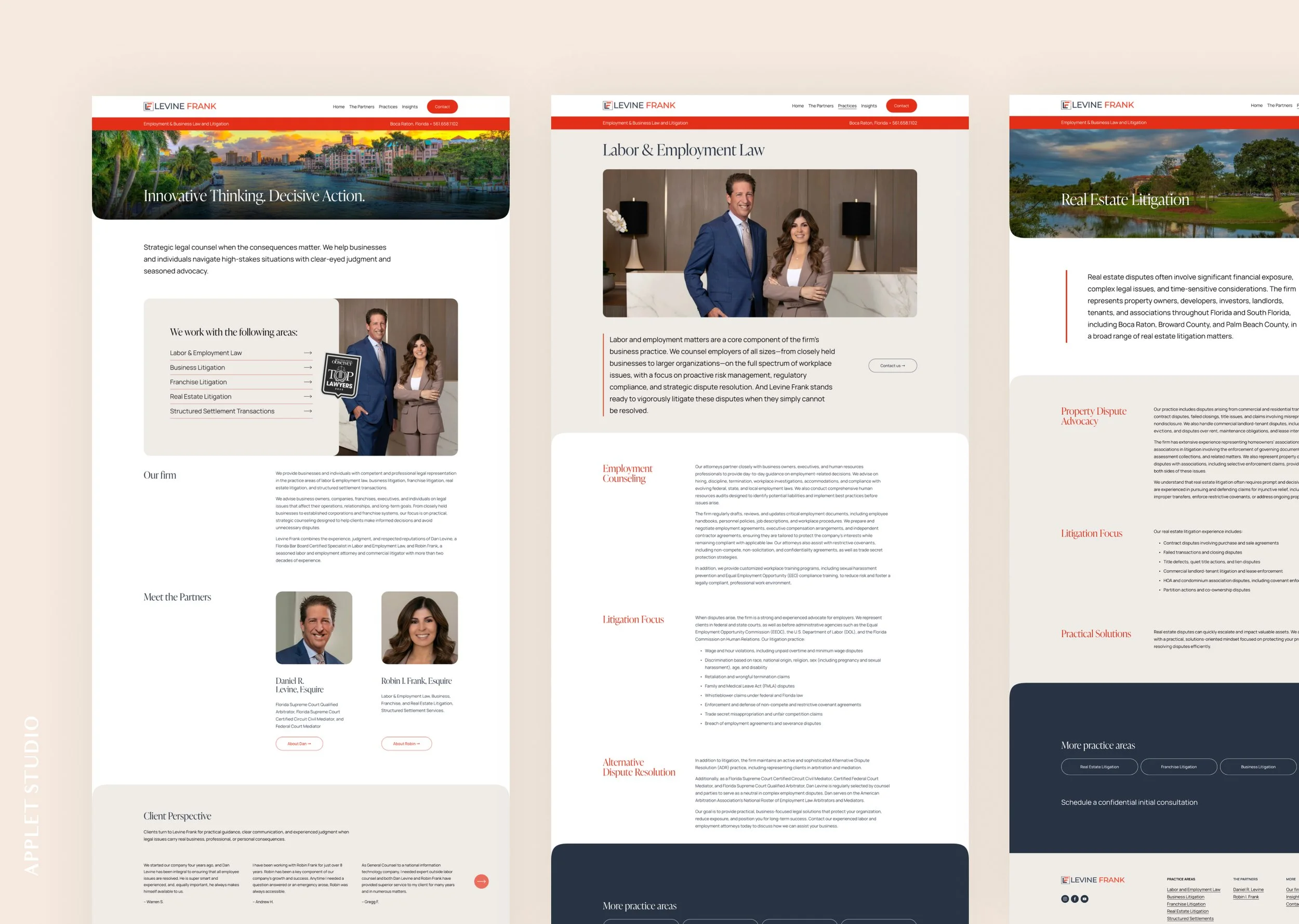
Daniel Levine and Robin Frank appear together in the homepage photograph at the same scale. Each gets their own card, their own credentials, and their own button through to a full bio. They sit side by side again in the footer. Nothing on the site establishes one as the senior figure and the other as support.
That sounds obvious and it isn't. Two-partner firms usually end up with a site where one partner's name carries the brand and the other appears somewhere on an About page.

Letting the Red Lead
The site runs on a hard red-orange, a deep navy, and a warm cream. What makes it work is the proportion.
Red leads. It's the buttons, the practice-area subheads, the announcement bar across the top. The navy is still present, holding the consultation bands and the footer, but it supports rather than sets the tone.
The photography is the other half. The homepage opens on Boca Raton at sunset, the Intracoastal in full color, rather than a skyline or a law library. The partners were photographed in their own office. Further in, the practice pages use images that match the work: a park and a bridge for real estate litigation, a desk and a phone for the contact page.
The Phone Number on Every Screen
A red announcement bar sits directly under the navigation on every page, with the firm's practice line on the left and Boca Raton, Florida, plus the phone number on the right.
For a law firm that's the conversion. Someone who has just been served, or just fired someone and realized they may have done it wrong, is not going to fill in a contact form and wait. They want to call. Putting the number in a permanent bar means it's visible from the first screen of any page without a floating widget chasing people down the page.
The consultation band at the foot of each practice page does the same job in a calmer voice: "Schedule a confidential initial consultation," with the number again.
Practice Areas as the Spine
The firm has five practice areas, and most of its traffic lands on them rather than the homepage. Someone searching for a franchise dispute in Palm Beach County arrives on that page, not the front door.
So the practice areas are the structure. They're a card list with arrows on the homepage, a row of pills at the bottom of every practice page, and a column in the footer. A visitor who lands on Real Estate Litigation and realizes their problem is really a business dispute can move across without going back to the start.
All five pages share one layout: serif heading, hero image, a short framing paragraph marked with a red rule and a contact button beside it, then alternating sections with red subheads in the left column and the detail on the right. It reads as considered rather than templated, and it means the firm can add a sixth practice area later without a design conversation.
Credentials Without the Shouting
Lawyers have a lot to list, and most firm sites list all of it immediately.
Here the board certifications and court appointments sit in small type under each partner's name, where someone who knows what a Florida Bar Board Certified Specialist is will find them and nobody else has to wade through. The Top Lawyers badge appears twice, in the homepage card and in the footer, and nowhere else.
The client testimonials are given the same restraint. They run in a quiet carousel under the heading "Client Perspective," attributed by first name and last initial, with no photographs and no five-star graphics.
The Outcome
Levine Frank has a site that sounds like the way the two of them practice: direct, warm enough to call, serious about the work. A prospective client can find the right practice area, read enough to know the firm has handled their problem before, and reach a person in one step.
Scroll through the home page: