Joyful and Curious Squarespace Website for a Preschool
Building a warm digital home for little explorers and their families
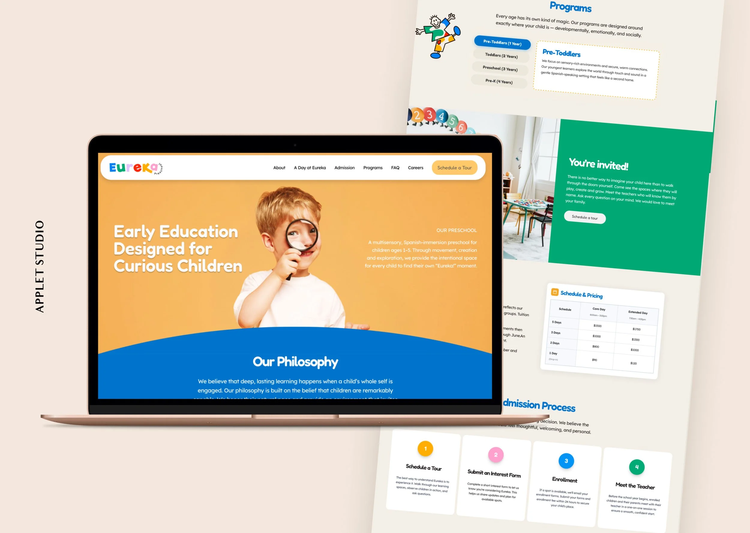
Eureka Preschool is a Spanish-immersion early learning center in Austin, TX, where children explore, create, and grow through hands-on, multisensory, and experiential learning. The client came to us knowing exactly what she needed: a one-page, mobile-responsive website that would feel warm and modern, clearly communicate Eureka's philosophy and programs, and make it easy for Austin families to take the first step toward enrollment.
The result is a custom Squarespace website that is equal parts joyful and purposeful — much like the school itself.
Color and Visual Identity
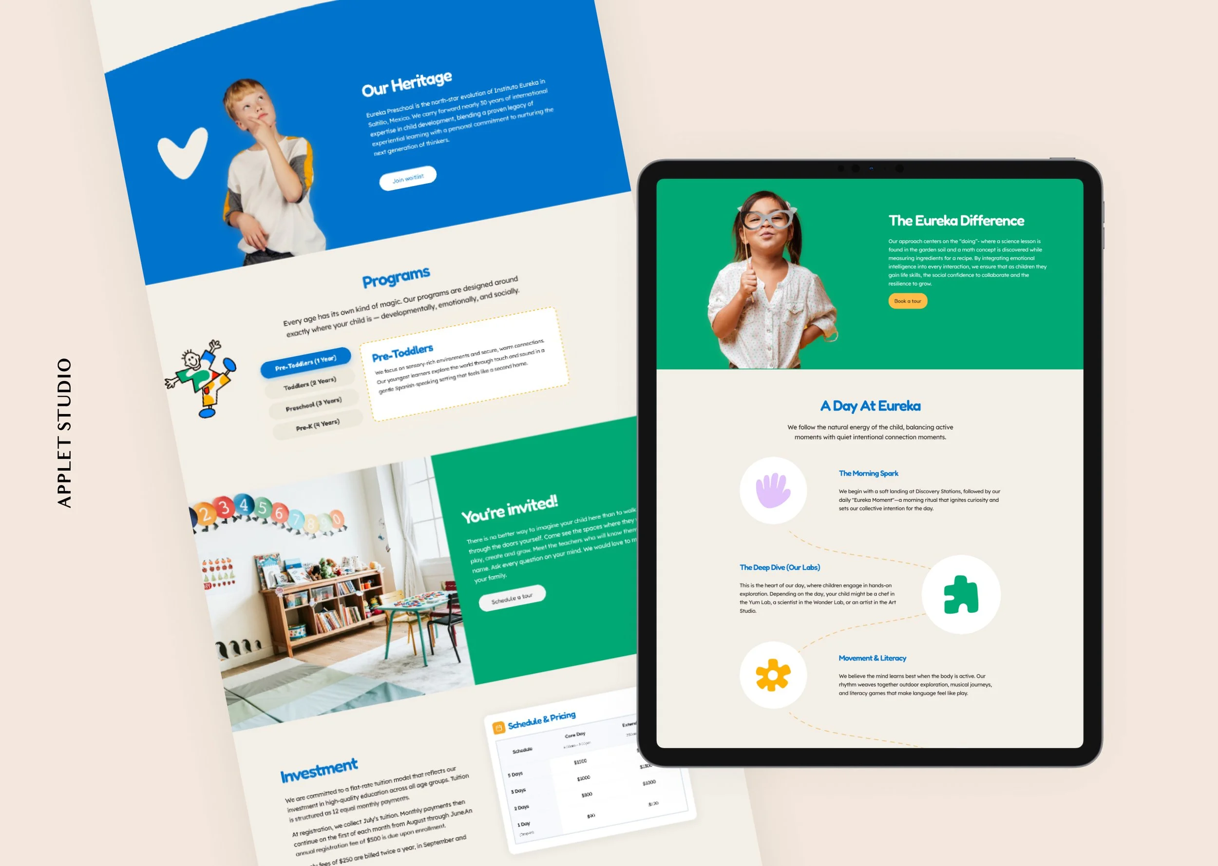
Eureka arrived with its own branding already in place. Their color palette leans into a bold, playful combination of golden yellow, cobalt blue, and warm off-white, vivid green — energetic without being overwhelming, and unmistakably child-centered without being childish. These colors set an immediate emotional tone: curiosity, warmth, and confidence.
The branded illustrations and custom icons throughout the page — a hand, a puzzle piece, a flower, a cloud — give the site a handcrafted personality that feels distinct from the typical stock-photo-heavy school website. Photography of real children in real learning moments adds authenticity and heart.
Structure and Layout
The main deliverable was a long-form one-pager, plus three supporting pages: Contact, Careers, and Privacy Policy. This structure is a natural fit for a preschool: parents want to explore at their own pace, scrolling through philosophy, curriculum, programs, and pricing before deciding to reach out. We added anchor links that move visitors from the header and footer to the needed page sections. Anchor navigation in the header means visitors can jump directly to Programs or Admissions without losing their place — a small but meaningful UX detail for busy parents researching on their phones. The one-page format removes friction and keeps families moving forward.
The layout moves between full-bleed color sections and content-dense areas, creating a natural rhythm as you scroll. Curved section dividers soften the transitions and add to the playful, organic feel. Bold section headlines ("A Day at Eureka," "Our Heritage," "You're Invited!") act as signposts that make the page easy to scan.
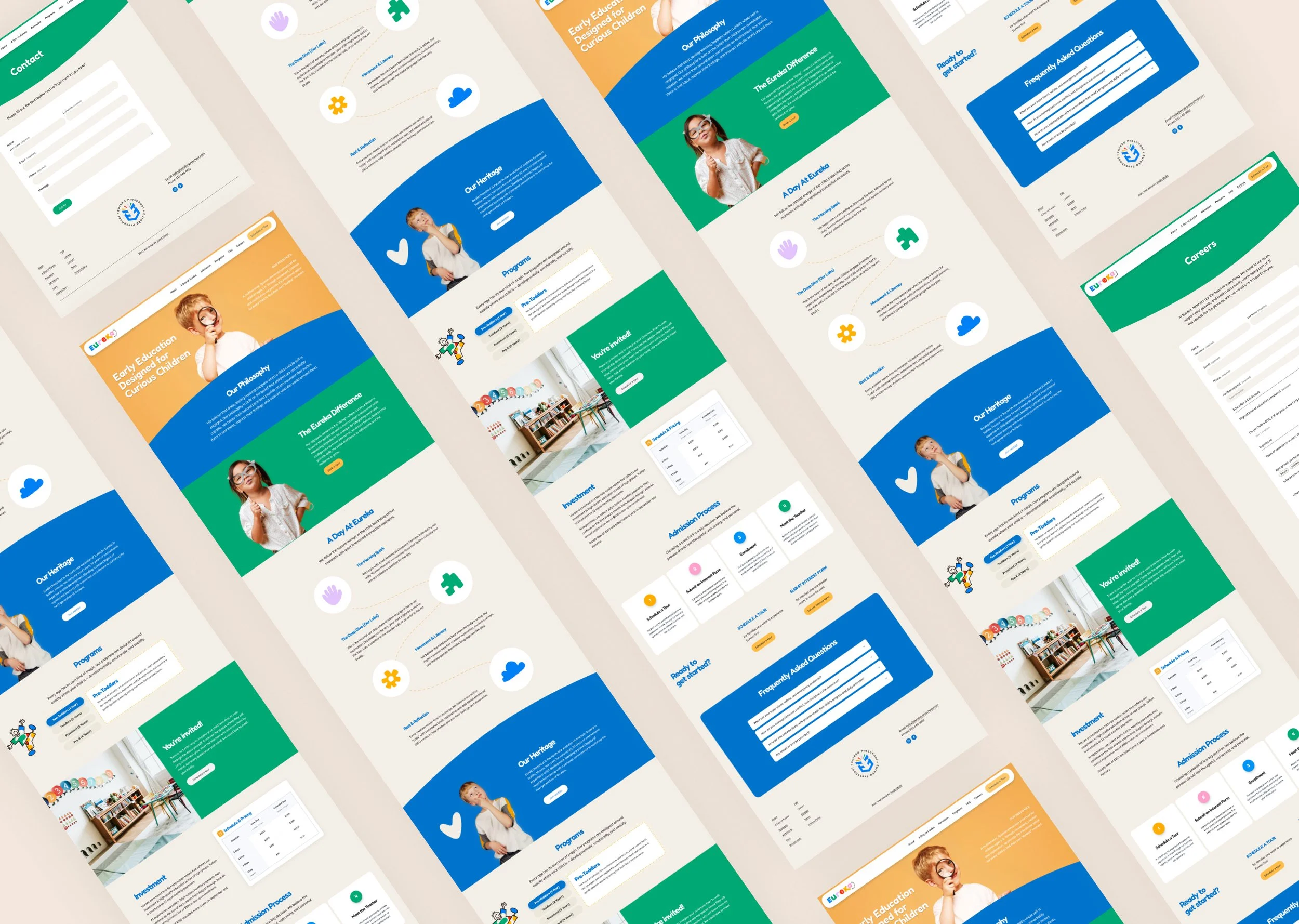
Content Architecture
One of the more thoughtful decisions on this site is how the curriculum is presented. Rather than listing subjects or standards, "A Day at Eureka" walks through the school day in narrative beats — The Morning Spark, The Deep Dive, Movement & Literacy, Rest & Reflection — with supporting icons and short descriptions. This approach communicates the pedagogy while making it feel alive and experiential, not institutional.
The Programs section uses tabbed or stacked blocks to present the different age groups (Pre-Toddlers, Toddlers, Pre-K) cleanly, letting parents quickly find what's relevant to their child. The Investment section pairs copy about the school's approach with a clear pricing table — a combination that reframes tuition as a considered decision rather than just a transaction.
The Admission Process section uses a numbered step layout to walk families through scheduling a tour, submitting an interest form, enrollment, and meeting the teacher. Making this process visible and approachable is key for any school website — it lowers the perceived barrier to getting started.
Mobile and Usability
Given that most parents will find Eureka on their phones, mobile responsiveness was a priority from day one. The stacked layouts, large tap targets, and clean typographic hierarchy all translate well to smaller screens. The sticky "Schedule a Tour" CTA ensures the primary conversion action is always within reach.
The Outcome
The finished website gives Eureka Preschool a digital presence that genuinely reflects what the school feels like: joyful, intentional, and full of personality. It communicates trust to parents, showcases the school's unique Spanish-immersion approach, and makes it easy to take the next step — all in a single, beautifully scrollable page.
Scroll through the home page: