Approachable Squarespace Website for a Sexual Health Educator
Creating a soft place to land for hard conversations
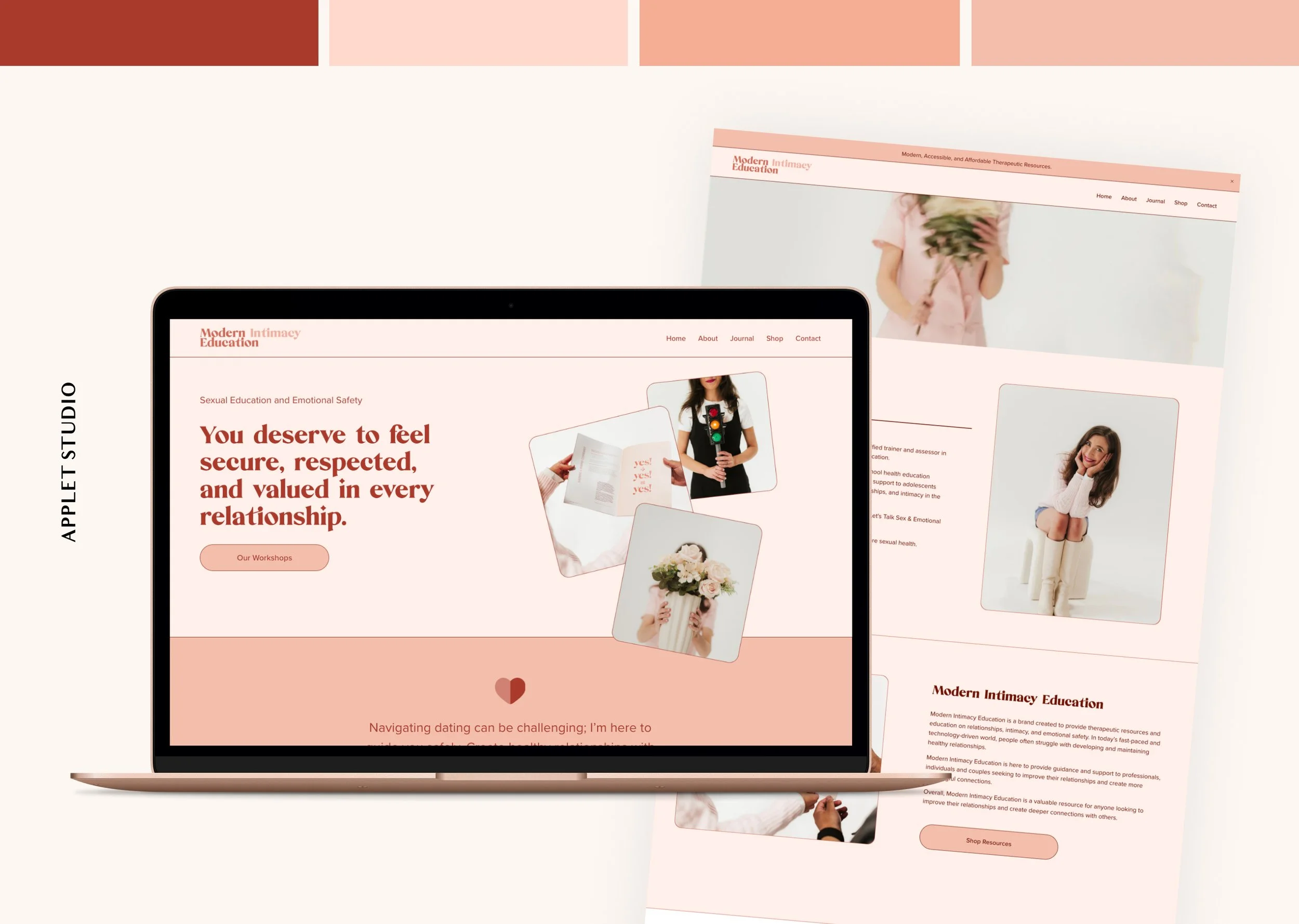
The current Modern Intimacy Education website is a 2025 revamp of the website we did in 2023. The founder of Modern Intimacy Education, Alexandra Greer, is our long-term client. First, she bought a Squarespace template in 2021. Later, she hired us to create a custom website for her in 2023, as well as its newer version in 2025.
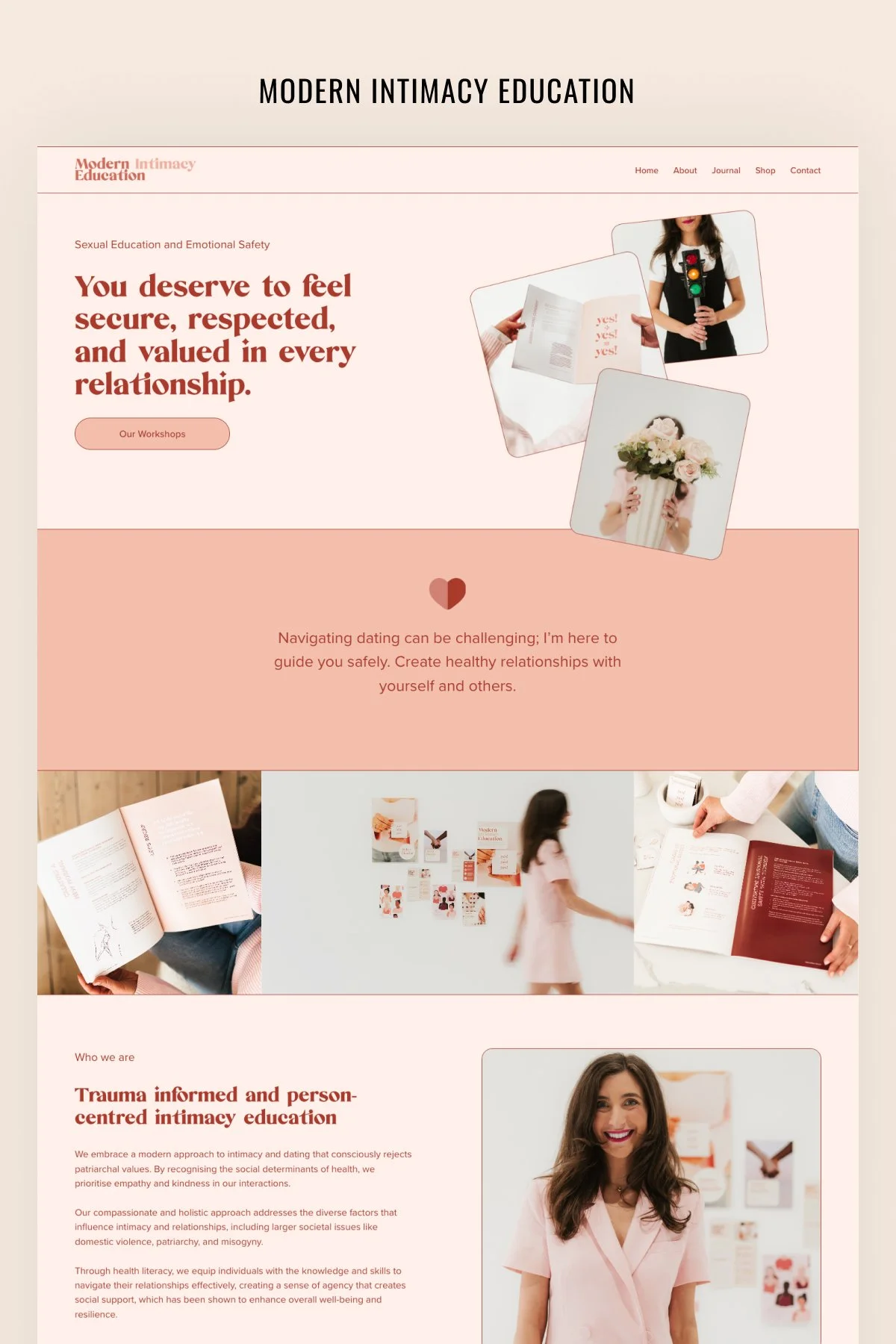
This new website for Modern Intimacy Education features a sophisticated, warm, and intentional design that leans into the soft era aesthetic. It successfully balances the authority of a sexual health educator and a therapist with the approachable warmth of a lifestyle blog.
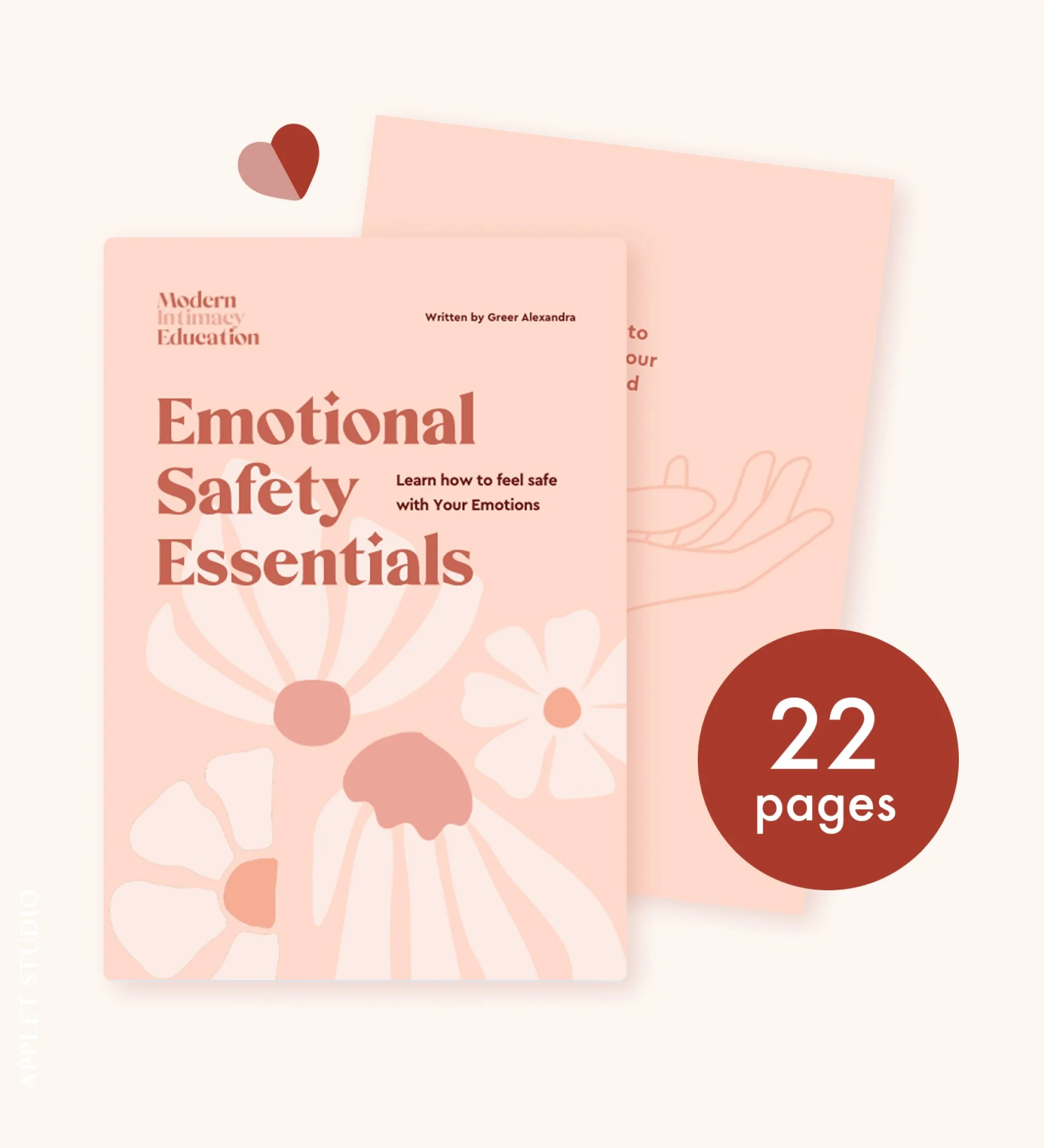
The color scheme is deeply rooted in human-centric, skin-toned neutrals that evoke a sense of safety and calm. At the same time, the colors are very feminine and remind you of an eye-shadow palette. A very soft, desaturated peach color provides a clean but warm base, which is much softer on the eyes than pure white. Large sections use a deeper dusty rose, adding depth and segmenting the long-form page into digestible chapters. A rich, deep umber is used for the text and buttons. This provides high contrast for accessibility while feeling more organic and high-end than standard black. Buttons use a muted salmon fill, which stands out without being aggressive.
The typography choices reflect a modern vintage vibe, blending traditional editorial styles with clean, contemporary lines. We used a bold, high-contrast old-style Serif for headlines. The rounded terminals and thick-to-thin strokes feel nostalgic, trustworthy, and feminine. It gives the site a journal-like feel.
It is important to ensure readability in the body copy, which is why a clean, geometric Sans-Serif is used in a lighter weight. This makes the educational content easy to digest across all devices.
The layout avoids a rigid "grid" look in favor of a more fluid, editorial composition that feels like a physical workbook.
The top of the Home page uses overlapping image frames with organic, rounded corners. This collage style makes the site feel personal and handcrafted.
Almost every image has a significant border radius. This softness is a psychological design choice — sharp corners can feel aggressive, while rounded corners feel safe and inviting.
There is generous white space (or in this case, peach space) between sections. This reflects the brand’s message of emotional safety — the layout isn't crowded, giving the reader room to breathe and process information.
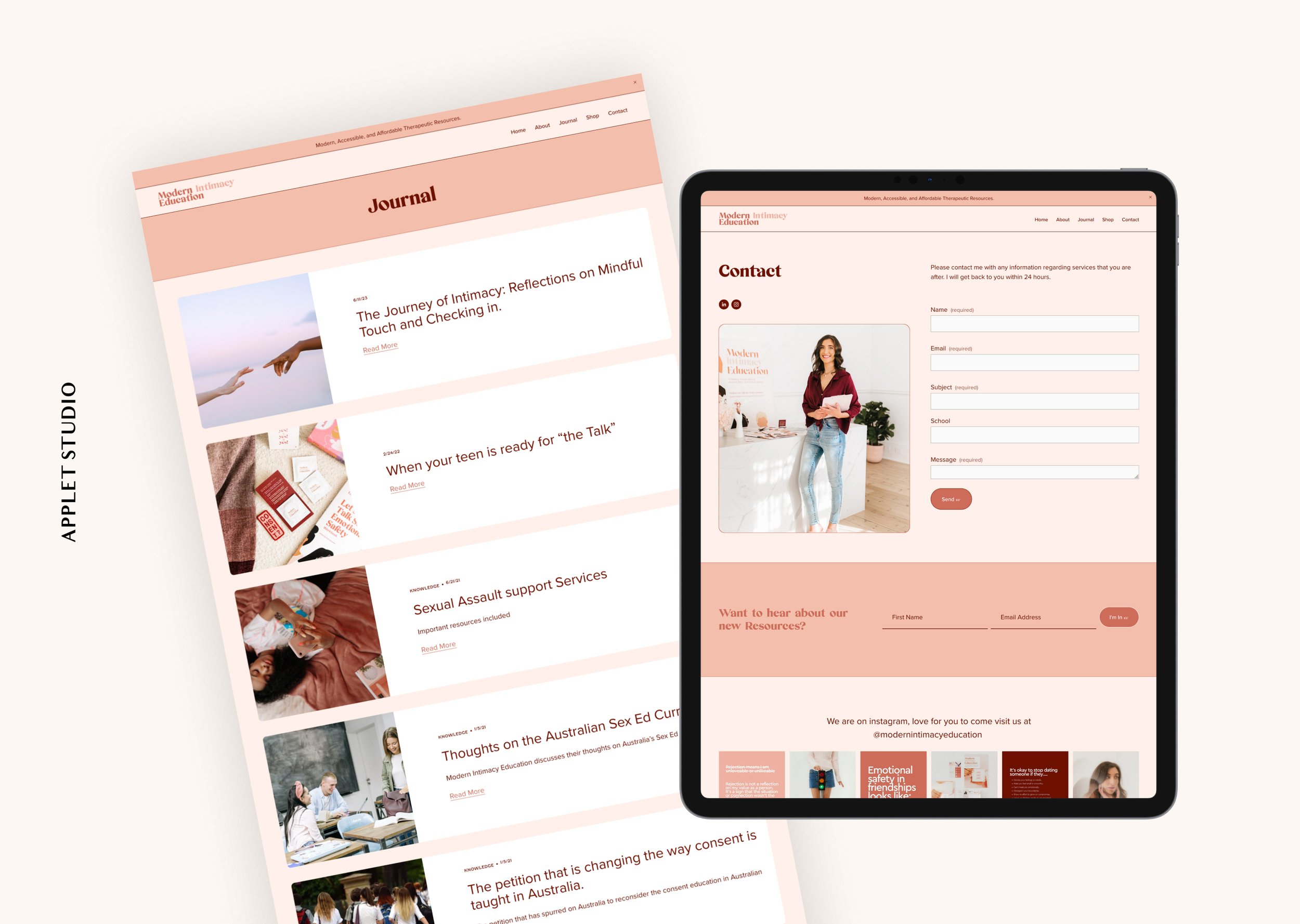
The pill-shaped buttons with subtle hover states (changing from light to dark) provide a modern, tactile feel that is very popular in current Squarespace designs.
The photography is a cornerstone of this design. It moves away from sterile, clinical imagery in favor of lifestyle photography. Every shot uses soft, natural, or warm-toned lighting that complements the peach palette. The photos of Alexandra have blurred backgrounds, which keeps the focus entirely on her, building a sense of personal connection and mentorship. Creative shots, such as the person standing behind a traffic light, cleverly visualize complex concepts like boundaries and consent without needing heavy text.
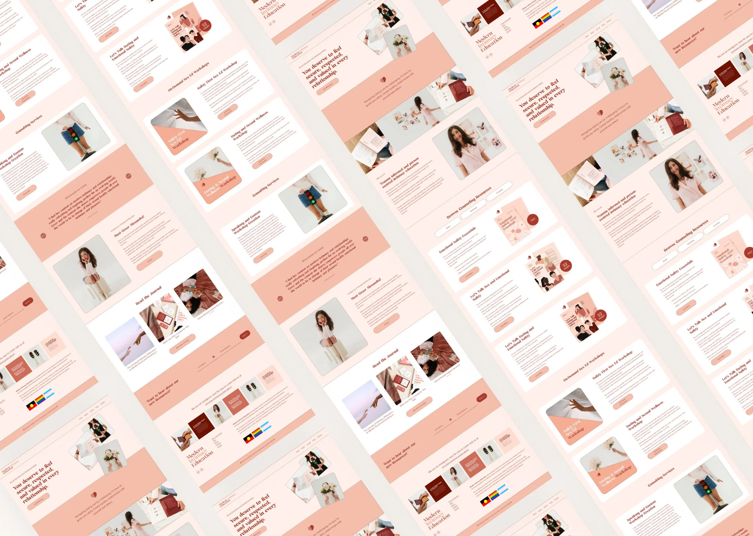
Scroll through the home page: