Unfiltered Squarespace Website for a Men's Cancer Nonprofit
A site that does the reaching out
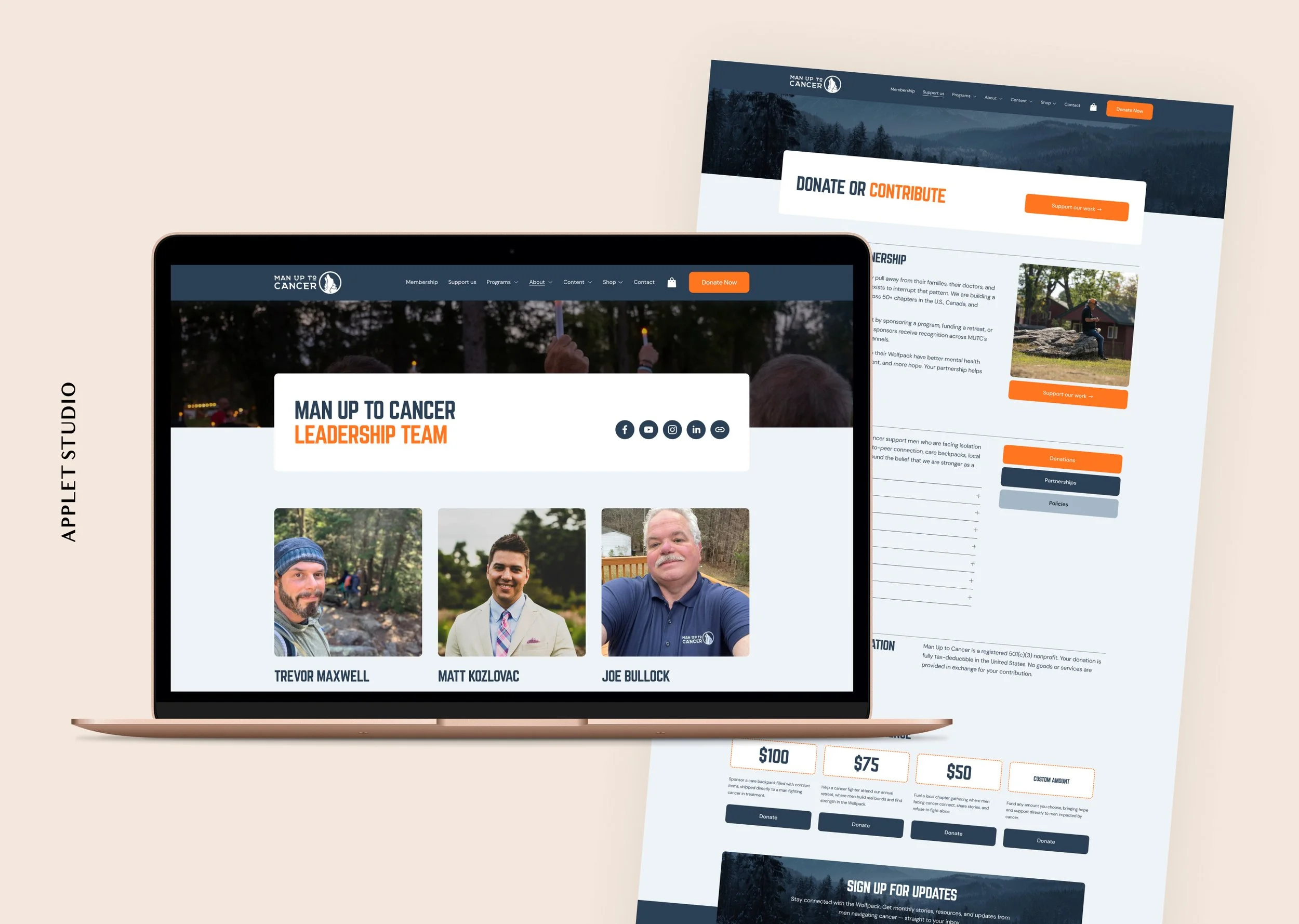
Man Up to Cancer exists because of a pattern its founder kept seeing: when cancer arrives, women reach out, and men check out. The organization works to interrupt that by getting men diagnosed with cancer into rooms, chat threads, and campfire circles with other men who understand what they are going through.
That made the design question fairly specific. A site meant for men who avoid support groups shouldn't look like a support group, or like a hospital brochure, or like a pastel ribbon campaign that asks a man to admit he's struggling before he's ready to.
We built it on Fidelity, our Squarespace template for nonprofits, so the structure was mostly settled from the start: routes for different visitors, a donation page with tiers, room for sponsors.
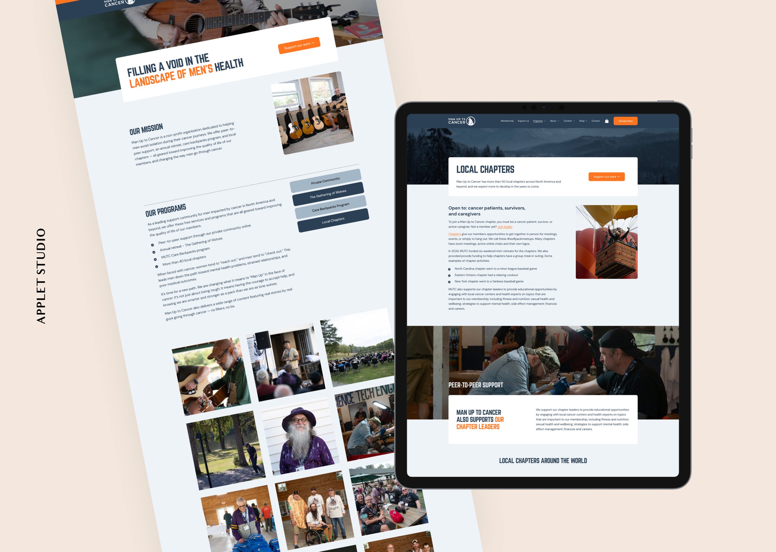
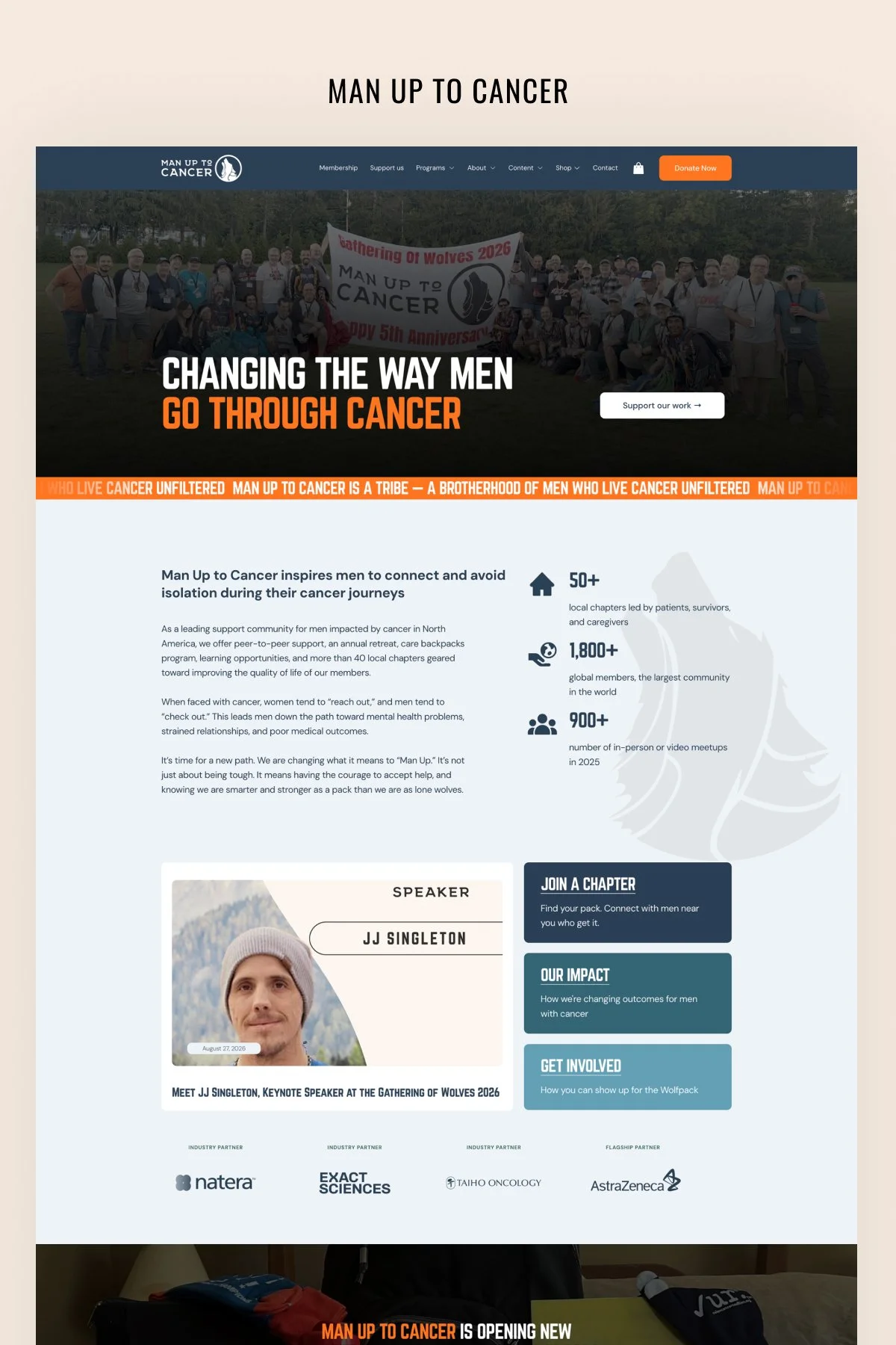
Man Up to Cancer runs on deep navy, a hard construction-site orange, and a pale grey-blue. The orange does most of the work, and it reads closer to signage than to decoration.
Headlines are set in a condensed uppercase face, with the key words picked out in orange, so they stand out inside the line itself.
The photography matters as much as the palette. The images show members at actual gatherings, with arms around shoulders and a lot of laughing, and several carry an orange wash that ties them back into the palette and keeps the page from turning into a photo album.
A nonprofit homepage usually has to serve several audiences who want different things, and here there were four: a man newly diagnosed and looking for support, a caregiver looking on his behalf, a donor, and a corporate sponsor.
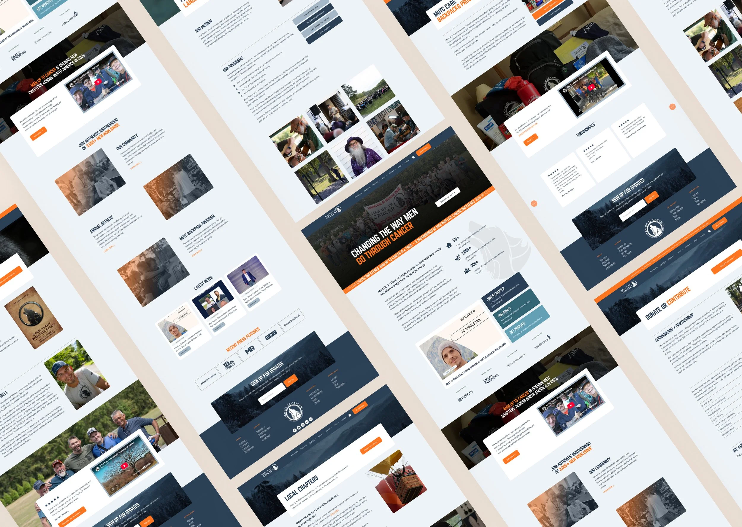
The three-route block near the top of the page handles that split, so visitors choose a direction before the page asks anything of them. For this organization, the routes are Join a Chapter, Our Impact, and Get Involved. Membership is also pinned in the main navigation, since it is the conversion the organization cares about most.
Sponsor logos rotate through their band rather than sitting in a static grid, which keeps a long and growing list from taking over a screen.
The donate page turns money into specific things instead of leaving it abstract: $100 sends a care backpack, $75 supports a retreat spot, $50 hosts a chapter gathering. Each tier has its own card and its own image, so donors can see what their money pays for.
The Outcome
Man Up to Cancer now has a website that reads the way the organization sounds. Someone landing on it after a diagnosis sees photographs of men who have been through the same thing and a clear route into the group, rather than a brochure asking him to be brave.
Scroll through the home page: