Confident colour, calm pages
The Design Trust has been teaching designers and makers how to run their businesses since 1994. Patricia van den Akker took it over in 2011, and in the years since it has accumulated what any long-running training business accumulates: memberships, courses, workshops, one-off events, consultancy, a book, hundreds of blog posts, and a programme for art schools and cultural organisations that grew into a serious income stream without ever appearing on the website.
All of that sat on a WordPress site built in 2021. By 2026 it was time for a redesign.
Three Areas of Training
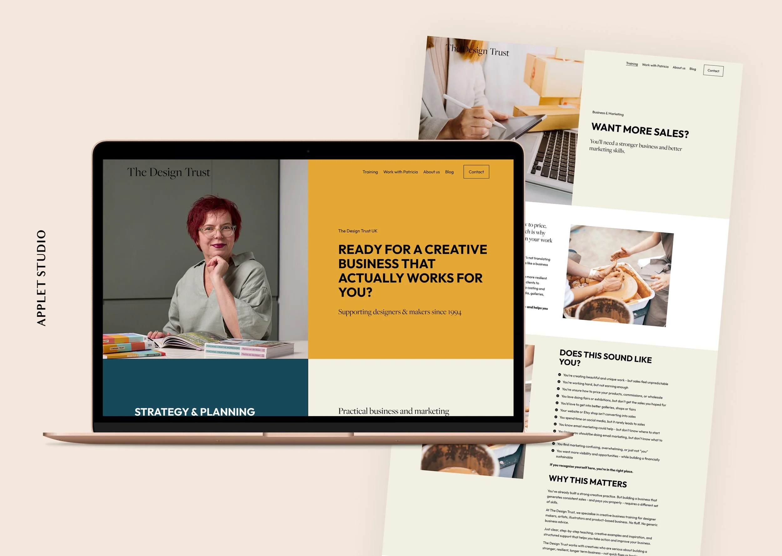
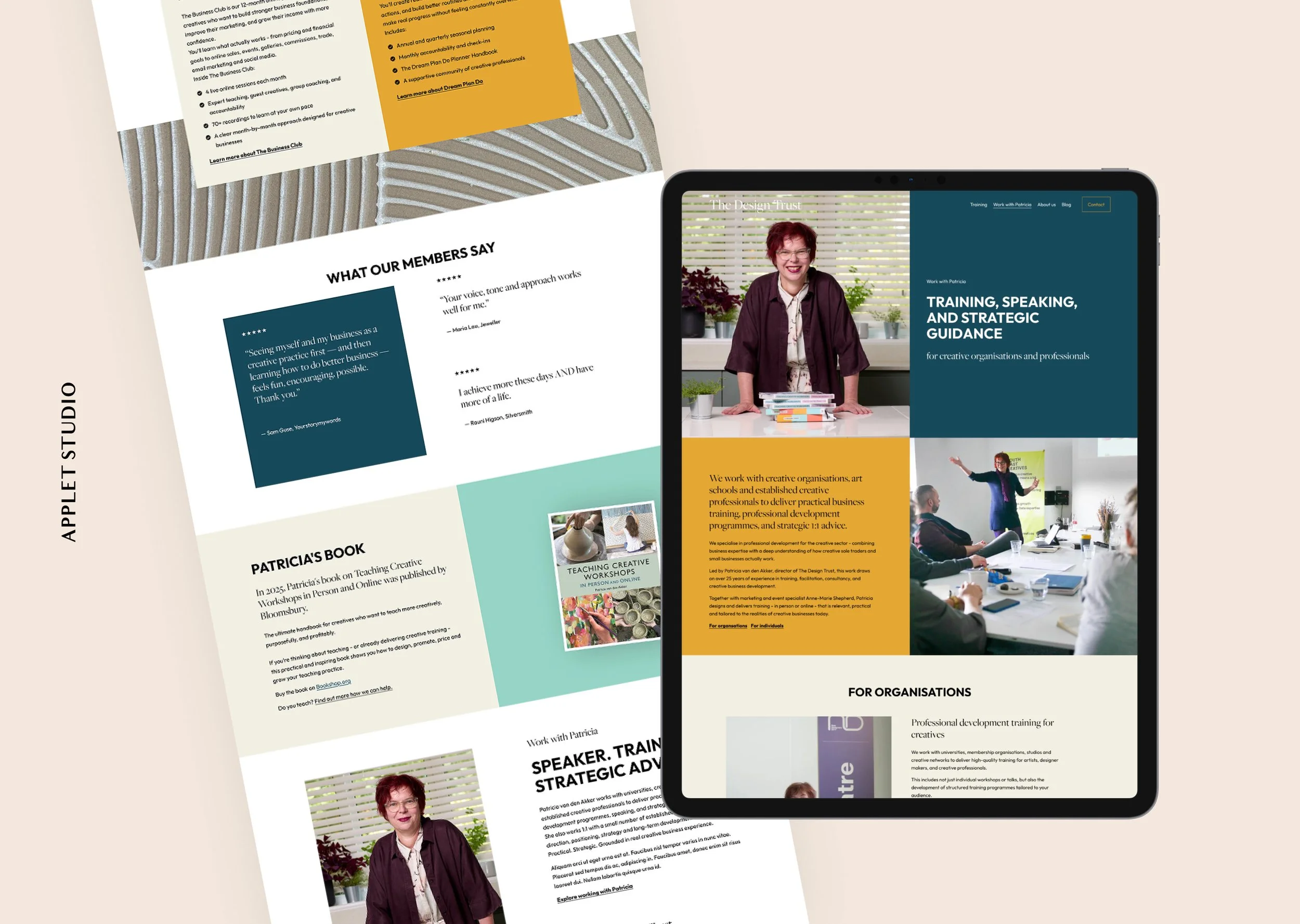
Everything the business teaches sorts into three areas. Strategy and planning. Business and marketing. Teaching creative workshops. The site's job was to make that obvious from anywhere on it.
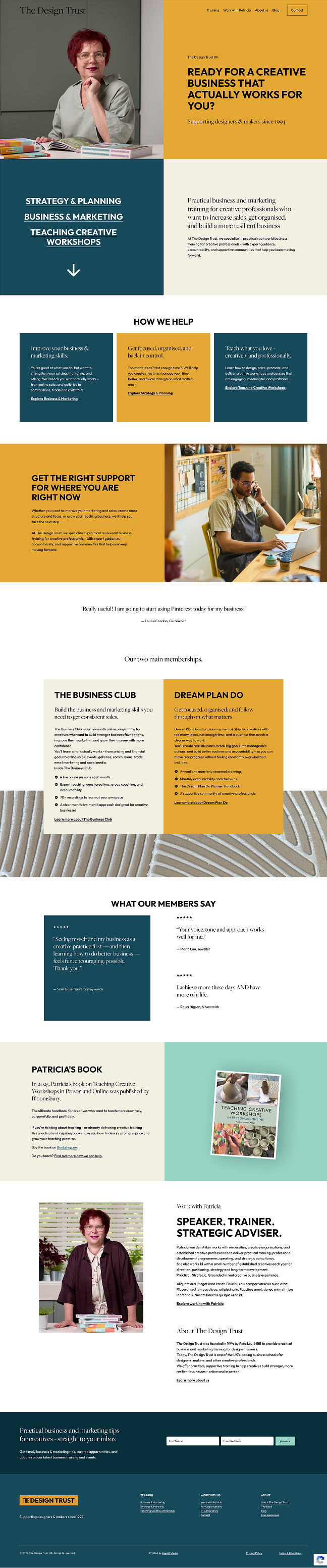
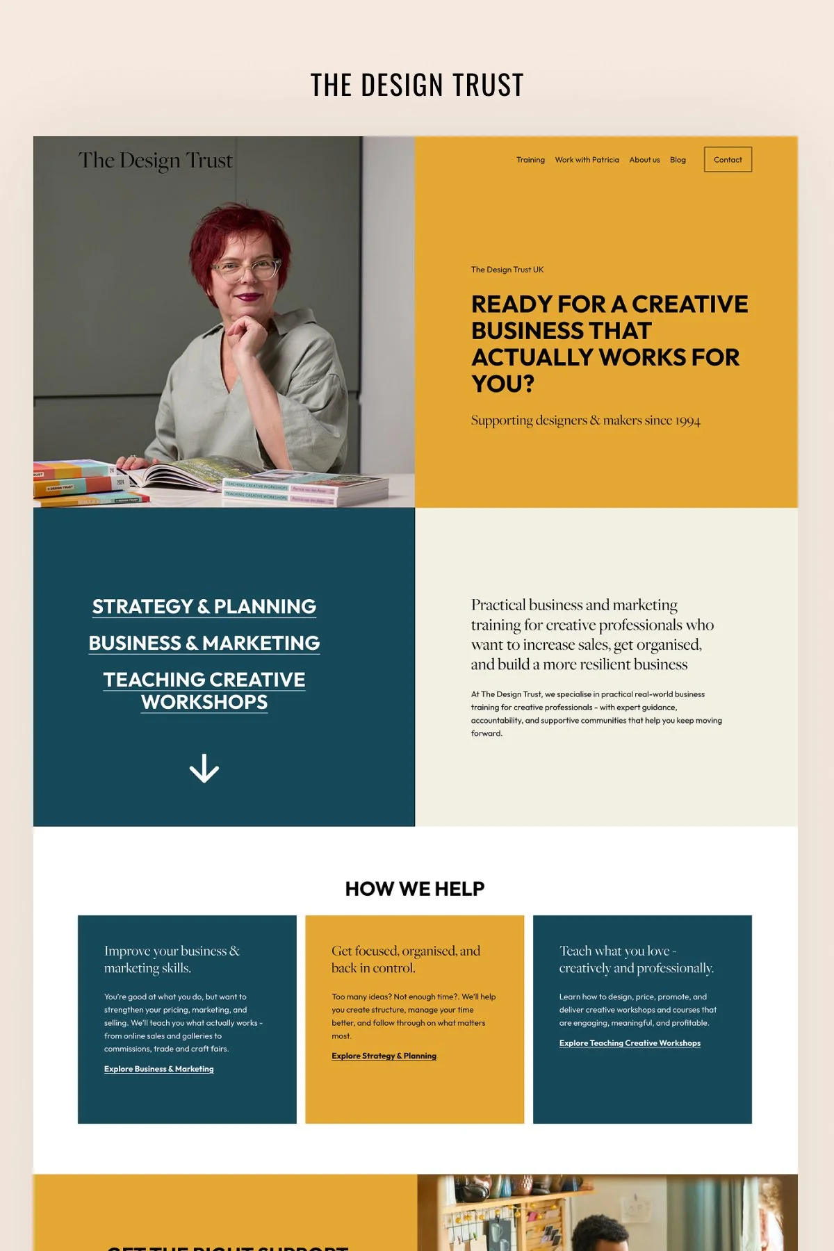
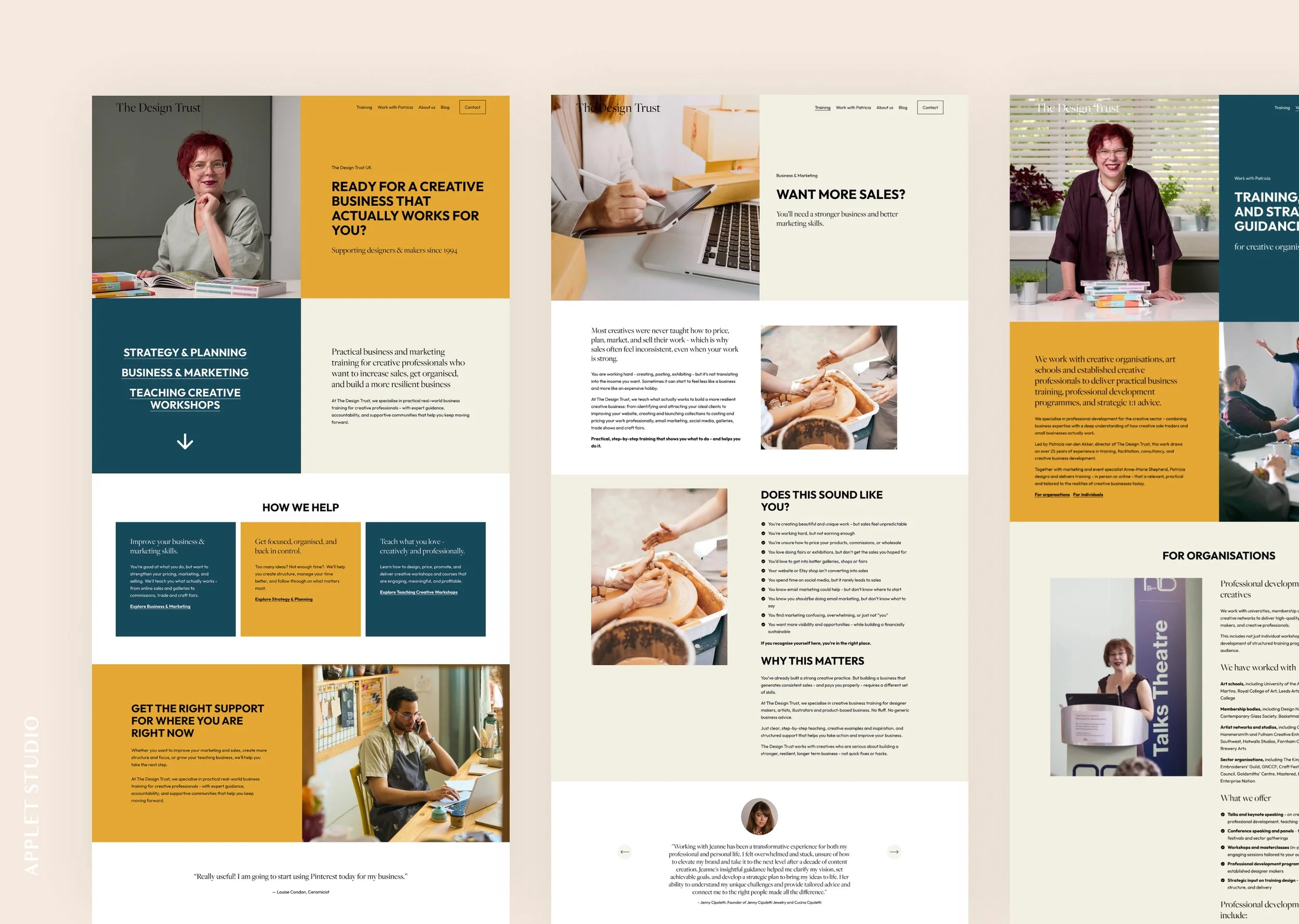
Those three appear on the homepage as a stacked list under the hero, again further down as three colour blocks, and again in the footer of every page. A visitor who skims the top, one who scrolls the middle, and one who reaches the bottom all get offered the same clear direction.
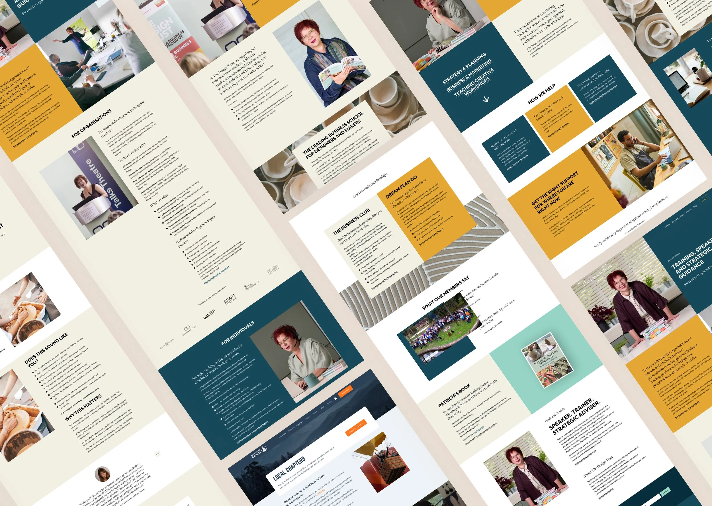
Each area has its own page, and the three share one architecture: a hero that states the promise, a checklist that lets a visitor recognise themselves, testimonials from members, the flagship membership, then shorter training and free resources. The business launches new training constantly, so the structure had to absorb it without a redesign each time.
Patricia's speaking and consultancy work sits outside the three, on a page of its own.
Mustard, Teal and Cream
The palette arrives in large blocks: a full-width mustard band, a teal panel holding the three, a cream section for reading. The eye gets somewhere to rest between them.
Type is split by job. Big statements are set in a heavy condensed uppercase, so the hero and the section banners carry weight. The conversational headings that introduce each offer are set in a serif at a comfortable size.
Every testimonial on the site is a photographed person with a name and a craft. Anna Scott, embroidery artist. Kate Kelly, paper artist. For a business whose clients are makers, a quote from someone whose work the reader recognises is worth more than a quote from a stranger.
A Colour for Every Course
The training catalogue is the part that changes most, and it needed to stay readable as it grows.
Each course is a solid block of colour with a serif heading, a short description, and the price or the status. Mint, lavender, mustard, coral, cream. No photography, which means nothing to commission or crop every time something new launches, and a grid that stays scannable as it grows.
Two Buyers on One Page
Work with Patricia had to serve an arts organisation booking a speaker and an established maker buying one-to-one consultancy. The page splits at the top, with For Organisations and For Individuals as jump links, and runs the two separately below.
The organisations half carries a logo band: University of the Arts London, The King's Foundation, Craft Festival, the Embroiderers' Guild. It's the clearest proof on the site of the reposition the project was for.
Built on Lora
The site started from Lora, one of our Squarespace templates. The split-screen heroes, the stacked link list and the full-bleed colour bands carried over.
The Outcome
The Design Trust now has a site that matches the business it has become rather than the one it was in 2021. A maker arriving from a search lands on the page that fits them, recognises themselves in the checklist, and reads a testimonial from someone doing the same work. An art school looking for a speaker goes somewhere else entirely.
Scroll through the home page: