Seasonal color without the orange-and-brown default
Here are seven fall color palettes with hex codes, each built to avoid the burnt-orange-and-mustard autumn default: Pine & Amber, Ceramic & Cork, Clay & Slate, Eggplant & Cinnabar, Bice & Maize, Merlot & Ginger, and Payne & Mahogany. Every one has four colors, a note on which color to use for text and which is decoration only, and a line on the kind of business it suits.
They're aimed at two situations: you're choosing colors for a business for the first time, or you're a designer hunting for something a client hasn't already seen across their whole industry.
| Palette | Colors | The twist | Best for |
|---|---|---|---|
| Pine & Amber | #264133 · #AF3816 · #FFB902 · #F1E1D5 | A saturated signal yellow instead of harvest mustard | Food and drink, outdoor, craft |
| Ceramic & Cork | #0068A5 · #EFF8FF · #BB8B63 · #747D84 | Blue-led, so it barely reads as seasonal | Ceramics, homeware, design studios |
| Clay & Slate | #A17955 · #F5E6CD · #28495D · #B43D1B | A slate blue where most sets put a third warm tone | Wellness, interiors, pottery |
| Eggplant & Cinnabar | #51354B · #CCB9D9 · #F7EADF · #DC3D20 | Lavender, which nobody puts in an autumn set | Beauty, events, editorial |
| Bice & Maize | #056996 · #F4E16D · #C90001 · #FBF6DC | Primary red and blue, closer to vintage poster | Children's brands, food |
| Merlot & Ginger | #8A524F · #52161A · #B16931 · #D2CBC1 | A near-black merlot: wine cellar, not pumpkin | Wine, restaurants, heritage brands |
| Payne & Mahogany | #5F6370 · #C8CCC7 · #B44102 · #F6DEEC | Cool gray stops the pink going sweet | Florists, boutiques |
Why Most Autumn Palettes Look the Same
Search for a fall palette and you get the same thing over and over: burnt orange, mustard, a muddy brown, a cream. It isn't wrong. It's just that every small business that has ever rebranded in October is already using it.
Each palette below has one color you wouldn't expect to find in an autumn set, and that color is doing the real work. It's what makes the palette read as a brand rather than as seasonal decoration.
How a Four-Color Palette Actually Works
Each palette here has four colors, and on a real website they're never used in equal amounts.
One color is the background, covering most of the screen, usually the lightest in the set. One is the text, sitting on that background everywhere. The remaining two are accents — buttons, links, a highlighted word, a section break — on maybe five percent of the page.
That split is what separates a brand from a swatch card. Give all four equal weight and you get a site that looks like a paint chart.
It also decides which colors can carry text, and that's less obvious than it looks. Two colors can be completely different and still be almost exactly as dark as each other, which makes type on top of them hard to read however striking the combination looks on a mood board. So each palette below says what works as type and what's strictly decoration.
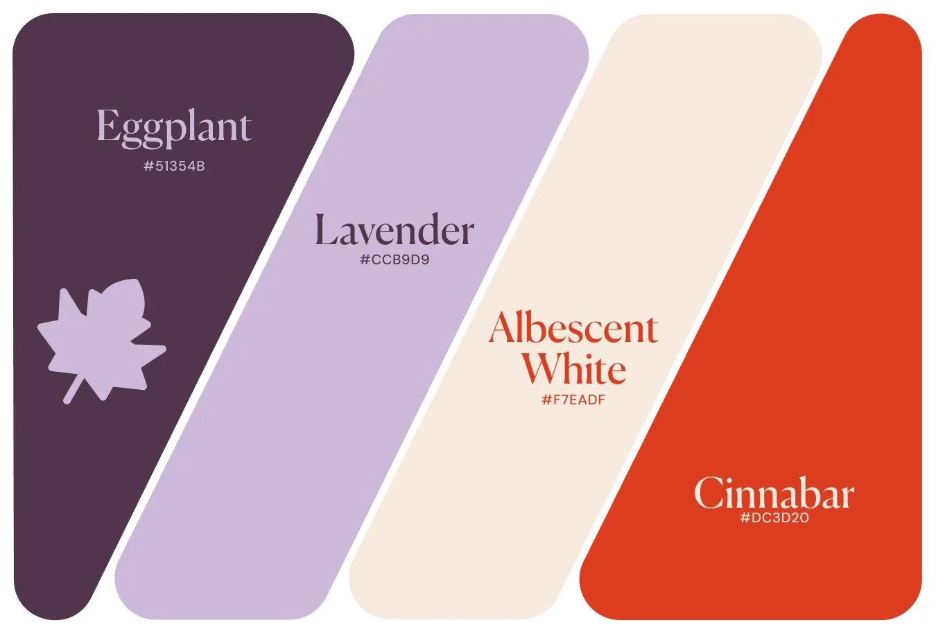
Eggplant & Cinnabar: Purple, Lavender, Off-White and Red
Eggplant #51354B · Lavender #CCB9D9 · Albescent White #F7EADF · Cinnabar #DC3D20
The twist: the lavender. Nobody puts lavender in an autumn palette, which is exactly why this one doesn't read as seasonal at all — it reads as a brand that happens to be warm. The cinnabar is the only conventional autumn note in the set.
Use it like this: Albescent White background, Eggplant text. Lavender works as a second background for alternating sections, and eggplant still reads cleanly on it. This is the sharpest text pairing of the seven.
Watch out for: cinnabar is an accent and nothing else. On the off-white it's headings at most. On the eggplant it's the dramatic combination everyone wants to try and nobody can read.
Best for: beauty, events, editorial, anything that wants to avoid the obvious.
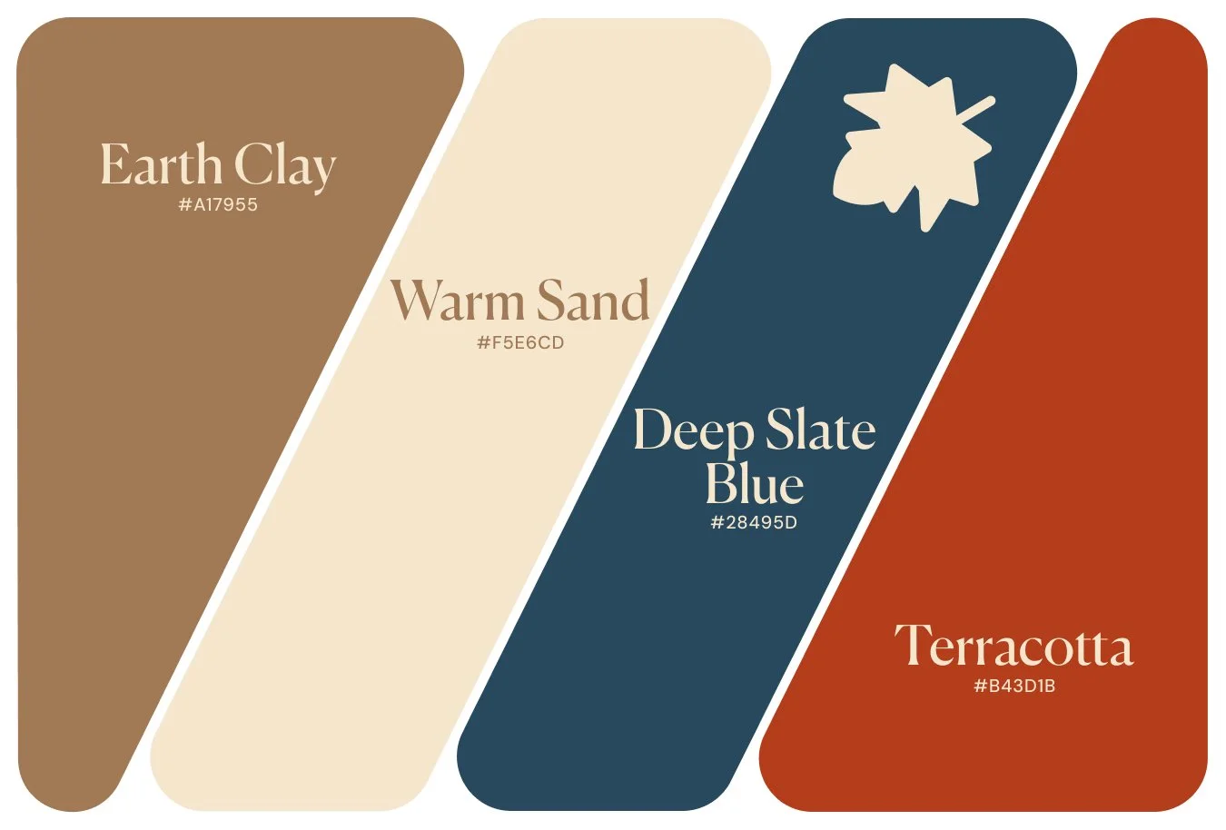
Clay & Slate: Terracotta, Sand, Slate Blue and Clay
Earth Clay #A17955 · Warm Sand #F5E6CD · Deep Slate Blue #28495D · Terracotta #B43D1B
The twist: the deep slate blue. Take it out and you're left with clay, sand and terracotta, which is a desert palette that a thousand wellness brands got to first. The blue is what makes it look chosen.
Use it like this: Warm Sand background, Deep Slate Blue text. Terracotta is also strong enough for body text on the sand, which means you can use it for links rather than only for buttons.
Watch out for: earth clay on warm sand is heading weight, not paragraph weight. And deep slate blue against terracotta looks striking and reads terribly.
Best for: wellness, interiors, pottery, anything hand-made.
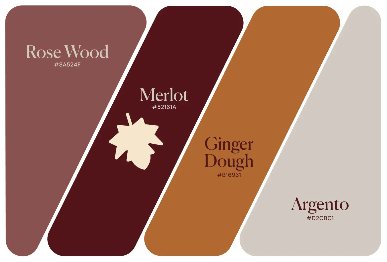
Merlot & Ginger: Deep Red, Rose, Ginger and Silver
Rose Wood #8A524F · Merlot #52161A · Ginger Dough #B16931 · Argento #D2CBC1
The twist: the merlot, by being so dark it's almost black. That depth is what moves the palette from pumpkin to wine cellar, and it's why the ginger reads as warm rather than orange.
Use it like this: Argento background, Merlot text. Ginger Dough is the accent that gives the palette its lift.
Watch out for: everything else here is heading weight or decoration. Rose wood on argento and merlot on ginger are both fine large and muddy small.
Best for: wine and restaurants, heritage brands, anything that wants to feel established.
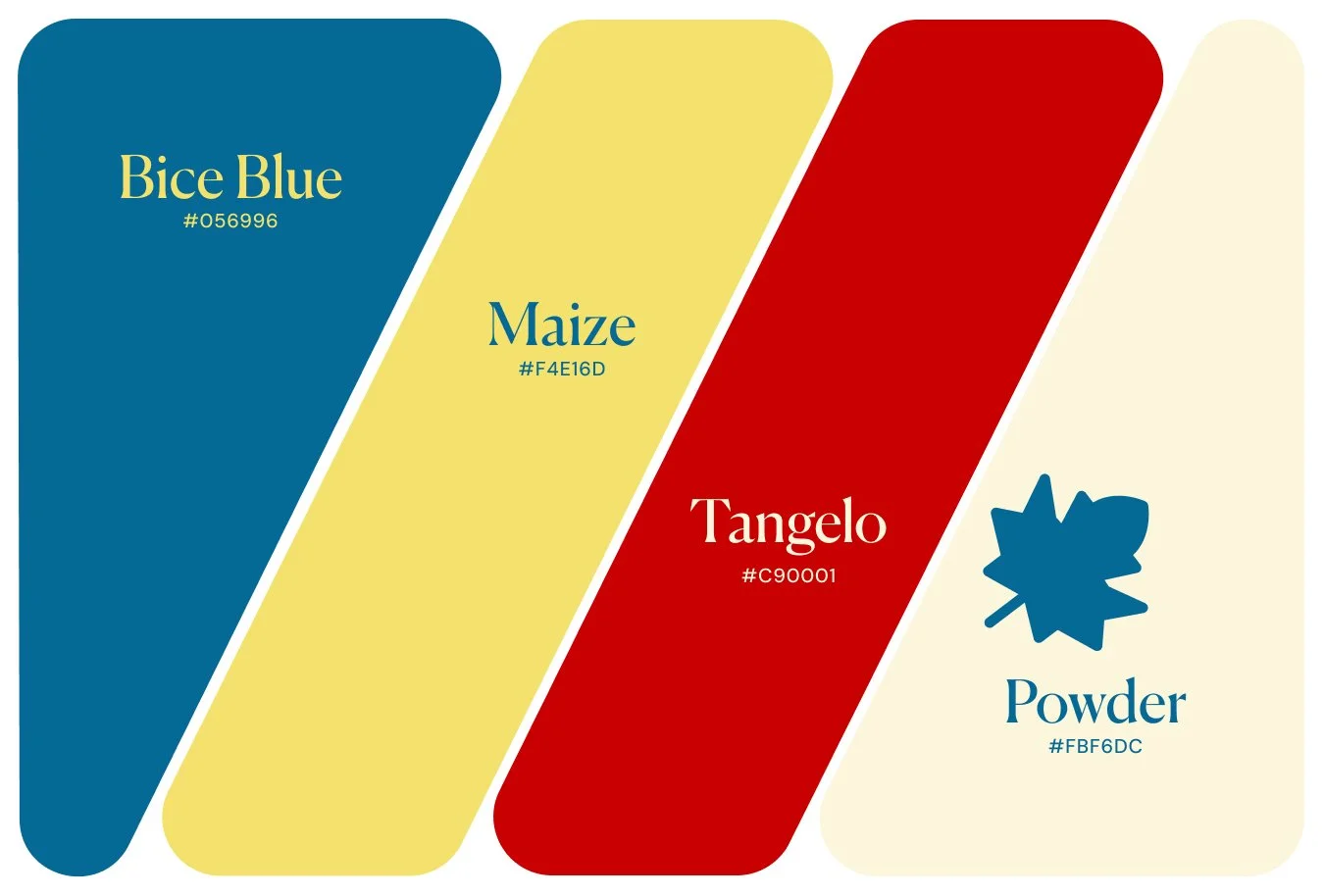
Bice & Maize: Blue, Yellow, Red and Cream
Bice Blue #056996 · Maize #F4E16D · Tangelo #C90001 · Powder #FBF6DC
The twist: the red, which is a true primary rather than a rust. Together with the blue it makes this less autumn-leaves and more harvest-festival poster — vintage signage rather than seasonal decor.
Use it like this: Powder background, Bice Blue text, with Tangelo available for type as well when you want a page to run hot. This is the most flexible palette here: both the blue and the red carry body text on the cream.
Watch out for: the blue and the red are the same brightness as each other. Side by side as blocks, they're the whole point. One on top of the other as text, they're genuinely hard to read, and for anyone with reduced vision, impossible. Maize on powder has the same problem.
Best for: children's brands, food, anything playful and confident.
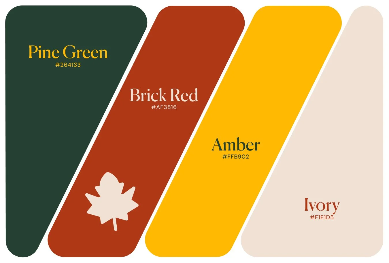
Pine & Amber: Deep Green, Brick Red, Amber and Ivory
Pine Green #264133 · Brick Red #AF3816 · Amber #FFB902 · Ivory #F1E1D5
The twist: the amber. It's a true saturated yellow rather than the dusty harvest mustard the season usually gets, and that one choice pulls the whole palette out of the craft-fair register into something closer to signage.
Use it like this: Ivory background, Pine Green text, Amber for buttons and highlights. Brick Red can go either way — it's strong enough on the ivory to set body text, so use it for a warmer page, for headings, or as a second accent beside the amber.
Watch out for: amber as type on a light background. It vanishes into the ivory. It's a button color, an underline, a block, never a paragraph. Pine green on brick red doesn't work either.
Best for: food and drink, outdoor and craft brands, anything that wants warmth without pastel.
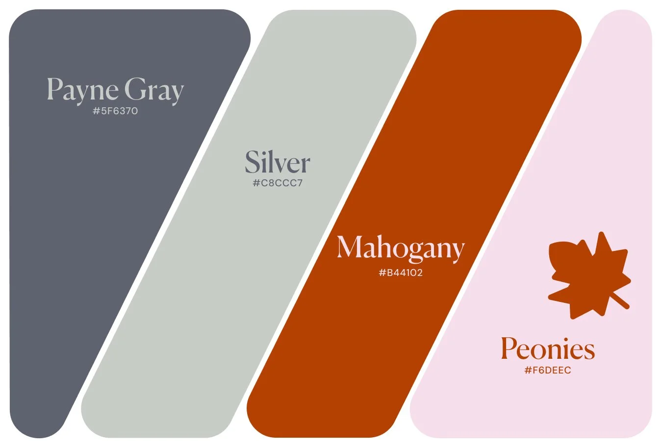
Payne & Mahogany: Gray, Silver, Mahogany and Pink
Payne Gray #5F6370 · Silver #C8CCC7 · Mahogany #B44102 · Peonies #F6DEEC
The twist: the cool gray. Pink in an autumn palette could go sweet very quickly, and the gray is what holds it back — it gives the pink something to be soft against instead of just being soft.
Use it like this: Peonies background, Payne Gray text, Silver for dividers and borders, Mahogany for buttons.
Watch out for: mahogany on the pink is lovely and lands just short of comfortable for paragraphs, so keep it to headings and buttons. Payne gray against mahogany is another pair that looks like a contrast and isn't.
Best for: florists, boutiques, brands that want soft and warm without going pink.
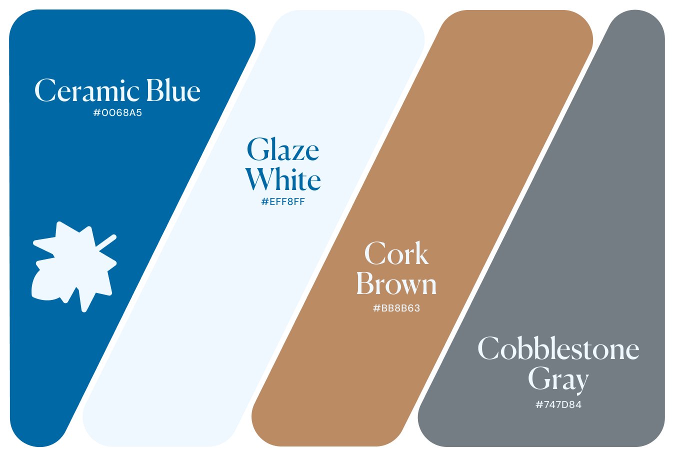
Ceramic & Cork: Blue, Off-White, Cork Brown and Gray
Ceramic Blue #0068A5 · Glaze White #EFF8FF · Cork Brown #BB8B63 · Cobblestone Gray #747D84
The twist: the blue, by being the whole palette. This is the one set here that doesn't look like autumn at all. It's the season by way of a studio shelf rather than a forest floor, which makes it the right choice for anyone who wants seasonal warmth without the leaves.
Use it like this: Glaze White background, Ceramic Blue text. Cobblestone Gray holds up for large headings and goes soft at paragraph size.
Watch out for: cork brown doesn't carry text against anything here. It's a block color for image overlays and section backgrounds. Plan this palette around one text color and you'll be fine.
Best for: ceramics and homeware, design studios, coastal and Scandinavian-leaning brands.
Which Fall Palette Should You Pick?
Starting from scratch? Clay & Slate or Eggplant & Cinnabar. Both give you a strong text pairing plus a second usable one, so you have room to change your mind later without reopening the palette.
Want the boldest? Bice & Maize has more usable combinations than anything else here, as long as you keep the blue and the red apart.
Want the least seasonal? Ceramic & Cork. Nobody will date your site to an October launch.
Frequently Asked Questions
What colors are in a fall color palette? The default is burnt orange, mustard yellow, brown and cream. It works, which is why it's everywhere. The palettes here keep the warmth but replace at least one of those colors with something unexpected — a slate blue, a lavender, a near-black wine red — so the result reads as a brand rather than a seasonal decoration.
How many colors should a website use? Four is plenty, and most sites use fewer well. You need a background, a text color and one accent. A fourth is useful for borders, dividers and sections that need to look different, but it shouldn't get equal weight with the other three.
I already have brand colors. Can I still use one of these? Usually by swapping one. Keep your brand color as the accent and borrow the background and text pairing from a palette here, since that pairing is doing the heavy lifting. Replacing a whole identity for a season isn't worth it, and these aren't meant for that.
How do I check whether my own colors will read? Search for a free contrast checker and paste in two hex codes. It gives you a number between 1 and 21: aim for 4.5 or above for normal text and 3 or above for large headings. Ten seconds a pair, and it saves rebuilding a page later.
Can I use these fall color palettes for free? Yes. Color combinations aren't anyone's property, so take the hex codes and go.
Building a site right now? Try Squarespace free and save 20% on your first subscription with code APPLET20. Or browse our Squarespace templates – every one comes with a 12-month trial through our Platinum partner status.