Type that carries a brand on its own, no graphic required
Most logos are not a symbol. They're a name, set well. Which means the font does all the work, and the right one can give a small business a mark that looks designed rather than assembled.
Canva has more display fonts than anyone can reasonably scroll through, but most of them are not logo material. These ten are. They have enough character to be recognizable at a glance and enough restraint to still read at the size of a favicon.
All ten are free on any Canva account. None of them need Pro.
First, Can You Actually Use a Canva Font in a Logo?
Yes, and this is the part most people get wrong.
Canva's license says you can't use its Free or Pro library content in a trademark, because other Canva users can use the same elements and a trademark has to be exclusive to one owner. That rules out the logo templates, the icons, the graphics, all of it.
Fonts are the exception. Canva's own licensing page lists fonts, basic shapes and lines as the content you can use in a trademark.
So a wordmark built from a Canva font is not just allowed, it's the only kind of Canva logo you can realistically protect. Grab a logo template and you've made something hundreds of other businesses can make too. Set your name in a distinctive typeface, adjust the spacing, and you've made something that's yours.
Important note: this is how Canva describes its own license, not legal advice. If you're heading for trademark registration, a trademark attorney is the person to confirm it with.
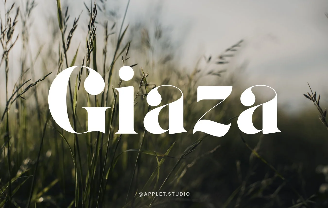
Giaza
Generous round bowls, dramatic thick-to-thin transitions, and a flourish on the capitals that does the job a logo mark usually does. One of the few fonts here where the first letter alone could become a submark.
Best for: fashion, beauty, luxury service brands.
By Anthony James.
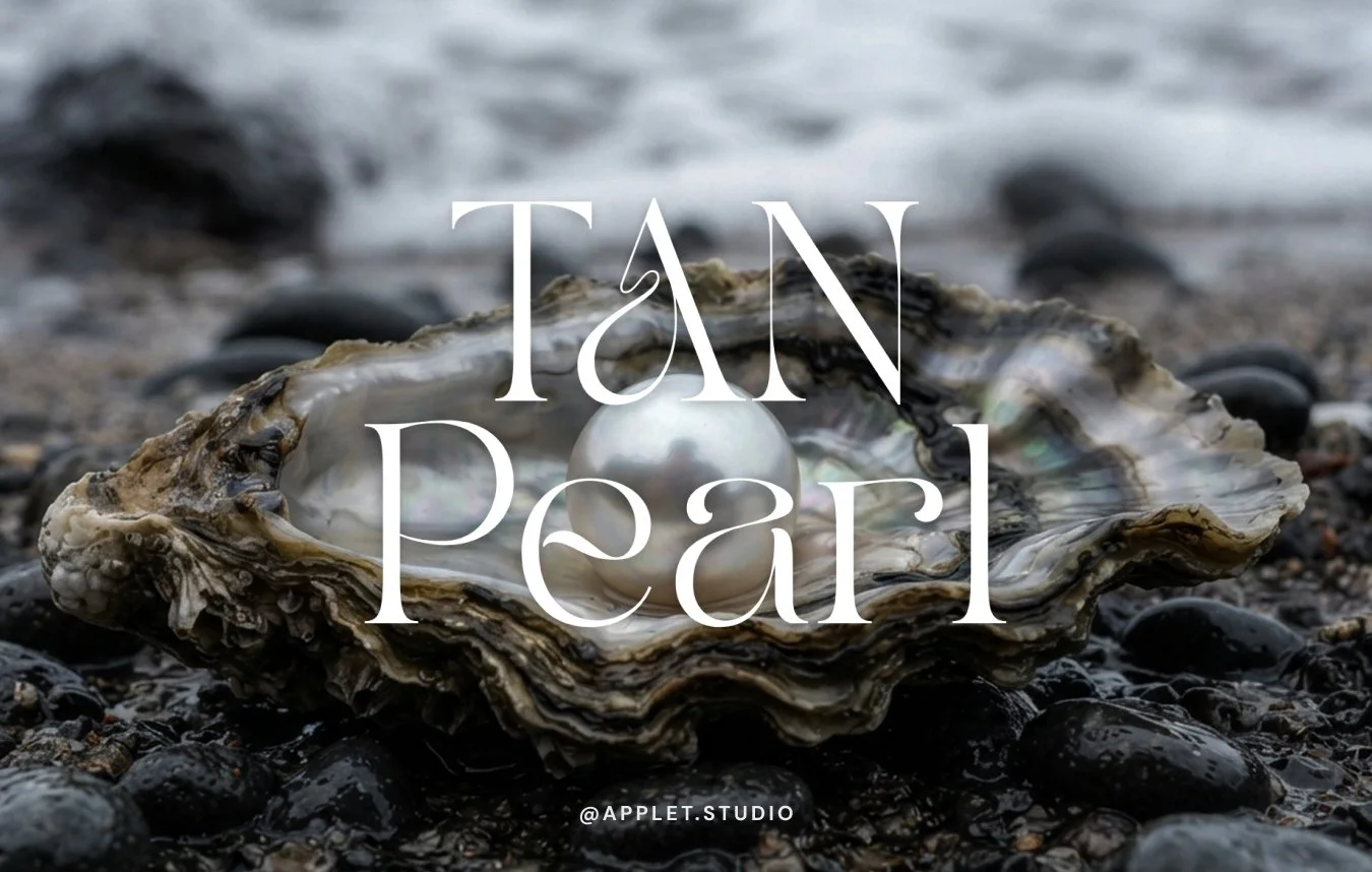
TAN Pearl
Fine hairlines, wide letterspacing, and a lot of air between the characters. Set in caps it reads as expensive without trying.
It needs room. Crowd the tracking and the thin strokes collapse into each other.
Best for: skincare, interiors, fine jewelry, anything where restraint is the point.
By Novia Jonatan, TanType.
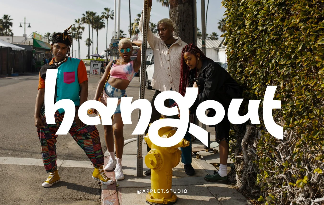
Hangout
Rounded, heavy, lowercase, with a hand-drawn bounce. Friendly without being childish, which is a narrow line that most casual fonts fall off.
Best for: community brands, kids' products, cafés, anything that wants to feel approachable.
By Vladimir Nikolic.
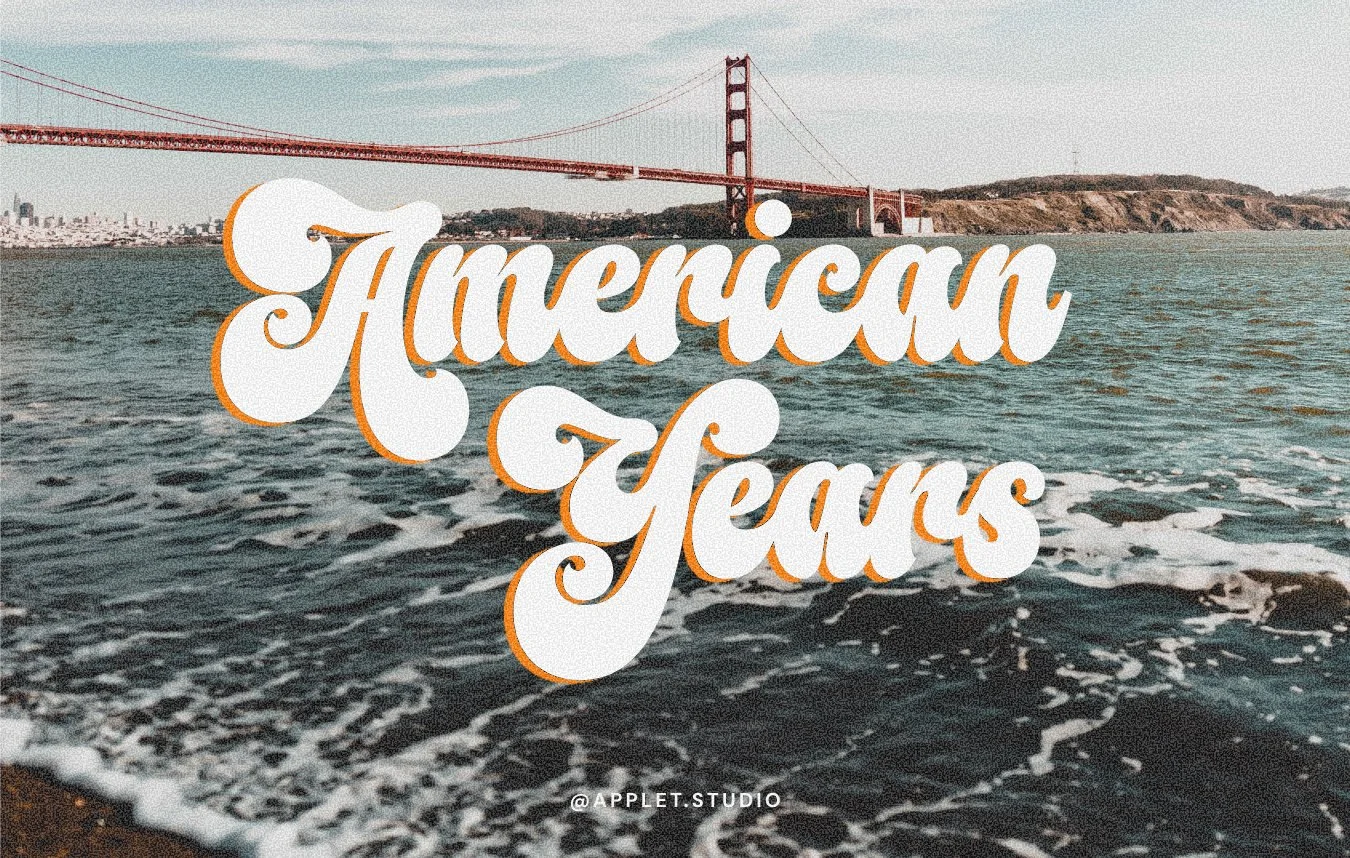
American Years
A bouncy script with an offset shadow that gives it dimension straight out of the box. It's the most decorative font on this list and the one to use most carefully, since the shadow needs to be handled deliberately rather than left as a default.
Best for: surf and skate brands, vintage shops, anything with a seventies reference built in.
By Måns Grebäck.
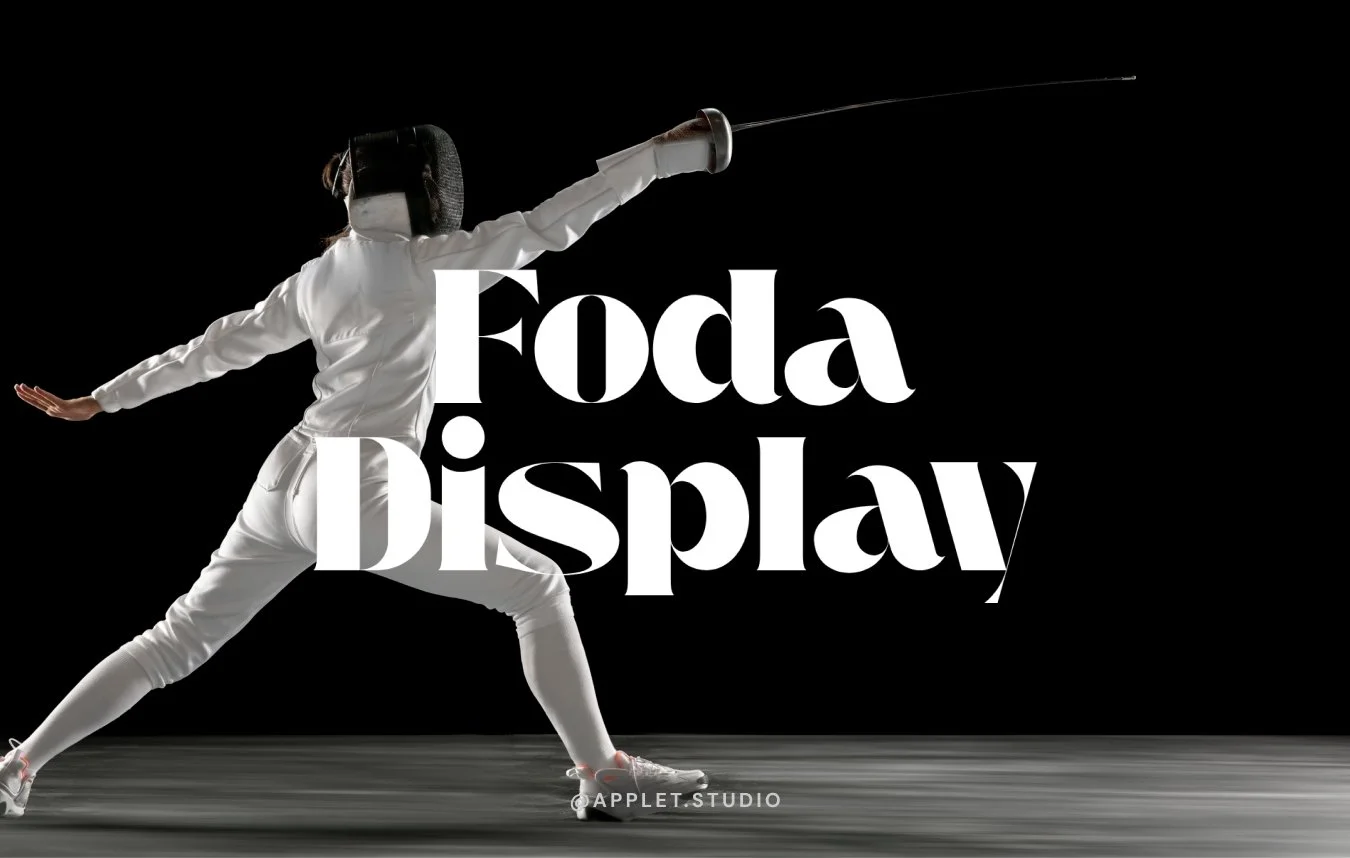
Foda Display
Condensed, high contrast, and built for stacking. Set it over two lines and you get a block of type with real presence, which is why it works so well on dark backgrounds.
Best for: fitness studios, agencies, drinks brands, anything that wants to look confident rather than delicate.
From Fo Da.
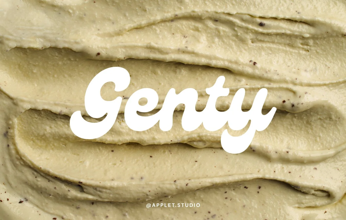
Genty
A bold retro script with a heavy, confident connection between letters. Seventies by way of a soft-serve sign, and it photographs well on packaging.
Best for: bakeries, ice cream, candles, playful product brands.
From Flavortype.
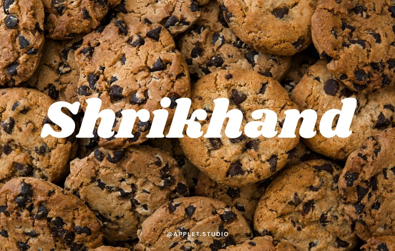
Shrikhand
Heavy, with the angled stress that comes out of brush lettering traditions, and more personality than almost anything else on this list. It was drawn for Gujarati and Latin together, and it's open source rather than Canva-exclusive, so you can also install it locally and hand it to a developer for your website. Not every font here allows that.
Best for: food brands, festivals, anything that wants warmth and weight at once.
By Jonny Pinhorn.
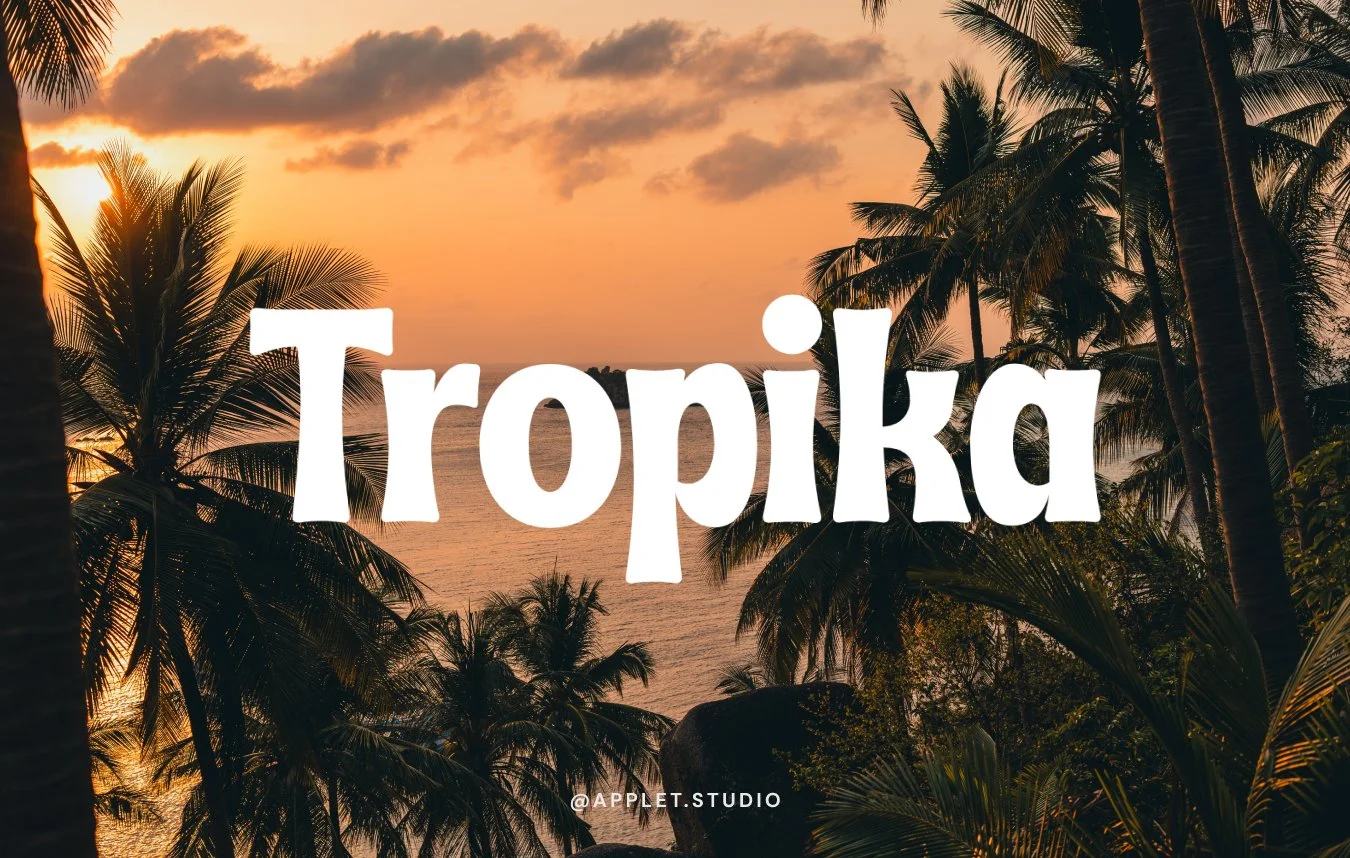
Tropika
Bold and angular, with sharply cut terminals that give it the look of hand-painted sign lettering. More personality than a plain display serif, and heavy enough to stay legible when it shrinks, which most decorative faces aren't.
Best for: restaurants and bars, travel brands, product labels that need to survive being printed small.
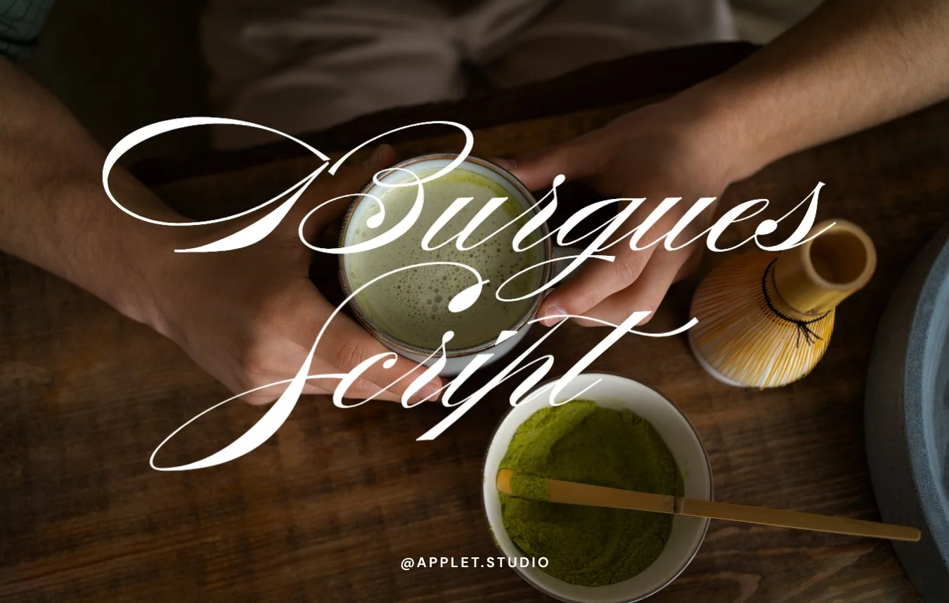
Burgues Script
Long swashes, extremely fine strokes, and the most traditional choice here by a distance. It's an homage to Louis Madarasz, a nineteenth-century American penman whose work still shapes how formal penmanship is taught.
Those hairlines disappear below a certain size, so it needs a simplified secondary version for small applications. Plan for that from the start.
Best for: patisseries, formal events, heritage brands, high-end stationery.
By Alejandro Paul, Sudtipos.
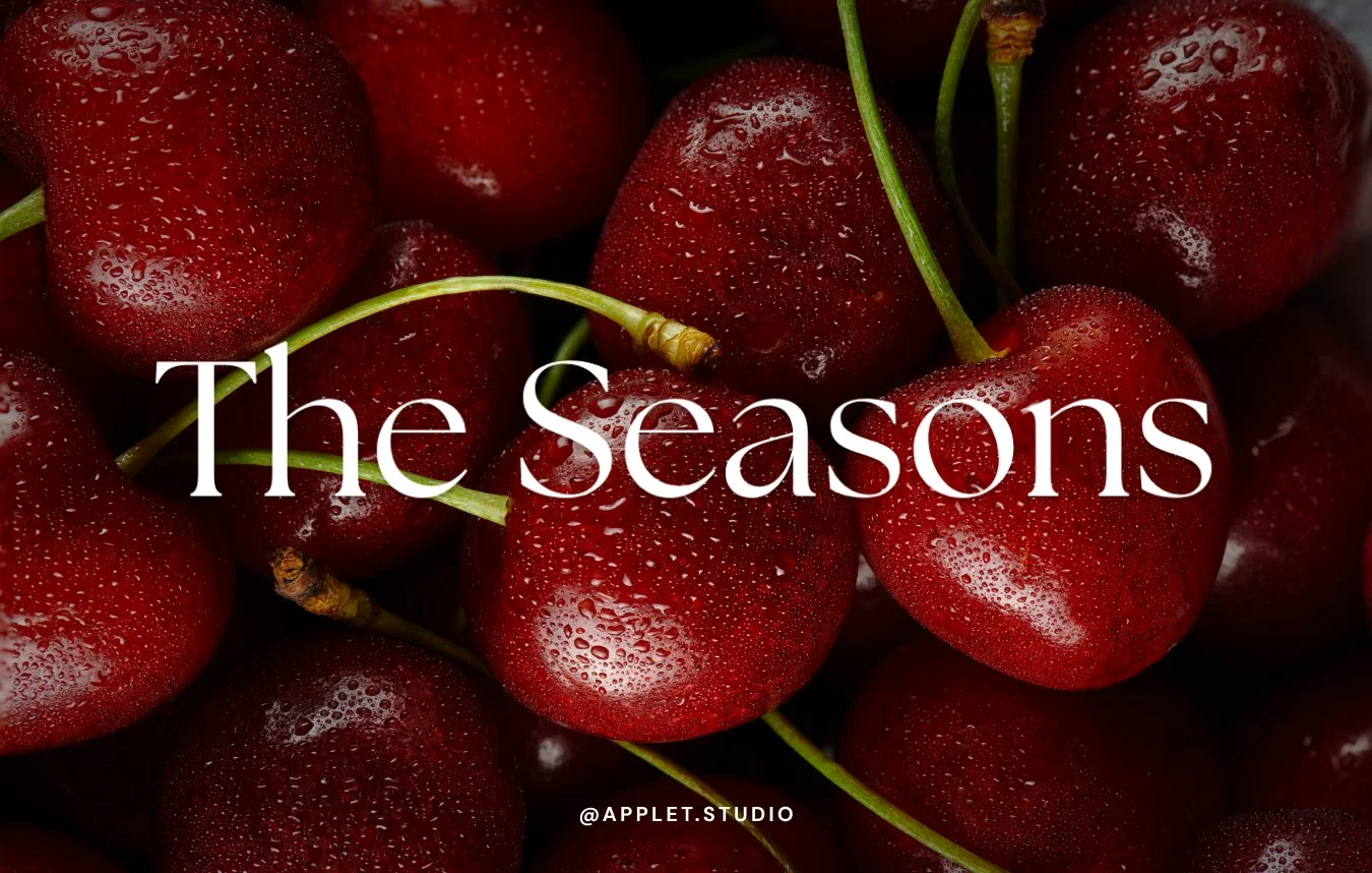
The Seasons
A high-contrast serif with classical proportions and a slightly softened finish, less severe than most fashion serifs, which makes it warmer without losing the polish.
Best for: photographers, boutique hotels, wedding brands, editorial-feeling businesses.
By Elena Genova, My Creative Land.
What Makes a Font Work as a Logo
A few things separate the fonts above from the rest of the display section.
It survives being small. Your logo ends up as a favicon, an Instagram avatar, a stamp on an invoice. Fonts with very fine hairlines lose them at that size, which is why Burgues Script needs a backup and Tropika doesn't.
It has one memorable letter. Giaza's capitals, Hangout's bounce, Shrikhand's angle. Something a person can picture afterwards.
It isn't already everywhere in your industry. The fonts most used in a category stop reading as distinctive within it. Worth a scroll through your competitors before committing.
You can set it in one weight. Logos don't need a family. If a font only has one style, that's a limitation for a website and a non-issue for a wordmark.
One weight is enough. Plenty of display fonts come with a single style and nothing else, no bold, no italic. When it comes to a website, that's limiting: you need a heavier weight for headings and a lighter one for paragraphs, so a reader can tell at a glance which parts matter most. However, a logo is one line of text set once, so it never needs any of that. Don't rule a font out just because it comes on its own.
Frequently Asked Questions
Can I trademark a logo made with a Canva font?
Canva's license allows fonts, basic shapes and lines in a trademark, unlike its graphics and templates. Whether your specific mark is registrable depends on the mark itself, so a trademark attorney is the person to confirm with.
Do I need Canva Pro for these fonts?
No. All ten are free on any Canva account. In the font picker, Pro faces carry a small crown beside the name, and none of these have one. If you do pick a Pro font elsewhere, a free account can still set type in it, but the design exports with a watermark unless you pay a one-off fee or subscribe.
I found one of these as a free download. Can I use that version?
Check what you're agreeing to. Several of these fonts are distributed free for personal use only, with commercial use requiring a separate purchase from the designer. Using a font inside Canva is covered by Canva's license. Downloading the same font from a free font site and putting it on a client's packaging may not be.
Can I use these fonts on my website?
Not directly. A Canva font licence covers designs you make in Canva, not installing the font on a web server. For a site, you'd export the logo as an image and choose a separately licensed webfont for the rest of the type. Shrikhand is the exception, since it's open source.
What should I use if I want something nobody else has?
A custom-drawn wordmark from a designer. These fonts get you a mark that looks considered, but anyone else can set the same name in the same face.
Building a site right now? Try Squarespace free and save 20% on your first subscription with code APPLET20. Or browse our Squarespace templates – every one comes with a 12-month trial through our Platinum partner status.