Bring Missing Image Layout Options Back to Squarespace 7.1 (CSS Snippets Inside)
Create awesome layouts with image blocks on Squarespace 7.1
Squarespace 7.1 cut some of the options available in the previous version 7.0.
Image blocks (or layouts) lost some of its features, like colorful card backgrounds and padding, as well as the ability to configure responsive text.
While we totally get the logic behind the decision the Squarespace design team made - cut the unnecessary things and make the tool as DIY friendly as possible - we still would like to see these options in the new version of the beloved platform.
Luckily, it’s very easy to add the missing image layout features back to Squarespace 7.1. Let me show you how to do this with some simple copy and paste CSS.
Card image block in Squarespace 7.1: Add card background and padding
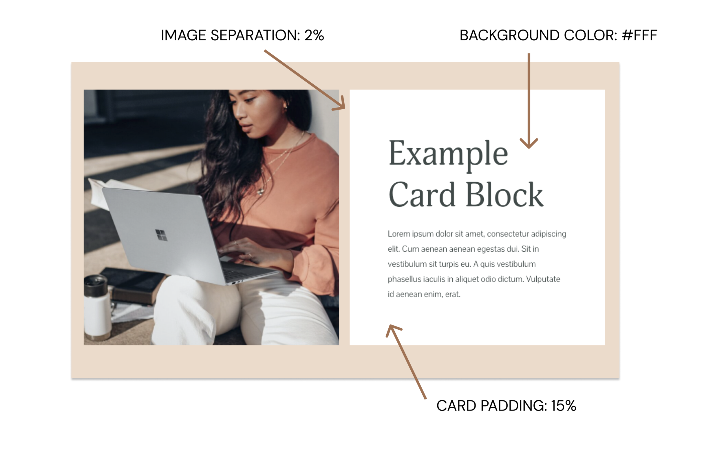
Here’s the look we will be creating with a card image block. We are going to create a symmetrical layout that is pleasing to the eye and will help you spruce up your text-heavy website with some images. Our website has this layout too! I use it to present freebies, offers, I use it on my sales page for the intro and about sections. You’ll find this layout in my Squarespace templates, too.
Here’s how to achieve this look:
1) Create a section on a page and apply some background color to it. To apply color, click the pen icon (Edit Section) in the right upper corner, navigate to the Colors panel, and choose a color theme that has a background color. In my case, it’s Light Minimal. You can edit these colors in the Design tab.

2) Add a card image block to the section. When editing a section, click the drop sign and you will see a menu of all blocks available. Select a card image block.

3) Add your content to the block. In my example, I am using a square image. The accompanying “card” will be square, too. You can add a headline, subheadline, and a button to the “card” portion of the layout. You can also set the image to be on the left or on the right. If you add too much text to the block, it might push the “card” down - so make sure you test this layout on different screens and cut the text if necessary.
4) Save the page, and navigate to the Design Tab. Click the “Image blocks” and apply the following setting to the image block:

5) Finally, let’s apply some CSS. Here’s the code you need to paste into the CSS area in the Design tab. You can change the color of the background by swapping the HEX code (#fff) with your own. Also, you can change the padding of the card (the distance between the text and the edge of the card) - just change the 15% into your value.
// Card image

.sqs-block-image .design-layout-card .image-card-wrapper {
    background: #fff !important;
}
.sqs-dynamic-text-container {
    padding: 15% !important;
}
Overlap image block: Make sure it doesn’t get the unnecessary padding, too
You’ll notice that the code above breaks the overlap image blocks. The problem here is that overlap image block uses the same CSS classes. As a result, the portion of the text that isn’t supposed to be above the image, also gets some overlap. Here’s what is happening:

In order to remove the unnecessary padding, we’ll have to target individual overlap designs:
#YOUR-BLOCK-ID {
  .sqs-dynamic-text-container {
    padding: 0 !important;
  }
}
To find the block ID, block ID, download this Chrome extension. Upon installation, this extension will appear in your Chrome toolbar in the right upper corner. When you click the extension, it will show all section and block ids on your Squarespace website. Replace #YOUR-BLOCK-ID with your actual ID.
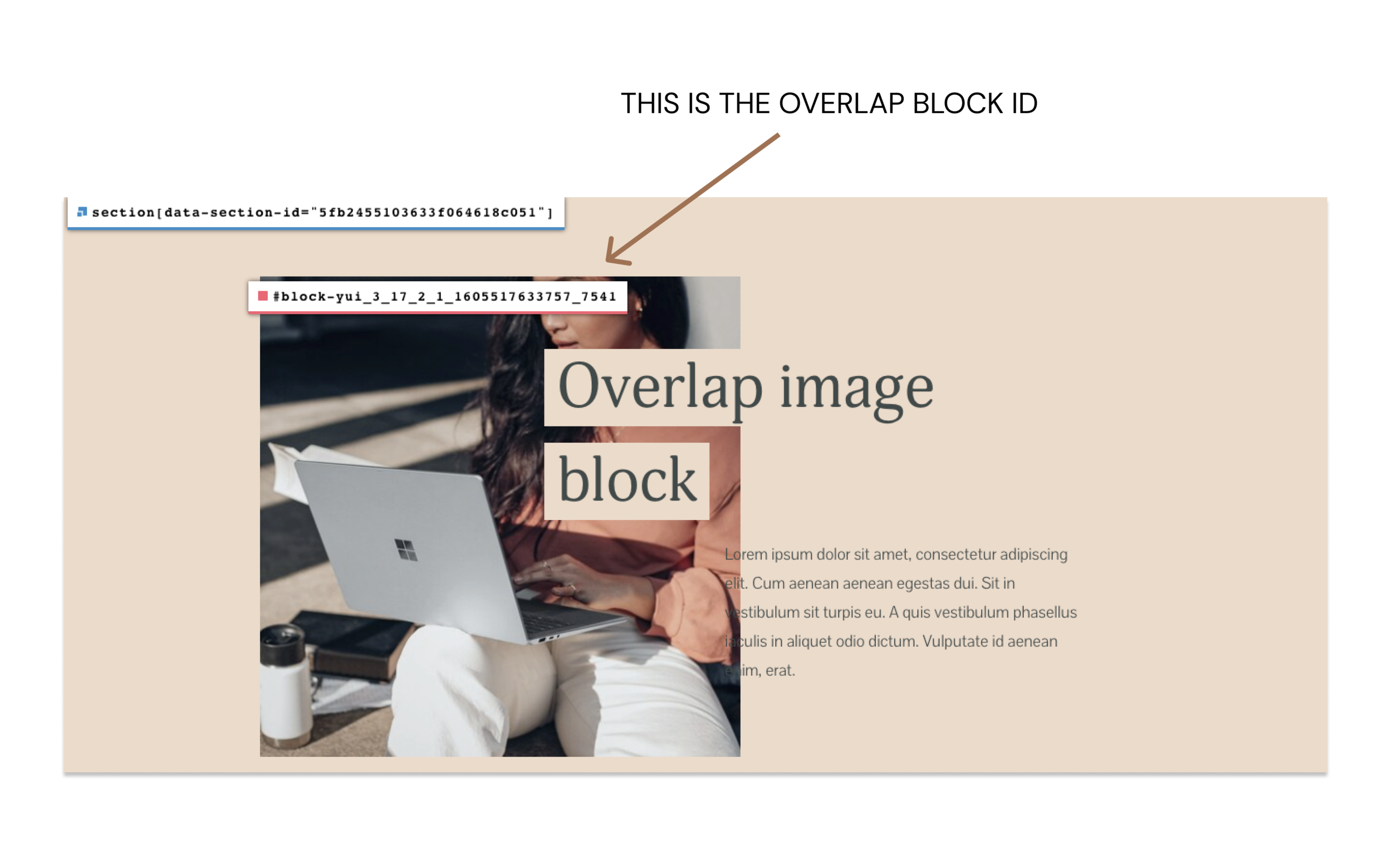
Once you remove the unnecessary padding, the overlap image block will start responding to the default Squarespace image block settings again.
Stack image block: Add card background and padding
There’s so much you can do with a stack image block! From CTA cards to pricing tables - the sky's the limit here.
In the example below, we added card background color and padding around the text. We also removed the distance between the card and the image in the block settings by setting image separation to 0%.

Use the following code to add extra background color and padding to the “card” portion of the stack image layout. Replace the background color with your own value and adjust the padding value as needed.
// Stack image
.sqs-block-image .design-layout-stack .image-card-wrapper {
    background: #fff !important;
}
  .sqs-dynamic-text-container {
    padding-left: 8% !important;
    padding-right: 8% !important;
    padding-top: 6% !important;
    padding-bottom: 8% !important;
  }
Adjust the image block settings on mobile
You’ll notice that the code above applies to both mobile and desktop versions of the site. But sometimes you want to adjust the settings for small screens. The following code will adjust the padding in card and stack image blocks on screens smaller that 640 px. Just swap the padding value with your own.
@media (max-width: 640px){
  .sqs-dynamic-text-container {
    padding:8% !important;
  } }
Responsive text in Poster Image layout and throughout your website
Squarespace 7.1 removed the dynamic text setting in image blocks - something that was previously available. The dynamic text setting adjusted the text size on mobile screens in such a way that it prevented the text sticking around the image block’s container.
On 7.1 though, we see this problem. If you add too much text to a poster image, you will see that it escapes the container on mobile screens. Here’s how it looks:

In order to fix this, we will adjust the sizes of paragraphs and headlines on tablet, small desktop and mobile devices. The following code will apply to all paragraphs and hearings throughout the website, not just the poster image block to keep things consistent. Test your site on different screens and replace text size numbers with your own. You can also add more text settings like h3 and h4 to the CSS below.
// Screens smaller than 1100 px
@media only screen and (max-width: 1100px) {
   h1 { font-size: 40px !important; }
   h2 { font-size: 30px !important; }
  p {font-size: 16px !important;}
}

// Screens smaller than 900 px
@media only screen and (max-width: 900px) {
   h1 { font-size: 35px !important; }
   h2 { font-size: 30px !important; }
  p {font-size: 16px !important;}
}

// Screens smaller than 640 px
@media only screen and (max-width: 640px) {
   h1 { font-size: 20px !important; }
   h2 { font-size: 20px !important; }
   p {font-size: 14px !important;}
}
How to target individual image blocks
What if you need to apply some of the CSS settings to only one image layout on a particular page without messing the rest of the design?
Luckily, the built-in CSS editor in Squarespace 7.1 accepts LESS - a variation of CSS that allows nesting the code.
In order to use one of the codes in an individual block, wrap your preferred CSS in the following code where you will change the ID value into your own.
// Targeting individual blocks
#YOUR-BLOCK-ID {
  // your code goes here
}
What else would you like to learn?
We hope you found these simple Squarespace image block hacks helpful! Let us know in the comments how these worked for you and what you were able to create! Have questions? Send us a message on Instagram.
We think you might be interested in:
Squarespace 7.1 Features That Will Fast Forward Your Website Design Process
How to Create a Customized Cover Page in Squarespace 7.1 (CSS snippet inside)
Buy Our Day
If you need help implementing this on your site, you can hire me for custom code support through contact page!


