Squarespace 7.1 Features That Will Fast Forward Your Website Design Process
We started using Squarespace 7.1 in January 2020, and it almost immediately stole our hearts. Although this version of Squarespace misses some of the features from 7.0, we noticed that it significantly lowers our development time. We build client websites up to two times faster with the new platform.

Squarespace 7.1 is packed with new amazing features that streamline the implementation process (we design all websites and templates with design tool Figma first). In this post, I’m about to share time-saving and not-so-obvious Squarespace hacks I use every day to develop websites for my clients and myself.
Go beyond the limited color palette
Squarespace 7.1 gives you a selection of five custom colors. On top of the standard black and white, you get to choose the accent, light and dark colors. Squarespace 7.1 auto-generates ten section themes out of this palette.
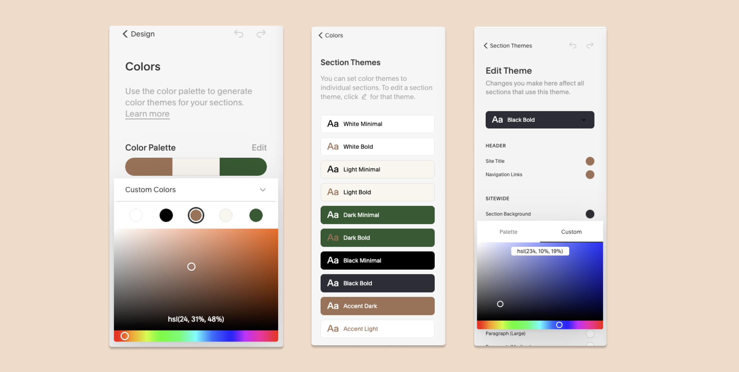
But what if you need more colors? You can edit colors of a particular color theme for individual blocks (like headings and backgrounds). And when editing, you don’t have to necessarily select a color from the predefined palette. Simply click on the color value and input RGB or CMYK value of your choice. With ten predefined color themes, you have unprecedented control over website colors. You can change the color theme of a section by clicking the pen sign.
Although Squarespace 7.1 has this feature, as a designer, I still highly recommend going the five-color route. Why? Because this is a good design practice. It gives you the logic behind the color selection. Personally, I use this feature when I want to add an extra color accent. For example, the Boho Social 7.1 template uses a light green color as a background here and there - this color is not a part of the limited palette but it creates a nice accent.
Also, I use the color editing feature to replace colors for headings and paragraphs. For example, I’d like to use a slightly lighter color for paragraphs across the footer - I’ll add a grey color as a custom color for one of the paragraphs and will use it to create footer links. Dimmed footer links create awesome visual hierarchy.
Access images you already uploaded
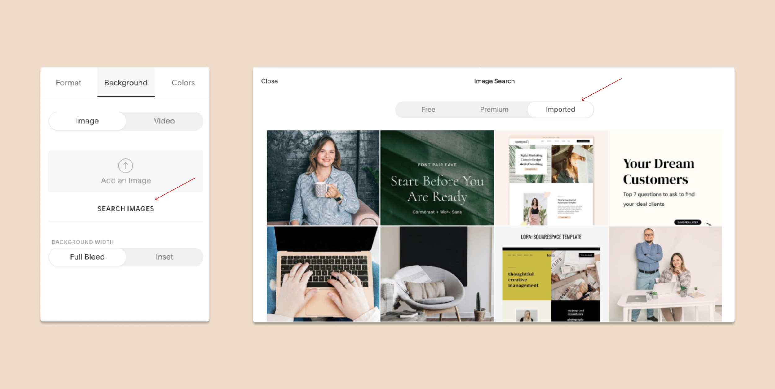
Repeating elements are really important in any good design. I like to add lines, shapes, and small vector illustrations to my designs to create the rhythm of repeating elements.
But guess what, every time I need to reuse an image for a background, I don’t have to upload it again. To access images you have already uploaded, click “Search image” and select the “Imported” tab. You’ll be taken to a grid of the images that have been uploaded to your site. This feature migrated from 7.0 version of Squarespace and it does save a lot of time (and server space).
Our Rosee Template uses the same CTA’s across the board and we are reusing the photos multiple times.
Move content between sections
One major improvement of Squarespace 7.1 is the streamlined section logic. Each page is a set of sections. In the previous version, you had to add “pages” to a “parent” index page to create a long scrolling page. You couldn’t move content between the sections of an index. Squarespace 7.1 allows moving content blocks between internal page sections. You can move blocks by simply dragging and dropping them.
How awesome is that? Here’s a little hack. You now can create a master page with multiple elements, duplicate it when you need to and just move stuff around instead of creating the page from scratch.
Use blog/shop as your home page
The new Squarespace 7.1 section logic applies to blog and shop home pages as well. This means you can add more sections before and after the blog/shop content.
Create a shop (store) page, assign it as a home page, and add your home page content before and after the store grid.

Why not just use a summary block to display as we normally would? Native shop / blog grid gives you more styling options than a summary block, plus an ability to display filters.
Who is this suitable for? This will work well for you if your project is product/blog - centric. If you’re building a regular brochure website, just keep the blog as a separate page and display some of the content on a homepage using a summary block. If you’re running an online shop, have hundreds of products, and want people to spend time on your site browsing primarily, then it makes sense to use your main shop page as a home page.
If your website is a magazine, a blog, it makes sense as well.
Add a site-wide CTA / lead magnet
Guess what – the new section logic applies to the footer as well. You can add sections to the footer and these sections can have different backgrounds and content alignment options.
On any page, click “Edit” footer and add a section, add your CTA, button or a newsletter block. Just like we did here on a Kismet Doula website:

Create two blogs with different designs on one Squarespace site
Sometimes multifaceted entrepreneurs want to run two blogs under one roof. Or, you want to write about two topics and want the blogs to look differently. Or you have a podcast and want to keep your blog and podcast episodes separate. It’s so easy to do in Squarespace 7.1!
In 7.1, Squarespace introduced a new collection type - Portfolios. And who cares what you use it for? Portfolios are similar to blogs, only they allow you to have pages made out of sections as collection items. Blogs in Squarespace 7.1 have the same design across the board - this means you can add multiple blog pages but they will all have the same design.
So in order to overcome this limitation, add a Portfolio page, and use it for your second blog.
Adjust the alignment of the content
Content alignment inside a section is a new life-changing feature in Squarespace 7.1! Add a section to any page and click the little pen sign on the right upper corner to bring up the format settings.
Here, you can set the exact width and height of the content and select alignment options - to the left, right, or center.
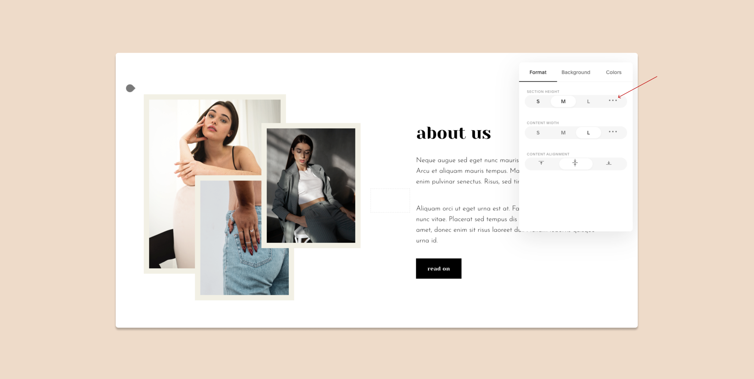
No more shenanigans with spacers to make your content align exactly as you want it to and no more weird stuff on mobile as these new alignment settings translate to the mobile version!
Use the alignment options to create visual rhythm on a page by placing your elements around the imaginary “power lines”.
I hope, you have found these tips helpful. The best hacks always come from practice, and we have spent hundreds of hours on Squarespace and thousands of hours web designing. Hit me with questions via e-mail or in DMs on Instagram.