Jessica Manning
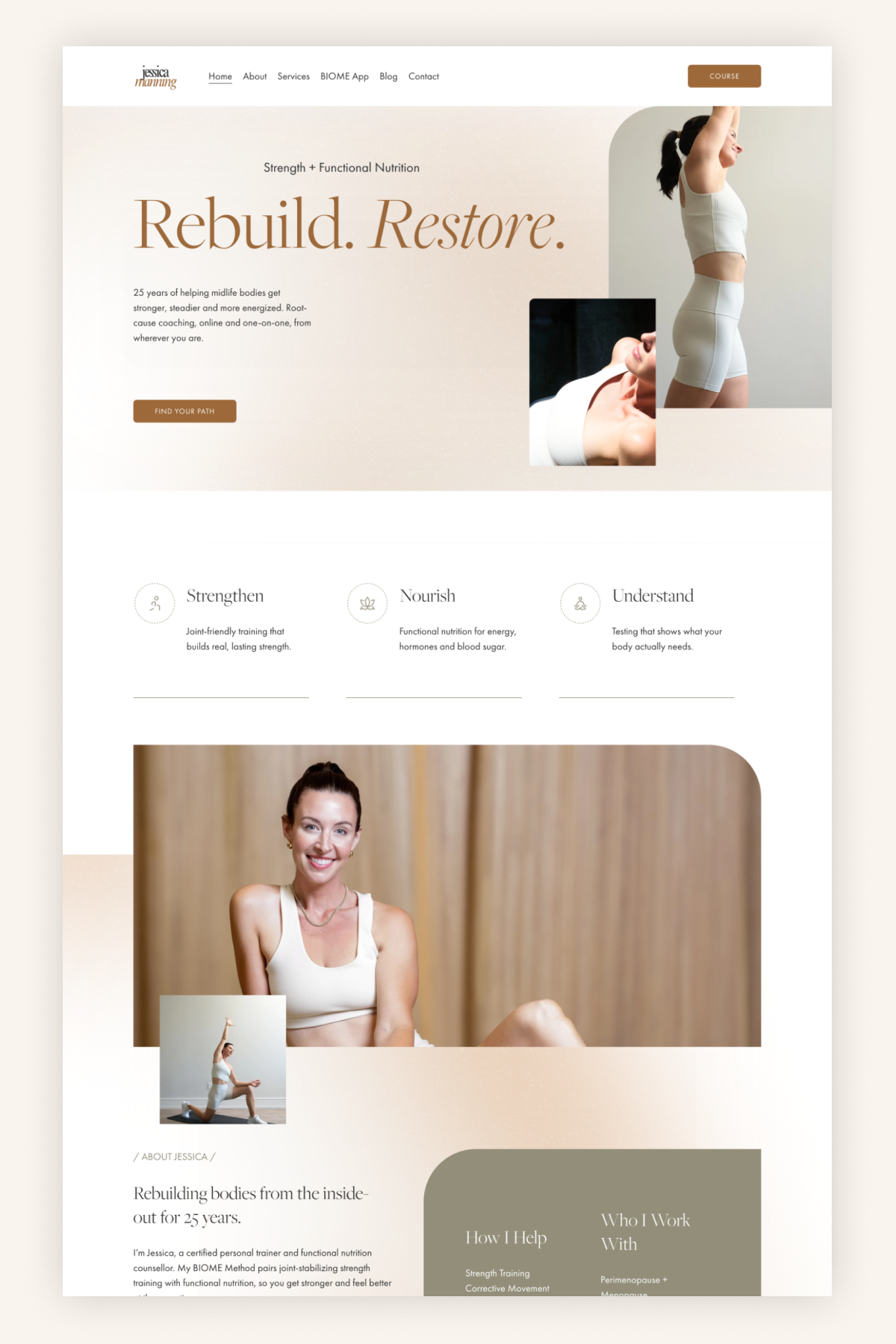
Jessica Manning is a certified personal trainer and functional nutrition counsellor with 25 years behind her, working online with people in midlife and beyond. Her BIOME Method pairs joint-stabilizing strength training with functional nutrition, delivered through one-on-one coaching, standalone nutrition sessions, lab testing, and her own app.
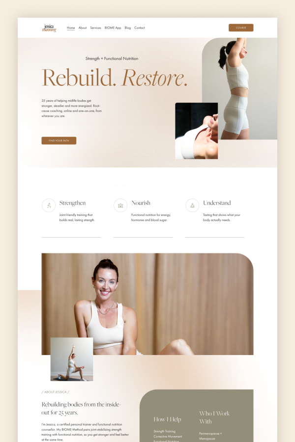
She built her site on our Squarespace Template LiveLove, and the palette stays close to the original: warm cream, soft beige, a copper-bronze accent, and a deep olive that anchors the footer and the larger blocks. It’s a quiet combination, and it suits a practice built on slow structural change rather than quick results.
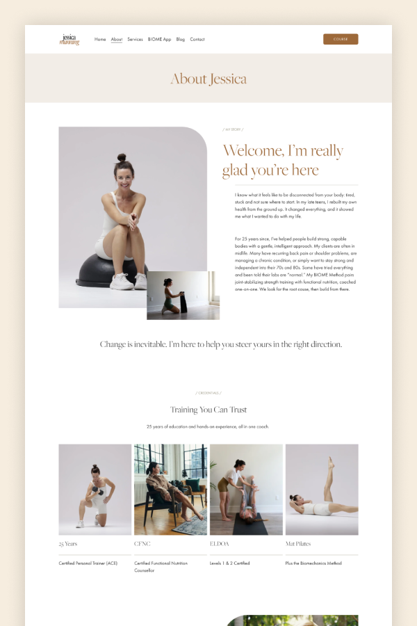
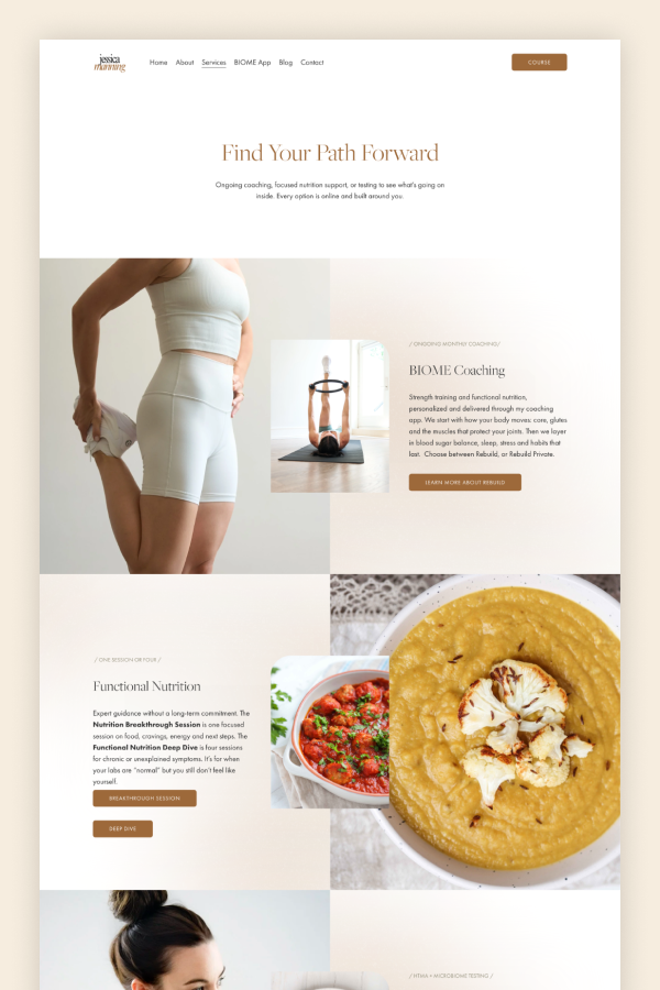
LiveLove’s offset image pairs do a lot of the work throughout. A large photograph with one rounded corner, a smaller one tucked over its edge, text alongside. It’s the template’s most recognisable move and Jessica uses it on almost every section — the About intro, each of the three services, the app, the self-care challenge. The rounded corner turns up again on the olive CTA band and on the hero, which keeps the whole site feeling like one object rather than a stack of sections.
The small slash labels above each heading carry over too, and they’re more useful here than they look. On a site with three services, an app, a challenge, and a pricing table, labels like My Story, Credentials, Fun Facts, and Good to Know let someone skim and land where they need to be.
Two of the template’s components get repurposed neatly. The four-card coach grid on LiveLove’s About page becomes Jessica’s credentials row — 25 Years, CFNC, ELDOA, Mat Pilates — each with a photo and a line of detail underneath. And the two-column panel that lists yoga types and conditions becomes How I Help and Who I Work With, set in olive beside her portrait. For a coach whose clients mostly arrive with something specific going on, having that list visible on the homepage saves everyone time.
The photography is where the site stops looking like a yoga studio. Her own images run throughout, shot in the same soft light with the same neutral styling, and they’re interleaved with food photography on the nutrition sections. The consistency matters: with this much white space, mismatched images would show immediately.
The result is a site that looks like what it’s selling: unhurried, well-built, and in no rush to convince you.