Inviting Squarespace Website for a Nutritional Therapist
Luciana Zegheanu
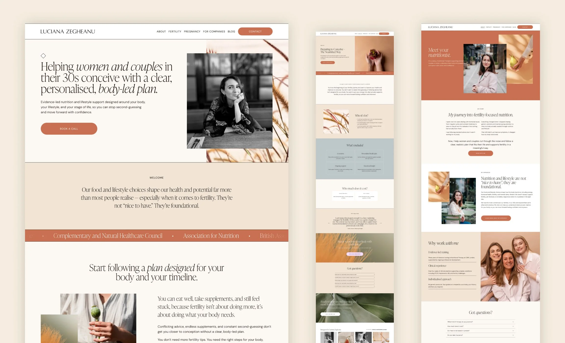
Luciana is a nutritional therapist specialising in fertility who was looking to shift her online presence into something that feels more grounded, calm, and wellness-focused. She wanted a space that feels minimal and uncluttered, but still carries a strong sense of trust and clinical credibility – not too medical, and not overly decorative either.
She already came in with a clear structure in mind for her new site, which includes four core pages: About, 1:1 Consultations, Workplace Wellbeing, and Signature Methodology. That clarity made it really easy to start shaping a thoughtful user journey right from the beginning.
One thing Luciana highlighted early on was how important it was to work with someone who offers template customization services:
“I liked the fact that you were reliable to respond promptly, as I need a service provider who is able to help, not just sell a template, as I believe loads of providers are, especially the ones on Etsy…”
Together, we chose the Stories Squarespace template that became a starting point for this project.
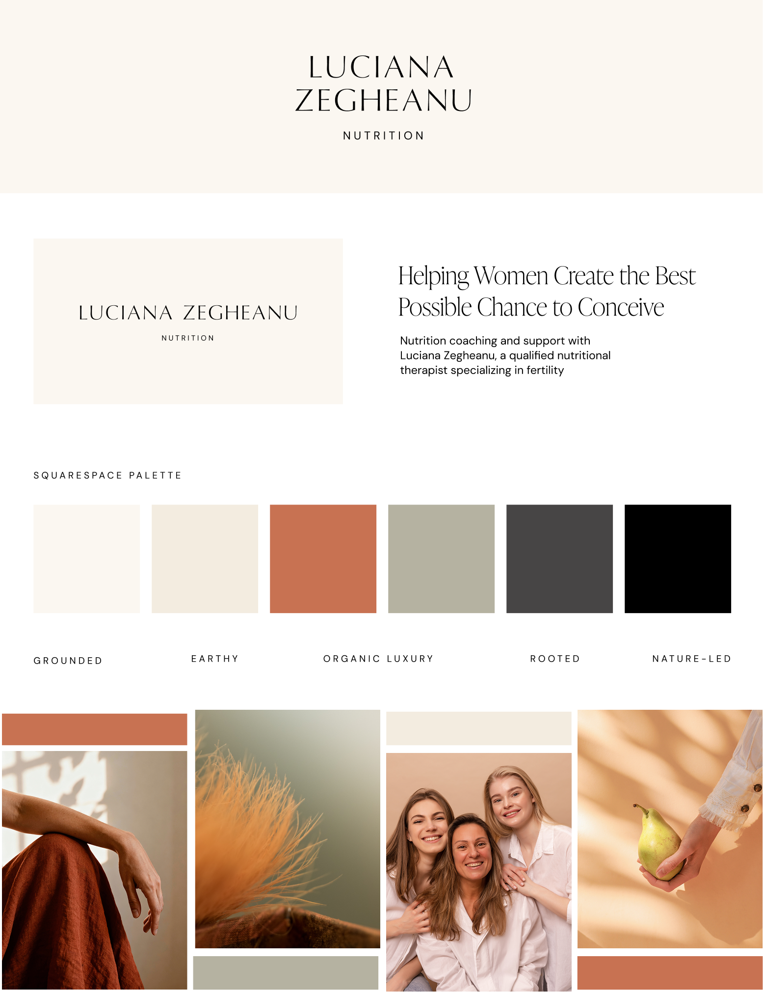
Visually, we tried to move away from the typical bright, clinical health website and instead leaned into a more elevated wellness editorial feel. The aim was to find that balance between being clinically trustworthy and still feeling warm and organic.
The website layout itself is intentionally minimal. There’s a strong focus on white space, which helps everything feel calm and easy to take in, especially important for visitors who may already be feeling overwhelmed by fertility-related topics. The structure is clean – the content has room to breathe rather than being packed tightly together.
We also leaned into a more editorial composition style. The split-screen sections, where the text is placed alongside imagery, create a clear visual rhythm. In some areas, overlapping images and offset text blocks (like in the “Meet your nutritionist” section) introduce a subtle asymmetry that makes the design feel more modern.
The color palette is soft and earthy, using tones like cinnamon, muted sage, and warm cream. These colors feel grounded in nature and subtly reference themes of fertility, stability, and calm. Instead of high-contrast black and white, the typography sits in softer charcoal tones, which makes the whole reading experience feel gentler.
We also introduced subtle organic textures, like close-up botanical imagery, to add depth without overwhelming the layout. It’s a small detail, but it helps bring in that tactile, natural feeling that runs through the whole design.
To support credibility without adding clutter, we kept things simple with a clean logo bar and a light Instagram grid in the footer. These elements quietly reinforce trust without pulling attention away from the main content.
Overall, the website design feels calm and supportive – a space that doesn’t just communicate expertise, but also makes people feel held by the hand as they move through it.