How to Make Your Squarespace Website More Attractive on Mobile
Does your Squarespace website still look cramped on mobile – even after tweaking it with Fluid Engine? Squarespace recently added more control over mobile layouts, letting you adjust sections, spacing, and alignment separately from desktop. But even with these updates, truly great mobile design requires a shift in mindset.
The biggest mistake designers make is still thinking in desktop terms. Squarespace automatically stacks elements vertically on mobile, which can make sections feel overstuffed or awkwardly spaced if you’re not intentional. So here are a few hacks that go beyond the built-in Fluid Engine tools – helping you create cleaner, more balanced mobile layouts that actually feel designed, not just auto-adjusted.
Adjust the font sizes, line height and letter spacing on mobile and tablet on your Squarespace website
You can adjust how fonts show up on mobile and tablet, including the size, line-height and letter spacing. Add the following CSS to the Custom CSS section in the design tab.
When your mobile design looks inconsistent – especially with oversized or broken headings – use CSS to scale fonts down across breakpoints.
Target your H1–H3 and large paragraph tags, and use text-wrap: balance; or text-wrap: pretty; to create smoother text shapes. Then, in your media queries, gradually reduce the font size and line height as the screen gets smaller.
Add h2, h3 and h4 inside the media query brackets. Squarespace uses three sizes for paragraphs, so that’s “p”,” p.sqsrte-small”, “p.sqsrte-large” respectively.
Change the values for “font-size”, “letter-spacing” and “line-height”. Don’t forget to wrap your values in the media query to adjust the screen size where they will apply!
// Typography
h1, h2, h3, p.sqsrte-large {
  text-wrap: balance;
}


// Typography
h1, h2, h3, p.sqsrte-large {
  text-wrap: pretty;
}


// Adjusting fonts on mobile
// Screens smaller than 1100 px

@media only screen and (max-width: 1100px) {
   h1 {
   	font-size: 50px !important;
   	letter-spacing: 0.07em;
   	line-height: 1.5em;
   }

}

// Screens smaller than 900 px
@media only screen and (max-width: 900px) {
   h1 { font-size: 40px !important; }
}

// Screens smaller than 640 px
@media only screen and (max-width: 640px) {
  h1 { font-size: 35px !important;}
   p.sqsrte-large {font-size: 22px !important;}
  p {font-size: 22px !important;}
   p.sqsrte-small {font-size: 22px !important;

  }
Here’s a full snippet from the YouTube video:
/* === Typography scale (smaller) === */
/* Desktop & up (≥1280px) */
@media screen and (min-width: 1280px) {
  h1 { font-size: 42px !important; line-height: 1.15 !important; }
  h2 { font-size: 32px !important; line-height: 1.2 !important; }
  h3 { font-size: 24px !important; line-height: 1.25 !important; }
  p,
  p.sqsrte-large { font-size: 18px !important; line-height: 1.6 !important; }
}

/* Laptop / Large tablet (1024–1279px) */
@media screen and (max-width: 1279px) {
  h1 { font-size: 36px !important; line-height: 1.15 !important; }
  h2 { font-size: 28px !important; line-height: 1.2 !important; }
  h3 { font-size: 22px !important; line-height: 1.25 !important; }
  p,
  p.sqsrte-large { font-size: 17px !important; line-height: 1.6 !important; }
}

/* Tablet (768–1023px) */
@media screen and (max-width: 1023px) {
  h1 { font-size: 32px !important; line-height: 1.2 !important; }
  h2 { font-size: 26px !important; line-height: 1.25 !important; }
  h3 { font-size: 20px !important; line-height: 1.3 !important; }
  p,
  p.sqsrte-large { font-size: 16px !important; line-height: 1.65 !important; }
}

/* Mobile (≤767px) */
@media screen and (max-width: 767px) {
  h1 { font-size: 28px !important; line-height: 1.25 !important; }
  h2 { font-size: 22px !important; line-height: 1.28 !important; }
  h3 { font-size: 18px !important; line-height: 1.32 !important; }
  p,
  p.sqsrte-large { font-size: 15px !important; line-height: 1.7 !important; }
}
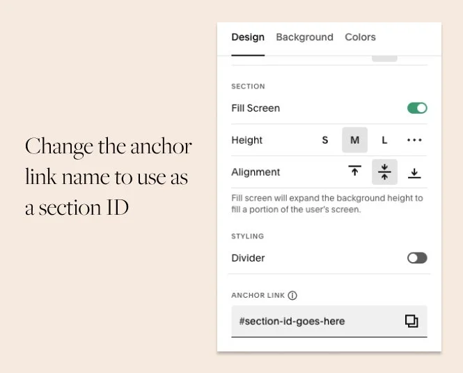
Let’s say you’d like to apply the new sizes only to one section of your website. Wrap whole code in curly brackets and add a section ID before the opening bracket. To quickly grab a section ID, install a handy Chrome extension that lets you do that without digging the inspector. Learn how to find a section ID in the Step 4 of this tutorial.
Here’s what the final result would look like:
// Screens smaller than 640 px
section[data-section-id="609d09582c8a3b795018ae62"] {
@media only screen and (max-width: 640px) {
  h1 { font-size: 35px !important;}
  }}
If you’re a Squarespace Circle member, you can use the built-in section ID setting – you can manually apply a section ID in the section settings.
Adjust the background image focal point
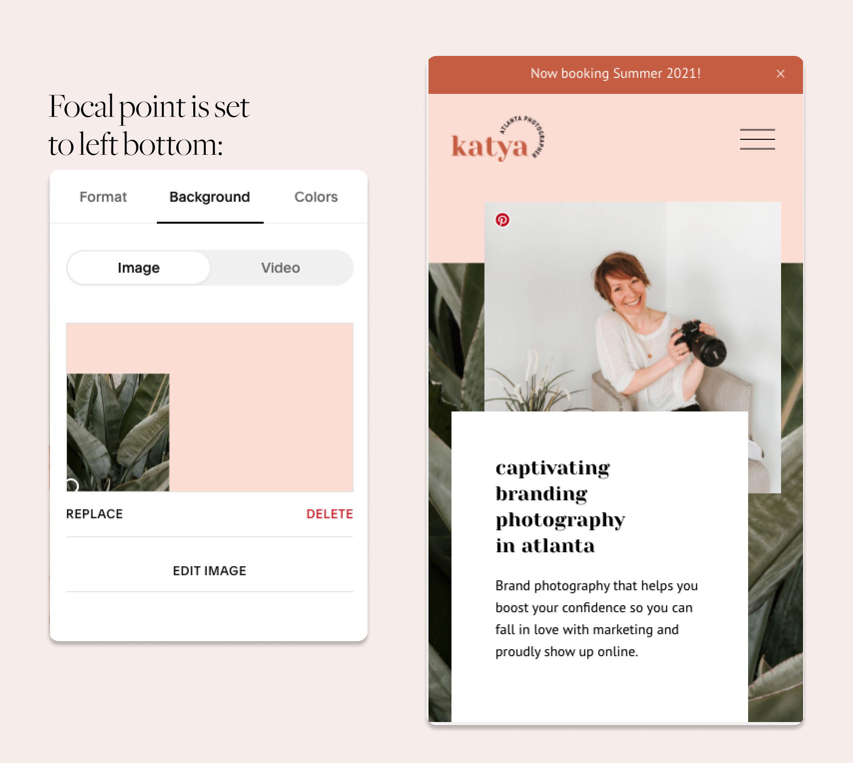
On mobile, Squarespace 7.1 sections use the same height settings that are configured on desktop. If your section is vertical on mobile – you have lots of copy that pushed it down or you added more rows on mobile, you can run into a problem of horizontal image not working in a vertical layout.
Thankfully, we can adjust the focal point on mobile - choose which area you’d like to show on mobile. It doesn’t solve the problem completely, but it lets us create an artsy collage effect in the design.
Here’s a hero area of Katya Vilchyk website. We use a collaged background to compliment the collage image block and create a fluid composition:

See how we adjusted the focal point on mobile to make the green area span the whole width of the mobile screen:
Simplify your mobile design
Squarespace’s mobile editor doesn’t perfectly match what users see in real browsers or on actual phones. So, plan your layouts around simplicity.
Avoid complex, layered sections and overlapping elements that might shift at different breakpoints. Instead, use a clean, minimal structure where each block fits comfortably within the screen width.
Think of mobile as packing for a flight – you can’t fit a full suitcase into the overhead bin, so take only what’s essential.
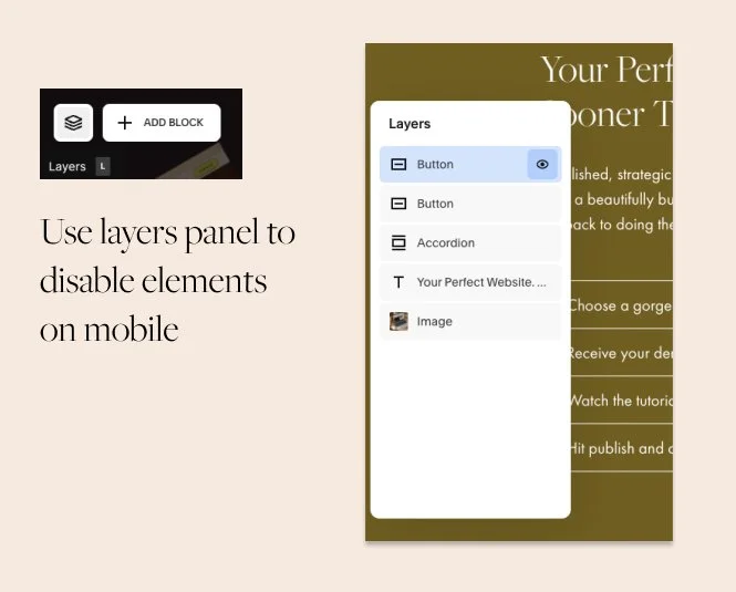
Disable extra elements on mobile
Use the Layers panel on mobile to turn off unnecessary design elements—such as background shapes, decorative images, or overlapping text.
You can do this directly in Squarespace by toggling visibility per element. Removing clutter gives your site more breathing room and helps important content stand out.
Adjust the section height with extra rows on mobile
Squarespace applies section height to both mobile and desktop. So let’s use these controls to apply design that we want on mobile and use extra rows to add more spacing on desktop.
For example, set the section height to 10%. Add the missing white space at the top and at the bottom of the section with rows on desktop. On mobile, remove the extra rows.
Be careful with Fluid Engine grid gap settings
We found that if you tweak the gaps to be as large as possible, it breaks the site on mobile adding a weird horizontal scroll.
Test on real device sizes
Squarespace’s mobile preview shows how your site looks on a large smartphone, not smaller screens. Always double-check in your browser inspector.
Open Inspect → Device Toolbar, and switch between models (e.g., iPhone SE, Galaxy S8) to see how your design behaves across different widths.
This helps you catch layout breaks early and make precise CSS adjustments for true responsiveness.
Leverage premade image layouts
Use pre-made image layouts that are designed to look consistent on mobile devices – it’s an older feature of Squarespace 7.1 (before Fluid Engine update). To use the pre-made image blocks, you need to add a Classic Editor section.
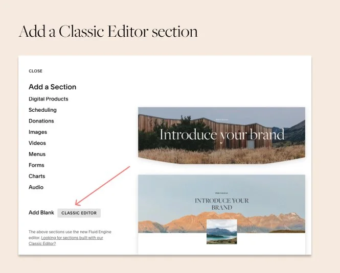
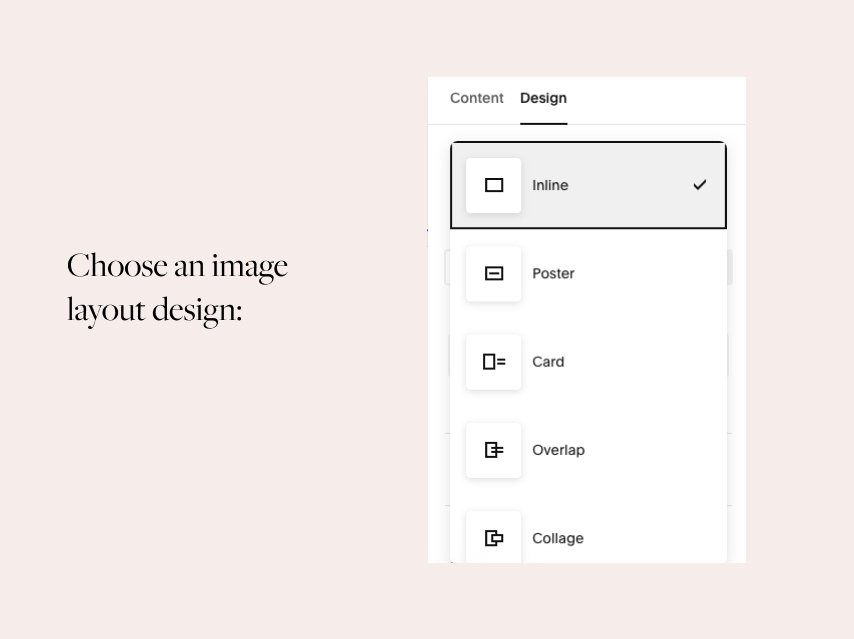
Image layouts are a secret weapon of Squarespace – you can use them to create alternating designs. Plan your design around these image blocks and you won’t have to worry about mobile design.
Browse the default template library for layout inspiration
Before you sit down to design your website, browse Squarespace free templates for layout inspiration. You’ll notice that all these default designs are really simple, not to say simplistic.
The power of Squarespace is in its simplicity. See how SqSp designers use the default blocks - it looks so easy and effortless! This is the best case study to see how they wanted the blocks to be used.
In Squarespace 7.1, all templates use the same functionality - you can recreate all these layouts on your site with ease! Study the default layouts and reuse them intentionally!
Hope you enjoyed these short tutorials! Check out our shop from your mobile, to see these tips in action.
Have questions about Squarespace and web design? We’re pretty active on Instagram. Send us a DM or send us an email via a Contact form.
Happy creating!

