Super Easy Split Section Layout in Squarespace 7.1 (CSS snippets inside)
Split layouts are trendy and will help you give your Squarespace 7.1 website a unique unexpected look.
Symmetry makes your layout more pleasing to the eye, helps you direct the attention of your readers, and splits huge amounts of text into sections. Half and half layout will help you add more white space to your design improving the overall user experience. It makes a perfect hero section, call-to-action section and will help you break any boring and text-heavy layout.
The Fluid Engine Way
Fluid engine is a new editor experience available to all new Squarespace websites. It differs in many ways from the classic editor, which used to be the default editing experience on both 7.0 and 7.1 Squarespace websites. You can read our in-depth comparison of the two editing platforms here.
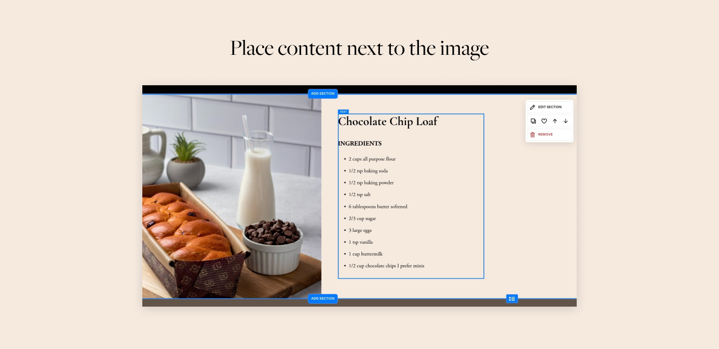
Split layouts are actually quite straightforward when it comes to Fluid engine. Since it allows you to drag and drop elements directly into sections and arrange them on a grid, to achieve a split layout all we need to do is place an image and some content next to it. There are several caveats and tricks you should about though and we’ll cover them below.
Image position and settings for Fluid engine:


Having done the above you now have a fully working Fluid engine split section! You can change the position of the image, of course, arranging several sections one after another with images positioned on the right and on the left, for example.
Don’t forget to also review the mobile view before you publish - Fluid engine allows you to create separate layouts for desktop and mobile, which means that you will be able to adjust where the image will be any other content (text, forms, buttons - whatever you want to place there).
Now, the straightforward approach out of the way, let’s talk about the classic editor and the older approach to designing on Squarespace. After all, many websites run the classic editor and will continue to do so in the near future, so the below tutorial is still going to be quite useful.
The 7.1 classic editor way
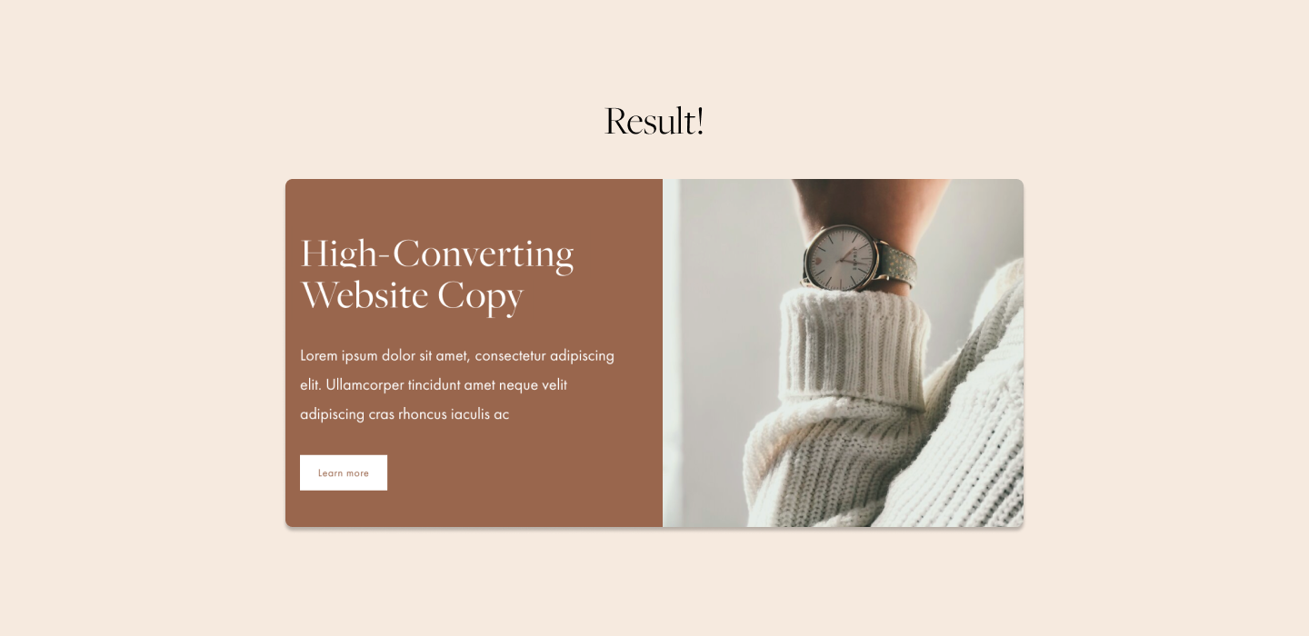
Let’s create the easiest possible split layout using a card image block and a little bit of custom CSS. In this design, we will have an image on the right-hand side and text with a button on the other side.
Step 1 - Prepare your content
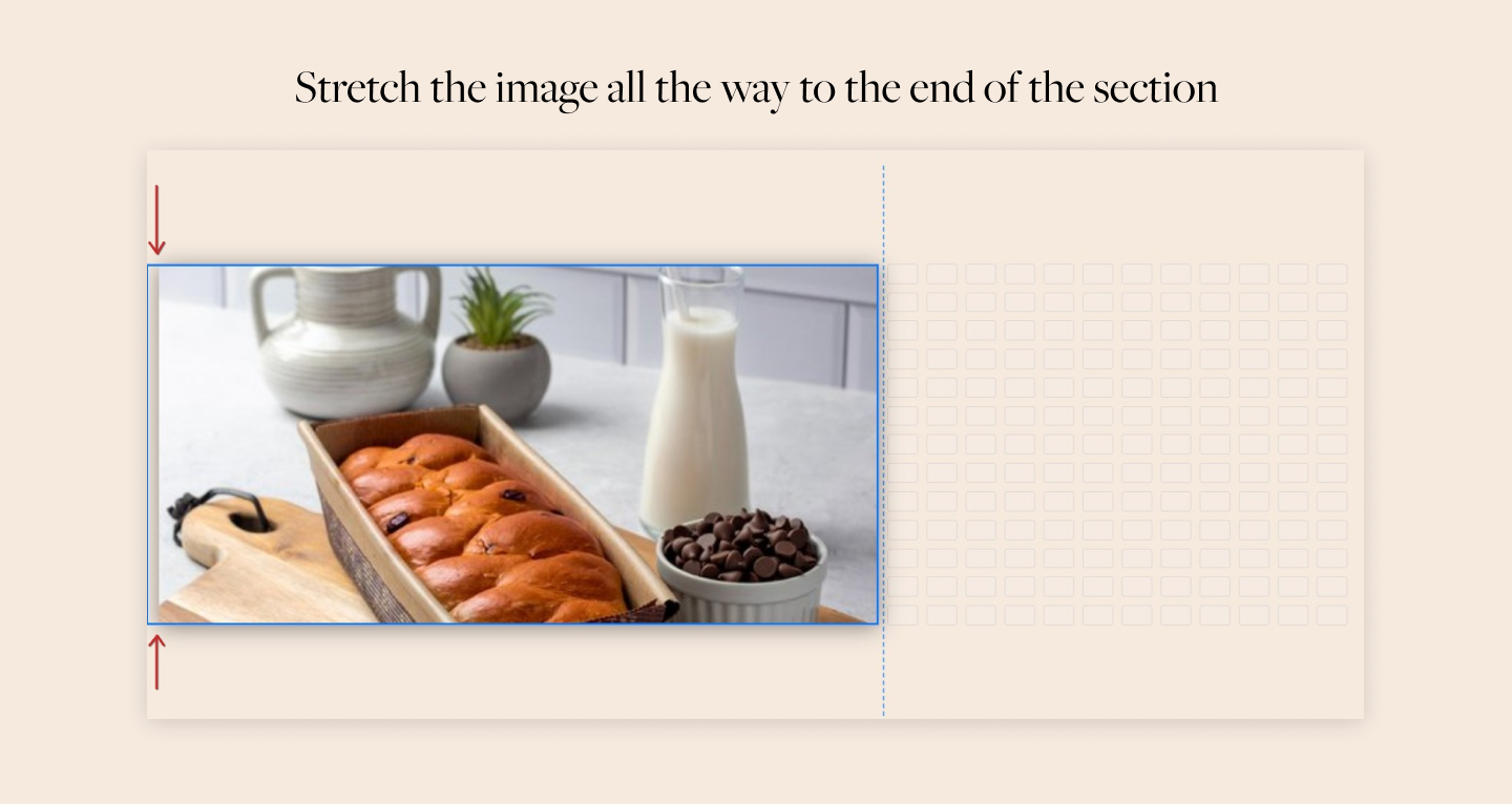
After you write your content, we need to determine the dimensions of your image. If you have a little bit of text and a small headline, then the image will likely be square.
We don’t recommend using too much copy in the split section. However, if you have a lot of text, keep in mind that it will likely push the section down. In this case, it’s better to use a tall rectangle image.
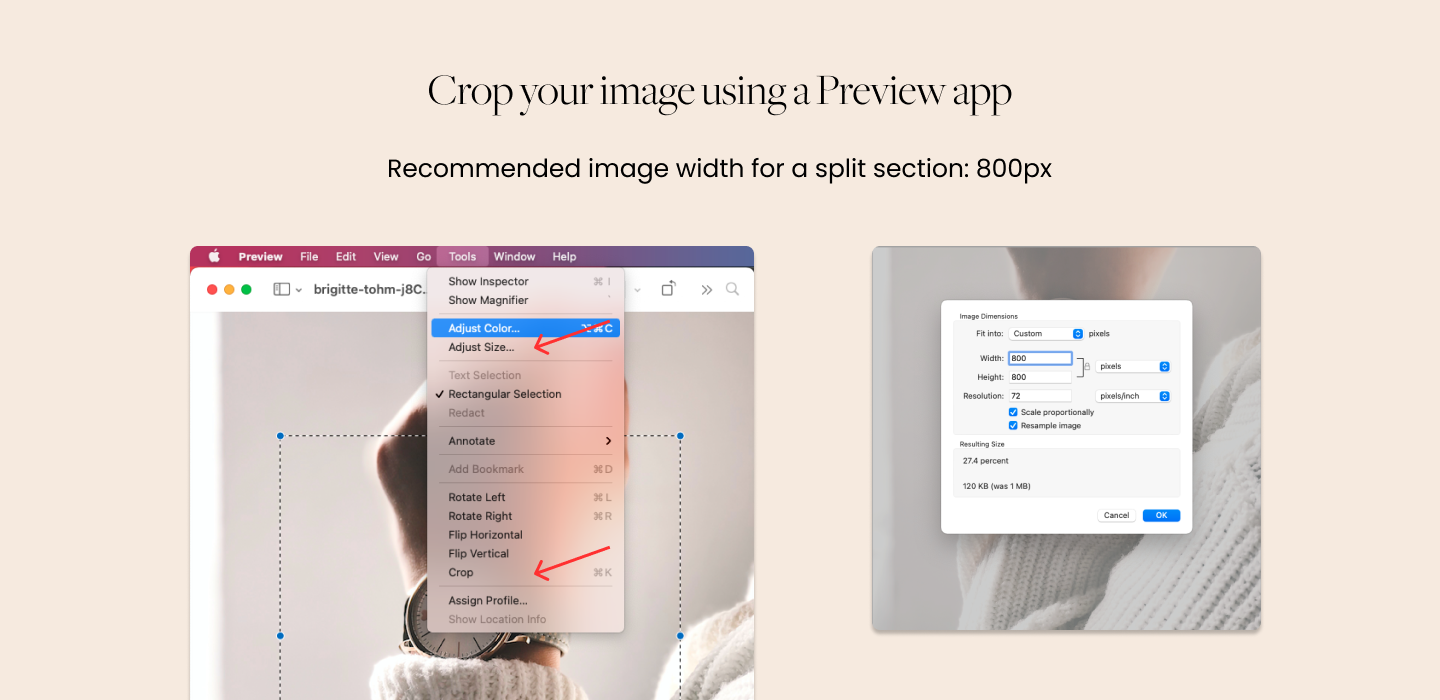
You can easily crop your image using a Preview app on a Mac. Hold the Shift button to draw a square, then open the edit panel and select “Crop”. Also, adjust the width of your image. The image for the split section should be at least 800px wide.
We recommend using a jpg or png and an online converter to compress your image so it doesn’t affect the site speed, especially if you are planning to use several symmetrical split layouts on one page.
Step 2 - Create a card image and upload your content
First, on your Squarespace website add a blank page and add a blank section to it. When you are inside the blank section, click the little plus sign and a block menu will pop up.

Select “Image” from the menu. Notice that Squarespace adds a text block above the image - we want to get rid of that. We need to have only one block in this section - the image card block.

Next, add your content - an image and two paragraphs of text.
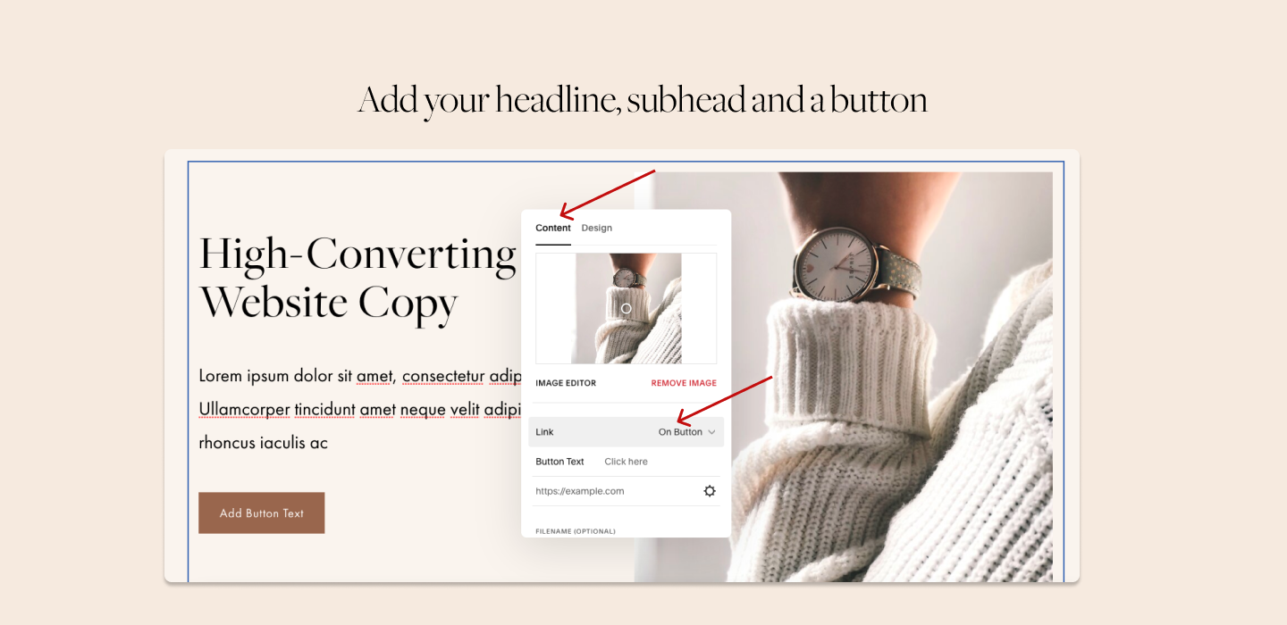
In the design setting of the card image block, you can set a button and select the alignment of the image to be set to the left or to the right.
Don’t forget to click “Save” in the upper left corner when you’re done.
Try Squarespace for free – and save 10% when you purchase a subscription with code APPLET10
Step 3 - Apply section settings
Head over to the right upper corner of the section and apply the following section format settings.
Section Height: 10
Content Width: Large
Content Alignment: Middle
Head to the color settings and apply the desired color. You want the section color to contrast the color of the next or the previous section.
Again, make sure the card block is by itself in the section - no additional blocks are added. For example, delete a text block that is created automatically in every new section, otherwise, you will have a full-width rectangle under your split section. Hit “Save” when you’re done.
Now head to Design > Site Styles > Image blocks and set the numbers in the settings to the ones you see in the picture below.

Step 4 - Turn card image into a split section
Next, head over the Design Tab and scroll down to Custom CSS at the bottom.
Paste the following code into the Custom CSS.
You will need to swap [data-section-id="YOUR-SECTION-ID"] with your own section ID.
To quickly grab the section ID, you will need to install a Chrome plugin Find Squarespace IDs.
Simply click on the extension, and it will bring up all section IDs. Click on a section ID to get it copied. Paste it into your code.
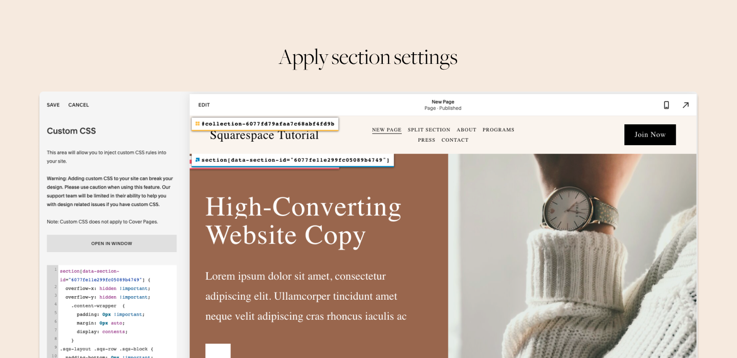
// Turn image card block into a split section

[data-section-id="YOUR-SECTION-ID"] {
    .content-wrapper  {
      padding: 0px !important;
      margin: 0px auto;
      display: contents;
    }
.sqs-layout .sqs-row .sqs-block {
  padding-bottom: 0px !important;
  padding-top: 0px !important;
}

overflow-x: hidden !important;
overflow-y: hidden !important;
}

.image-card-wrapper .sqs-dynamic-text-container {
  padding: 30px !important;
}
For the split sections on the top of a page
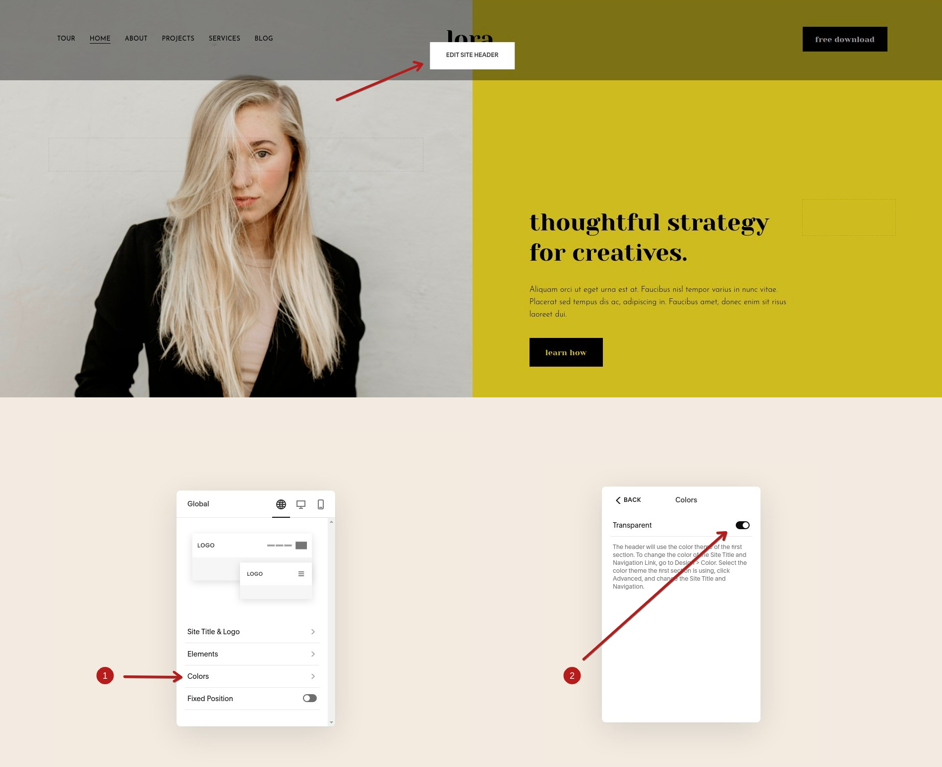
Now, if you’re adding the split section layout at the top of your page and want it to appear behind the page header, to look transparent on top of the split section sort of “hovering over it” – like you see in one of the examples above - do this:
1. Make sure the header is transparent. Here’s a screenshot illustrating where that’s done:
2. Use this code snippet instead of the one above (don’t forget to use the proper section ID):
// Turn image card block into a split section

[data-section-id="YOUR-SECTION-ID"] {
  padding-top: 0 !important;
  overflow-x: hidden !important;
  overflow-y: hidden !important;

  .content-wrapper  {
    padding: 0px !important;
    margin: 0px auto;
    display: contents;
  }

  .sqs-layout .sqs-row .sqs-block {
    padding-bottom: 0px !important;
    padding-top: 0px !important;
  }

  figcaption {
    padding-top: 100px !important;
  }
}

.image-card-wrapper .sqs-dynamic-text-container {
  padding: 30px !important;
}
An important thing to note here:
Notice how we set the padding-top value of the figcaption element to 100px !important; as seen here:
  figcaption {
    padding-top: 100px !important;
  }
The 100 pixels value here represents the height of your header. But not all headers are created equal of course, which is why you might want to adjust this number - either make it bigger or smaller - play with the value to make sure the header does not overflow over the text part of your split image section layout.
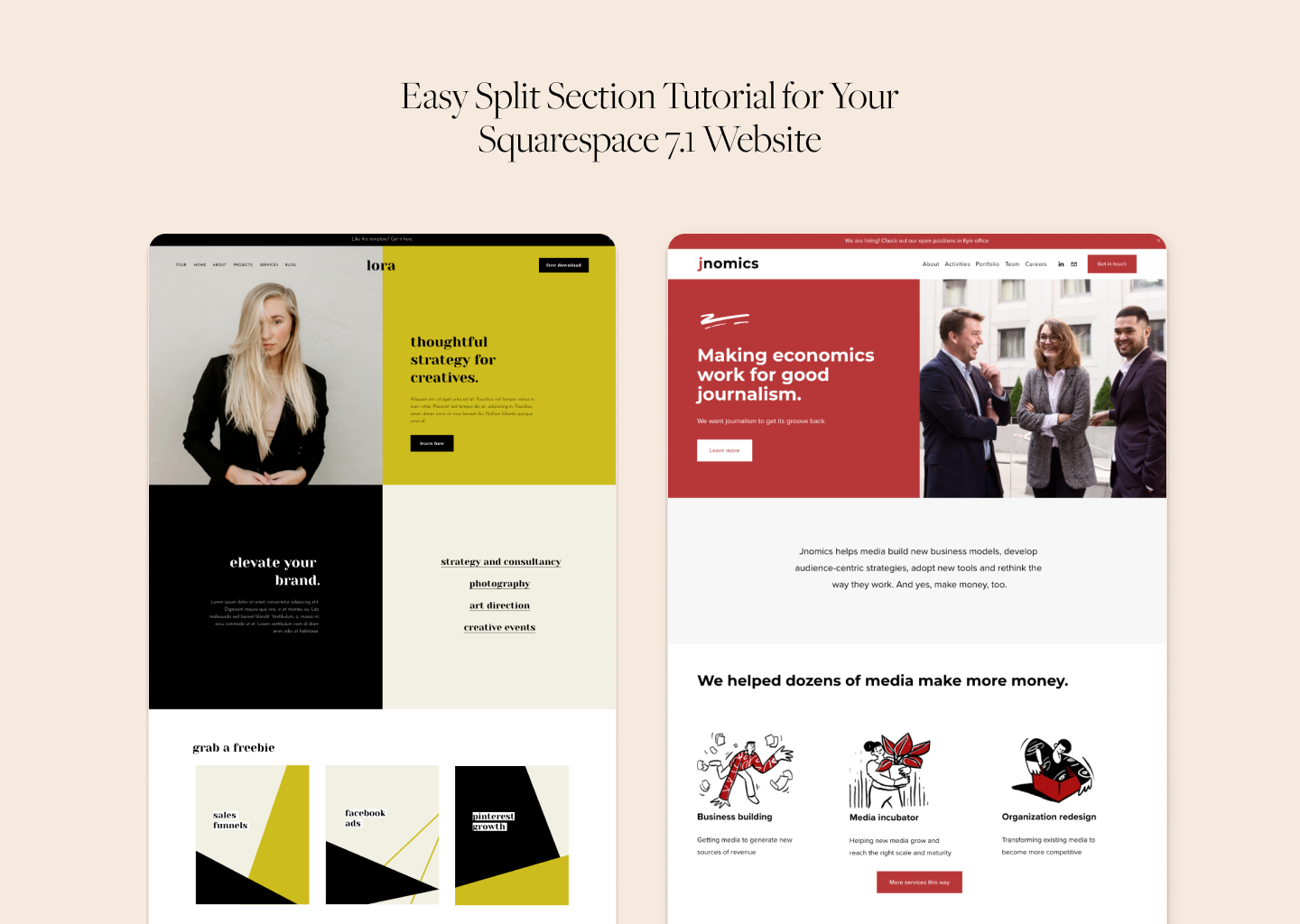
We hope you liked this tutorial! Check out our Squarespace templates Lora and Lemongrass to see how the split sections look in action and get more design ideas on how to style them.
If you still have questions left about Squarespace and web design, find us on Instagram. We reply to DM’s and emails via a Contact form.
Did we help? Consider sending us a little gift as a way of saying thanks.

