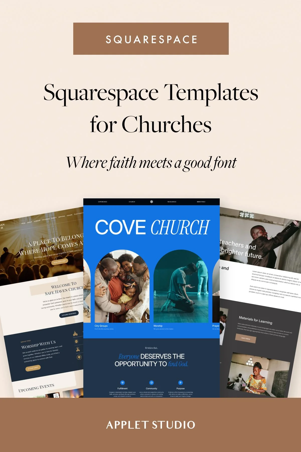
How to design a dazzling sales page on Squarespace
Long-form sales page on Squarespace? Heck yes! Squarespace 7.1 added an ability to customize the width, height, and colors of a section inside of a page, which makes creating long-form sales pages a breeze. With just a bit of CSS and some custom graphics, you can give your page a truly unique flair.
We urge you to use Squarespace to design your long-form sales page to sell your course, program, or high-ticket offer. There’s no point in paying for additional tools when you have such an amazing platform at hand!
Let us share some design secrets to help you prettify your sales page and give your design a custom polished look.
Avoid centering your text
Especially, avoid centering large amounts of text at all costs. We see this design mistake everywhere, quite literally. Our eyes move from left to right when reading and it’s hard for the eye to turn to the next line when it’s not aligned to the left. We have to make extra effort to keep reading.
So if you want your customers to actually read the content of your sales page, make it easy for them to do so. Break down your copy into paragraphs and align the text to the left. You still can center the headlines - if it makes sense artistically.

Have clear typography hierarchy
You need to create a clear and visible contrast between your headlines and body copy. Aim to have one big bold headline for the main heading of the page, smaller font for the secondary heading to use inside of the page, and easy to read body paragraph font.
The easiest way to achieve a clean, modern look on your sales page is to use the same font family for paragraphs and headings. Pick a sans-serif font that has a wide variety of weights - Poppins, Montserrat, Futura, Open Sans, just to name a few. Create contrast between h and p by alternating weight and letter spacing. Bolder and bigger for headings and thinner fonts with bigger line-height for paragraphs. Make your paragraphs readable by using at least 150% line-height.

Don’t overuse decorative fonts
Another big no-no is decorative fonts - handwritten fonts. Never even use them for the headlines! Decorative fonts are for secondary accents and embellishments but never for any crucial information.

Some people have trouble reading handwriting, most people will have to make an extra mental effort to be able to read the hand-written text - our goal with a sales page to get them hooked with our brilliant copy and keep them reading the page until they reach the end of it.
Don’t distract your readers with unnecessary details!
Break down a huge body of text into sections
A courteous thing to do for your readers is to break the text down into contrasting and alternating sections. The rule is this: have 1-2-3 paragraphs per section and 3-5 short sentences in each paragraph.
By “section” I mean an actual Squarespace section inside of a page. You can create as many sections as you like by clicking a plus sign when editing the text.
Text is one of the design elements - use it as a design tool to amplify the clever layout of your page.
The shorter your text inside of each section the better - your sales page will flow more naturally. This will also allow you to add more white space to the page.
Use alternating & contrasting sections
Alternate dark and light sections to emphasize your messaging. Your sections should contrast each other in color and layout.

For example, your sections can go like this: white, dark, bright and colorful, pale (light), accent dark, etc. You can change the color settings of a section if you click the pen sign to edit the section settings. Choose one of the color themes. Then go to the design panel and change individual color settings inside of a color “theme”.
Also, alternate the layout of the sections. For example, this might be the order of your sections:
Bold centered headline
Heading + short paragraph
Image on the left plus text on the right
Image on the right plus text on the left
There columns with icons
etc.
Use symmetry
Use symmetrical layouts next to each other if you’re presenting similar information. For example, on my Squarespace Mastery sales page, I am using alternating symmetrical sections to present what’s included in the course bundle.

Use card or overlap image blocks to recreate this look - just set the image alignment settings to left and right.
Group elements
Our brains are trained to understand and digest lists better than regular boxes of text. Break down your copy and use color and layout to group elements. Put your bulleted list on a dark contrasting background to draw attention to the information they will present.

Use elements like icons and arrows to give pointers to your readers.
Include clear CTAs
Include one clear call to action and don’t be shy to repeat it multiple times throughout the page. Most people will scan your page, not read it so it’s crucial to keep reminding them what action they are supposed to take on the page. We have three working CTA formulas for you here.
Remove header and footer
If you’re planning to run ads to your sales page, it’s clever to remove the header and the footer and include one more section - a “fake” footer that will contain your Privacy Policy and social links. No navigation will make it easier for people to stay on the page longer and and buy from you.

We have a blog post that breaks down how to remove the header and the footer with some CSS.
Here is how you write copy for your sales page for maximum conversion.
Hope we have answered all of your sales page design questions. Now, you are good to go to create your own. And if you prefer to buy a ready-made sales page, we have a Terranova Sales Page Template for you here.