How to Design a Sales Page for Maximum Conversion
Here at Applet Studio, we design websites on a regular basis and also help our clients sell their professional services. Through years of trial and error, we have learned how strategic web design can affect the bottom line of any marketing campaign. Here are our tips on improving your sales pages game.
An effective sales page is a business presentation that combines useful information with certain triggers that prompt users to take action - subscribe, submit a form, or buy a product. Before writing the content of the page, ask yourself:
➡️ What target action would you like your prospect clients to take?
➡️ Who is your audience? Do they know you?
A landing page should consist of the following blocks:
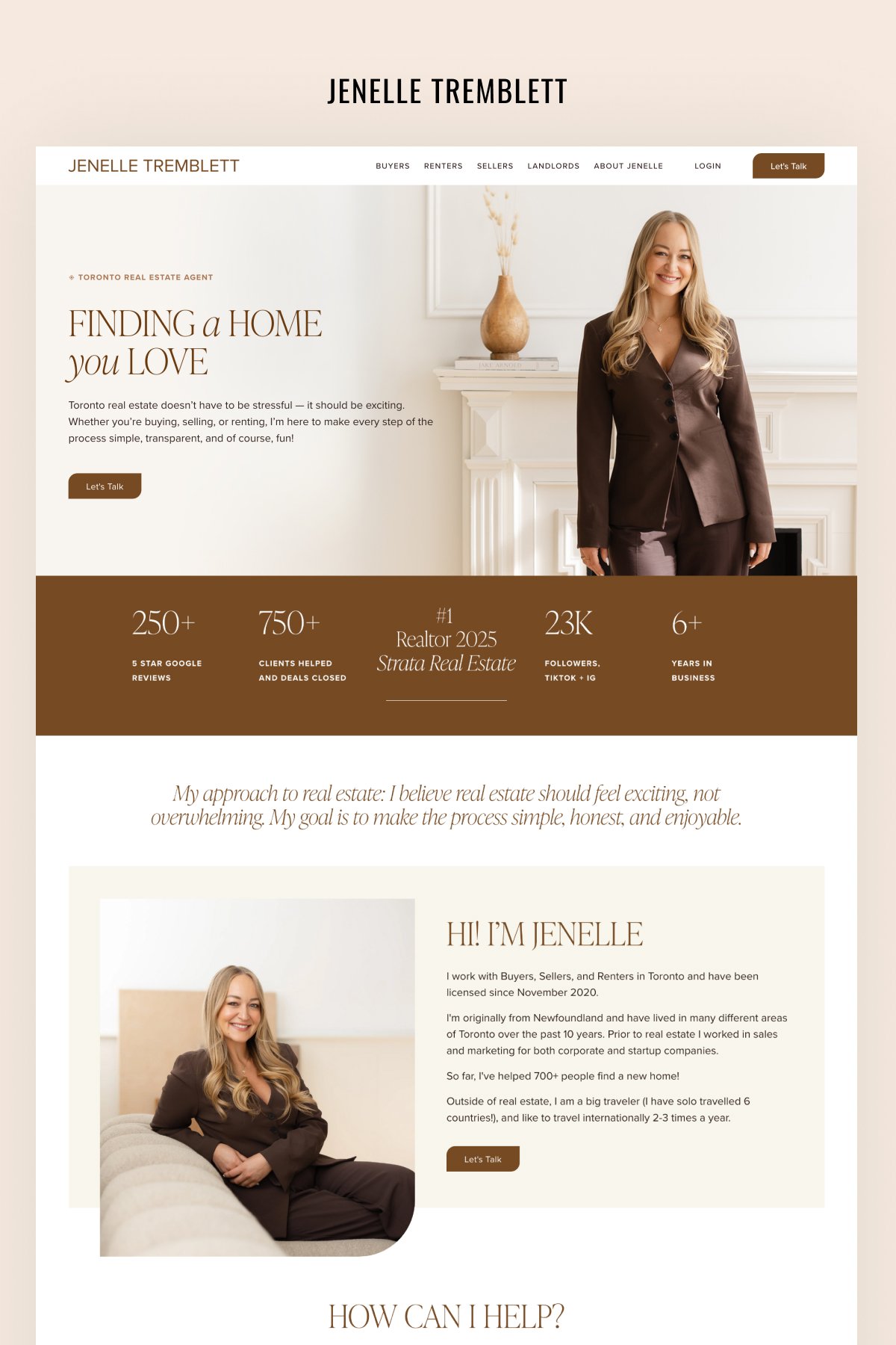
1️⃣ HERO IMAGE AND HEADLINE
The first section consists of a headline and an explanation of what is about to happen on the page. Your headline here is also your first call to action. This section explains what customers will get if they take the target action.
2️⃣ INTRIGUE
The second block presents an intrigue that highlights the biggest pain of the potential customer. They have to realize they need to start taking action to solve the problem.
3️⃣ BENEFITS
This section has to paint a picture of much better things are going to go in the future (if they take target action).
4️⃣ OFFER
Describe your offer in detail: what’s included, how you solve their problem. This section has to convince your potential customer that your product is the best, while also being quite short and to the point.
5️⃣ WHY US
Here, give your potential clients the right motivation. Why do they need to buy from you? What are people saying? Include testimonials, reviews, numbers. Don’t be afraid to compare your product to closest competitors.
6️⃣ SALE
Describe different packages and give them a discount, your best deal ever.
7️⃣ DEADLINE
But wait, the deal you just advertised has a deadline. These can be restrictions in time or in the number of items available, etc. Explain why those restrictions exist.
8️⃣ CALL TO ACTION
Make a final call to action backed up by transformation promise and benefits.
Each of these blocks is followed by their own call to action, supported by the right triggers. Keep reminding your customers they need to take action. CTAs are highlighted by graphics and bolder fonts.
So, your page is ready, but how do you know if it’s any good? Read the headlines. If it takes less than 10 seconds to figure out what the page is about by reading headlines only, you’re good.
Then use heat maps to see which elements of the page are lagging behind. Change those elements and do some split testing - et voilà, you have the best landing page possible!
And now let us share some design secrets to help you prettify your sales page and give your design a custom polished look.
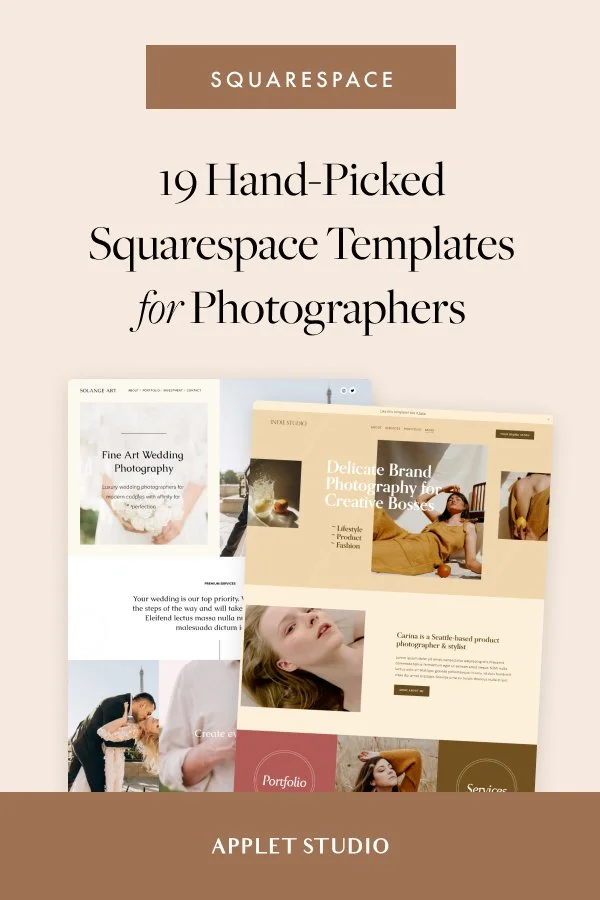
These rules are simple, yet they often get neglected. Want support designing the best sales page possible? Check out our amazing Squarespace templates that have everything you need to design amazing sales and landing pages for your offers and products.

