How to Hide and Swap Sections on Mobile in Squarespace 7.1 (CSS Snippets Inside)
How to easily edit the mobile view of your Squarespace website
Here’s a common problem of many Squarespace websites: You design a website in the desktop view in your browser but when you switch to mobile or check the website on your phone, it doesn’t look quite right.
The easiest way to fix the situation without writing a lot of custom CSS code is to simply show and hide certain sections on mobile and desktop.
In this tutorial, we are going to walk you through a simple CSS that would allow us to hide and show page sections on mobile and desktop breakpoints so you could fix whatever is bothering you and create a custom look for your mobile website.
Try Squarespace for free – and save 10% when you purchase a subscription with code APPLET10
Step 1. How to check the mobile view of the Squarespace website
In the admin panel of your website, click on the mobile phone icon in the upper right corner. Click it again to go back into desktop mode.

You can actually edit your pages in the mobile view, however, it will affect the desktop view too.
Step 2. How to find a section ID on a Squarespace website
First, install this handy Chrome extension. After you install it and run it, you will find a hashtag sign in the upper panel of your browser. Go to your Squarespace website and click on it. You will see the strands of numbers and letters pop up around your page. Section IDs are the blue ones.
To quickly copy a section ID, you just need to click it once.

Step 3. How to hide a section on mobile on a Squarespace website
Imagine, there is a section on your website, that looks good on big desktop screens, but is a disaster on mobile. You do not need it on mobile, and you just want to hide it.
Go to Design > Custom CSS in the right-hand menu of your website admin panel. Copy and paste the snippet of code below into the text box designed for Custom CSS.
// Hiding sections on mobile
@media screen and (max-width: 641px) {
section[data-section-id="YOUR-SECTION-ID"] {
 display:none !important;
  }
}
Now, with the help of the Chrome extension, we have installed in the previous step, grab the section ID of the Section you want to hide and paste it in the code instead of: section[data-section-id=“YOUR-SECTION-ID”].
Click Save in the upper left corner and go to the mobile view in the upper right corner to see if the section disappears on mobile.
Step 4. How to swap a section on mobile for another section:
There are cases when you want not only to hide a section on mobile but to show another one instead of it.
To swap the sections you will need to:
Hide a section from the mobile view
Create a section specifically for mobile view
Hide this section from the desktop view
In such a case your snippet of code will be longer. Copy and paste it in the Design > Custom CSS as you did in the previous step.
// Hiding and showing sections
@media screen and (max-width: 641px) {
section[data-section-id="YOUR-SECTION-ID-HIDE-FROM-MOBILE"] {
 display:none !important;
  }
}
@media screen and (min-width: 641px) {
section[data-section-id="YOUR-SECTION-ID-HIDE-FROM-DESKTOP"] {
 display:none !important;
  }
}
Grab the ID of the Section you want to hide with the extension and place it instead of section[data-section-id=“YOUR-SECTION-ID-HIDE-FROM-MOBILE”].
Grab the ID of the Section you want to show on mobile devices only and paste it instead of section[data-section-id=“YOUR-SECTION-ID-HIDE-FROM-DESKTOP”].
Save everything in the upper left corner.
To test the result, simply switch between the mobile and desktop view like we have described in Step 1. The right sections should appear and disappear depending on the view.

Step 5. How to hide several sections from mobile view
To hide several sections from either view you need to add their IDs into the same code. You do not need to reproduce the code several times. Just add your Section IDs, separating them with comas, e.g.:
// Hiding and showing sections
@media screen and (max-width: 641px) {
section[data-section-id="613b4b48c997891de63563ac"],
section[data-section-id="613b4c4b2b1b020abe5cd2b7"],
section[data-section-id="6114dd1df6d1b85de191b2d1"] {
 display:none !important;
  }
}
Here are five more tips on how to make your Squarespace website more attractive on mobile.
Creative Workshop Series for Squarespace
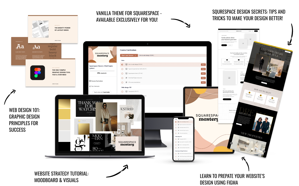
The workshop is jam-packed with design goodness. Inside, you’ll find the following topics:
What size should I design for? Responsive layouts and industry standards
Typography 101: How fonts can elevate your design & look professional
My approach to using colors in web design
Complete Figma tutorial
How to use layout grids to direct the attention of your website visitors
How to create a mood board and plan your website visuals
Squarespace Vanilla theme build-out: Complete walk-through, CSS snippets and Figma wireframe
Massive Squarespace design practicum: We go from a mood board to a finished design on Squarespace in a matter of an hour. Two designs included along with CSS plugins and Figma templates
Redesign 2 real websites with me in real time
How to grow as a designer and how to look for creative inspiration
Plus, there are some really helpful documents included: Complete Squarespace development checklist, copywriting and branding guides, sample client questionnaire and so much more!
Are you in? I’ll see you in Squarespace Mastery!


