How to Style Your Newsletter Block with CSS in Squarespace
How to fix the design of the newsletter block – a super cool Squarespace feature – so you could use its full potential
You can create a good-looking newsletter or lead magnet sign-up form using the Squarespace default functionality. In this tutorial, we show you how to style a Newsletter form block with CSS and fix some common problems with this block.
If your email marketing software has limited options to style forms (like Mailchimp or Active Campaign), we recommend using a built-in Squarespace feature. It’s easy to plug the Newsletter Block into any email marketing tool using Zapier.
Plus, Newsletter blocks can post your emails into a spreadsheet or add emails to the default Squarespace Campaigns list. Read our article How to Set Up your Freebies in Squarespace to learn more about how it works. It’s always great to keep everything under one roof for simplicity. We can plug the Newsletter block into any email marketing software using Zapier.
To add a Newsletter block to your page, click the plus sign when editing a page and select a Newsletter block. There’s also a Form block and, technically, the Newsletter block is also a form, but it has different features and is made specifically for quickly collecting emails.
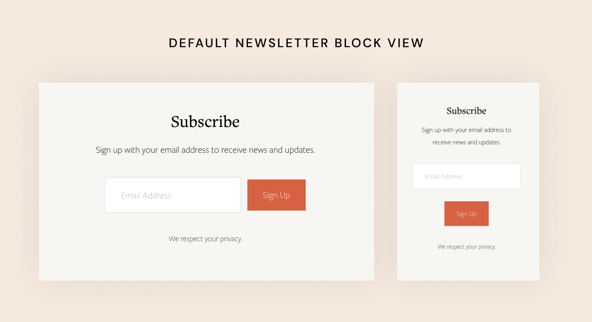
Here’s a default Squarespace newsletter block design:
Try Squarespace for free – and save 10% when you purchase a subscription with code APPLET10
We are not using the name and last name fields because it’s impossible to use just the first name (without the last name). We are asking just for the email address to make this form more user-friendly.
There are several problems with the design:
The button is disproportionally smaller than the input field, especially it looks bad on mobile screens. We’d like the button to be the same size as the field and span 100% width on mobile phones.
If we remove the bottom disclaimer text, it leaves a weird-looking empty space which is impossible to remove
If all our buttons on the site are pill buttons (have rounded corners), the field in the newsletter block still remains rectangular
Sometimes we need to install a completely custom font into the newsletter block
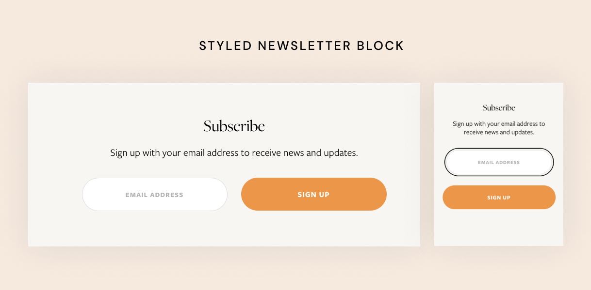
The CSS snippet below solves these problems. Go ahead and paste it into Design → Custom CSS.
The snippet below produces the following result:
// Email newsletter section
.newsletter-block {

  header {
    .newsletter-form-header-title {
      // Styling the form title
      font-family: "Open Sans", sans-serif; //Main font family
    }

    .newsletter-form-header-description {
      p {
       // Styling the newsletter main text
        font-family: "Open Sans", sans-serif;
        font-size: 1.5em; // Size can be in px
        font-weight: 400;
        line-height: 1.2em;
      }
    }
  }

  .newsletter-form-body {
    input.newsletter-form-field-element {
      // Styling the form input fields
      // including the "email" field
      min-width: 300px;
      font-family: "Open Sans", sans-serif;
      padding: 1.5rem !important;
      font-size: 0.9rem !important;
      text-transform: uppercase;
      font-weight: 600;
      letter-spacing: 1px;
      border-radius: 300px;
      text-align: center;
    }

    @media screen and (min-width: 920px) {
      // Making sure the email field and the button
      // are better displayed on larger screens
      display: flex;
      flex-direction: row;
      // Below line sets the float of the form fields,
      // change value to flex-start to float left, flex-end to floar tight
      justify-content: center;

      .newsletter-form-button-wrapper {
        margin-left: 20px;
      }

    }
  }

  // This hides the container for the form disclaimer
  // this part needs to be removed if you display
  // the disclaimer on your website
  .newsletter-form-footnote {
    display: none;
  }

  // Styling the newsletter block button
  .newsletter-form-button-wrapper {

    // Full screen wide on mobile
    @media screen and (max-width: 768px) {
      width: 100%;
    }

    .newsletter-form-button {
      // Styling the button text and appearance
      min-width: 300px;
      font-family: "Open Sans", sans-serif  !important;
      text-align: center;
      padding: 1.5rem 4rem !important; // This controls how big the button is
      color: #FFFFFF !important; // Button text color
      background-color: #FF9230  !important; // Button background
      text-transform: uppercase !important;
      border-radius: 300px;

      @media screen and (max-width: 768px) {
        padding: 1.5rem 0 !important;
        width: 100%;
      }

      .newsletter-form-button-label {
        font-size: 1rem !important;
        font-weight: 600;
        letter-spacing: 1px;
      }
    }
  }
}
After you paste this into CSS, open it in a new window like so:

Use the comments to tweak the settings to your liking. For example, you can change the form title and subtitle fonts (read this article to learn how to install custom fonts on Squarespace) – simple swap “font-family: "Open Sans", sans-serif;“ with “font-family: "your-font-family", sans-serif;”.
If you’d like to keep the form and a button rectangular, simply remove “border-radius: 300px;” from the code.
The snippet also lets you change the colors of the button and text (if you’d like to override the default Squarespace settings). You can always remove the lines of code you don’t need.
To change the colors you need to know the color HEX codes and swap them in the snippet.
So go ahead, paste the snippet into your CSS settings and study the comments (highlighted in gray color) and tweak the values to match your style.
Creative Workshop Series for Squarespace
The workshop is jam-packed with design goodness. Inside, you’ll find the following topics:
What size should I design for? Responsive layouts and industry standards
Typography 101: How fonts can elevate your design & look professional
My approach to using colors in web design
Complete Figma tutorial
How to use layout grids to direct the attention of your website visitors
How to create a mood board and plan your website visuals
Squarespace Vanilla theme build-out: Complete walk-through, CSS snippets and Figma wireframe
Massive Squarespace design practicum: We go from a mood board to a finished design on Squarespace in a matter of an hour. Two designs included along with CSS plugins and Figma templates
Redesign 2 real websites with me in real time
How to grow as a designer and how to look for creative inspiration
Plus, there are some really helpful documents included: Complete Squarespace development checklist, copywriting and branding guides, sample client questionnaire and so much more!
Are you in? I’ll see you in Squarespace Mastery!


