How to Use Custom Images as Bullet Points on Your Squarespace Website
Squarespace Bullet Points
Create custom illustrations and use them instead of default dots on your website
If you like to use bulleted lists on your website, this tutorial is for you. Lists are great, because they hold similar items, facilitate reading, and make the text on your page look better visually.
But lists might look a bit boring. To escape the dull look, you can change the bullet points to cute icons of your choice.
Here is an example of the page of our Squarespace Mastery course, where we explain the benefits of mastering Squarespace. We have changed the regular bullet points for the yellow checkmarks here. But you can choose to have any bullet points you want: flowers, crosses, geometrical shapes, arrows, stars, you name it.

In this tutorial, we are going to use CSS, but it is beginner-friendly. You just need to copy-paste a few things, no heavy lifting. We will walk you through the entire process, and if you still have questions, we are ready to answer them in the comment section below this post.
This tutorial is going to teach you how to swap the regular bullet points in the unordered lists for the icons of your liking. It isn’t meant to change the numbered lists.
Squarespace Custom Bullet Points Step 1: Designing the icon
There are many ways to design or download an icon on the internet. You can create it in Canva, or any graphic design tool of your choice, or download it online. The main thing is that it should have the size of 20x20 pixels and the .png format.
It is better to have two color versions of the icon too. A regular Squarespace website has many color themes in it a.k.a site styles, but many of them are either predominantly dark or light. We need to have two color versions of the icon to ensure, they are contrasting enough with the background and look good in any Squarespace color theme.
In our tutorial, we are using the free design tool Figma to create the icons. Skip this step if you already have an icon 20x20 pixels in the .png format. Go directly to Step 2.
Open a new project in Figma and go to plugins. Here, search for a plugin named Iconify.

Search for ideas in the plugin. We, for example, typed in “arrow”.
Choose the icon you like, scroll down and click import icon. It will appear on the art board and in the left-side menu.

Drag the group (a dash-lined square) out of the frame (a hashtag grid) in the left-side menu. Click on group, hold it and pull it up. Go to the right-side menu and constrain proportions (click the little lock sign). Then, change W (width) and H (height) to 20 pixels.

Now you can change the color of the icon in the right-side menu. We duplicated the icon (Cmd+C, Cmd+V and dragged it from the first icon it landed on), changed their colors, and renamed them “white” and “red”.

Time to export your icons. With your icon selected, scroll down the right-side menu. Your export settings should be 1x, PNG.
Step 2: Uploading icons to Squarespace
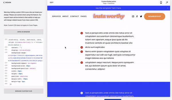
Now go to your Squarespace website. Go to Design > Custom CSS and scroll down the left-side menu until you see the Manage custom files button. Click on the button and upload your icons to the website from your device. Click Save in the upper left corner.
Click Add images or fonts and upload your files. Save your progress.

Let’s start with adding bullet points for the light-colored sections. For them, we are going to use a contrasting bullet point – in our case a red arrow.
Here is the first part of the code. Copy and paste in the custom CSS window.
// Custom bullet points

.bright-inverse, .light-bold, .light, .white-bold, .white {ul[data-rte-list] li > *:first-child::before {
    content: "";
    display: inline-block;
    background-image: url(YOUR URL GOES HERE);
    background-repeat: no-repeat;
    background-size: 20px;
    background-position: center;
    width: 20px;
    height: 20px;
    position: absolute;
    margin-left: -50px;
    margin-top: 5px;
  }}
Now, find this line in the code: background-image: url(YOUR URL GOES HERE); You are going to put a URL of the icon you have uploaded to your website between the round brackets instead of the text.
How do you get this URL? It appears in the CSS box when you click on your previously uploaded file in the custom files. Delete YOUR URL GOES HERE text, but leave the cursor between the brackets. Scroll down, click on the Manage custom files button, and click on the item you need, in our case it is a red arrow. The URL should appear between the brackets.
That is it! Click Save in the upper left corner.
Now, to the dark-colored sections. For them, we are going to apply a white arrow.
Here is another snippet of code. Copy-paste it in the Custom CSS window.
.black-bold, .black, .dark-bold, .dark, .bright {ul[data-rte-list] li > *:first-child::before {
    content: "";
    display: inline-block;
    background-image: url(YOUR URL GOES HERE);
    background-repeat: no-repeat;
    background-size: 20px;
    background-position: center;
    width: 20px;
    height: 20px;
    position: absolute;
    margin-left: -50px;
    margin-top: 5px;
  }}
Repeat what you have done with the previous icon: put the URL of another icon between brackets and save.
Well done! This is an example page with different sections of what we got.
Step 3: Advanced
For those, who want more control over their color schemes we will explain the logic behind these two snippets of code. It will give you greater flexibility and the possibility to upload more than two color variations of the custom bullet points.
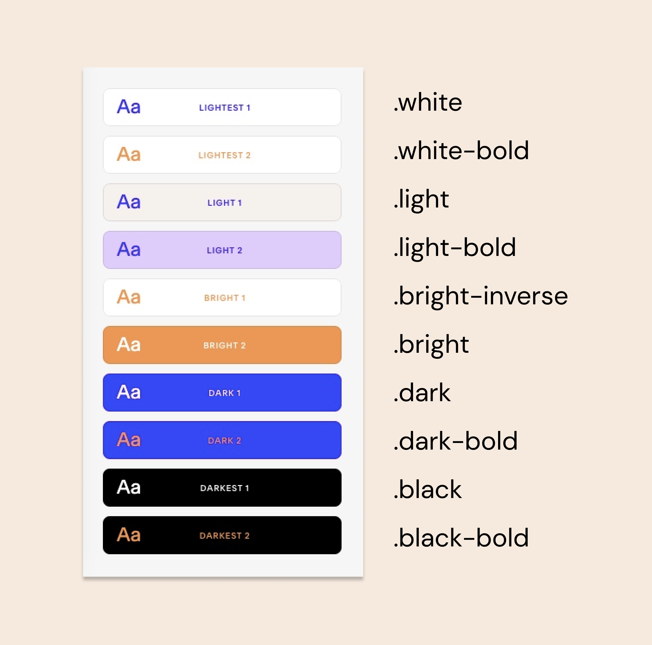
The two snippets of code we have used are almost identical except for the first line. It contains the list of the Squarespace color themes the icon will be applied to.
For the light color sections we mentioned: .bright-inverse, .light-bold, .light, .white-bold, .white
For the dark-colored sections we mentioned: .black-bold, .black, .dark-bold, .dark, .bright
Basically, you can add the names of the themes you need and delete the ones you don’t need from your code.
How do you know which one is which? The thing is that the names do not correspond with the ones Squarespace tells us in Site Styles menu.
Here is a cheat sheet for you.
In case you need to check the theme yourself here is where to find it. To learn the real names of the themes you need to right-click your page and choose inspect. In the source code of the page find the words data-section-theme=””. You will find the name of the section between the quotation marks.
In Chrome browser it looks something like this:

We hope this was helpful! Drop your questions in the comment section below or send us a DM on Instagram!
Creative Workshop Series for Squarespace

The workshop is jam-packed with design goodness. Inside, you’ll find the following topics:
What size should I design for? Responsive layouts and industry standards
Typography 101: How fonts can elevate your design & look professional
My approach to using colors in web design
Complete Figma tutorial
How to use layout grids to direct the attention of your website visitors
How to create a mood board and plan your website visuals
Squarespace Vanilla theme build-out: Complete walk-through, CSS snippets and Figma wireframe
Massive Squarespace design practicum: We go from a mood board to a finished design on Squarespace in a matter of an hour. Two designs included along with CSS plugins and Figma templates
Redesign 2 real websites with me in real time
How to grow as a designer and how to look for creative inspiration
Plus, there are some really helpful documents included: Complete Squarespace development checklist, copywriting and branding guides, sample client questionnaire and so much more!


