How to Create a Squarespace Accordion Block and Make it Look Fab
Create a standard accordion block for your FAQ and style it together with me
Back in 2021, Squarespace finally introduced the long-awaited accordion block. Users can now easily find it in the basic blocks menu. Adding an accordion block to a page was a bit of a headache before. Designers used workarounds to create accordions, some used plugins, others (like us) used markdown blocks. But the pain is over, the new native accordion blocks are easy to create and quite intuitive to use.
Squarespace accordion plugins previously and native accordion blocks now are in high demand because of their functionality. A Squarespace accordion block allows you to display information in collapsible rows. It is helpful when you have big chunks of text that need to be hidden.
It is often used for FAQ accordion blocks and service pages. In FAQs, questions are visible and answers are hidden. This design helps users find the answers faster. This is how an FAQ block looks on our website in the image below, or check it out on the page.
Try Squarespace for free – and save 10% when you purchase a subscription with code APPLET10

On service or sales pages using the accordion in Squarespace you can hide descriptions of services or products until a user clicks on the appropriate title. This way you can avoid text-heavy blocks that are difficult to digest, and also reduce scrolling and information fatigue.
In this tutorial, we are going to explain how to add an accordion block to your website and show you advanced options for styling them with CSS.
How to create an accordion block on a Squarespace website
First, click Edit at the top left corner of a page you want to add an accordion block to. Then go to the section you need, click an insert point (looks like a plus), and choose accordion among the basic blocks.

You can edit the block’s content and some of its design right away. Click a pencil icon that lights up when you hover over the accordion block and you will be taken to the Content settings tab.
There are three dummy items in your block. Click one of the items and you will be able to fill in the information – add a title (that is always visible) and its description (that is collapsible.)

In the design tab, you have the basic styling options for your accordion block. Here, you can edit the title and description text style, make the first item collapse automatically, allow multiple open items, turn on/off the dividers between items, choose item icons and style them, and regulate item padding.

You can also control the colors of your accordion block. In order to do that, click the paintbrush icon in the top right corner of the page. Now, go to Colors and choose the Color theme of your block. The color theme sign has just lit up in the top right corner of every block on the page. Find the accordion block settings on the list. Here you can control the colors of the dividers and icons. Pro tip: to find these settings faster, click the accordion block on your page.
With these inbuilt Squarespace settings, you can create simple, functional, and stylish accordion blocks for your website.
Pro design options for Squarespace FAQ accordions
For those who want to go further with styling, we have put together three pre-made options of accordion blocks. These are CSS-enabled designs. In order to build them, you will need to insert custom code into your website as well as change the Design settings of the accordion block itself.
Choose the one you like on the pictures below and follow along to recreate it on your Squarespace website. Create an accordion block with several items, fill it in with your real or dummy content and let’s dive in.
How to find section ID on a Squarespace website
For any of these tutorials, you will need to grab an ID of the section that contains your accordion block. This is because you need to tell the website where you want to apply your styling.
In Squarespace, all the pages are divided into sections. The easiest way to grab a Section ID is to use this extension for the Chrome browser. Install it and reboot your browser. Go to the page on your website you want to have your accordion block in, scroll to the section where it is situated. Find a hashtag-like icon in the upper right corner of your browser and click it. The extension will now show you the IDs of the collections, sections, and blocks on your page. You need one of the blue&white ones. Find the right one and click it once. It is now copied to your buffer ready to be inserted into the code snippet.

Design Option 1

Our first design is geometrical and solid. We created this mood by filling in title containers with color. At the same time, once you open one of the dropdown items the design looks very lightweight. It is because the descriptions containers are the same color with the dividers and section background (in this case they are white).
Here is the code snippet to attain the same style.
//Design 1

@accordionTitleBackground: #ECE9D4;
@accordionDivider: #FFF;

section[data-section-id="61e57ee1fa858224c4d378bc"]{

// Accordion title background
.sqs-block-accordion .accordion-item__title-wrapper {
    background-color: @accordionTitleBackground;
}

//Accordion divider color
.accordion-divider {
    color: @accordionDivider !important;
  }

//Add more padding to item description
  .accordion-item__description {
    max-width: unset !important;
    padding: 20px !important;}

// Accordion title padding
  .accordion-item__title-wrapper {
    padding-left: 20px !important;
    padding-right: 20px !important;
}

}
Copy and paste this snippet to Website > Website Tools > Custom CSS on your website and click Save in the upper left corner of the page.
First things first, swap section[data-section-id="61e57ee1fa858224c4d378bc"] for the section ID of your accordion block. We have learned how to do it in the previous step. Once you save the code, the styles will be applied to your accordion.
There are two variables that you can control in this design. These are accordion title background color and accordion divider color.
The accordion title background is greyish beige. If you want to change it to a different color, find a Hex code of the color you need and paste it instead of #ECE9D4 in your code.
The accordion divider is white. If you want to recolor it, keep in mind that it should be the same color as the section background to create an airy effect. To change the color swap #FFF with your Hex code.
Don’t forget to click Save!

To finish off the styling we will need to go to the Accordion block settings. Click Edit on your page, scroll down to the block and click the pencil icon. Now set all the settings to the ones you see in the picture. Note that the dividers are on and they are set to L to be thick.
Design 2

The second design is an elegant and nicely framed FAQ. Let’s achieve this look by adding some CSS to your website.
Copy the CSS snippet below, and go to Design > Custom CSS to insert it in the code editor. Swap section[data-section-id="61e9643df8db847c5db75c26"] with the relevant section ID, the way we have learned earlier. Click Save in the upper left corner of the page from time to time.
// Design 2

section[data-section-id="61e9643df8db847c5db75c26"] {

// Accordion title description
  .accordion-item__description * {
    opacity: 0.6;
}

// Removing the default divider
.accordion-divider {
  display: none;
}

.accordion-item  {
  border: solid 1px black;
  border-bottom: 0;
}

.accordion-item:last-child {
  border-bottom: solid 1px black;
}

.accordion-item__dropdown--open {
  padding-top: 20px;
  border-top: solid 1px black;
}

//More weight to the title
 span.accordion-item__title {
    font-weight: 400 !important;
}

//Add more padding to item description
  .accordion-item__description {
    padding-left: 20px !important;}

// Accordion title padding
  .accordion-item__title-wrapper {
    padding-left: 20px !important;
    padding-right: 20px !important;
}

}
There are several things you can control in this code. For example, we have given accordion title description some opacity, that is why it is grey. It is set to 0.6, but you can change the value to make it less transparent if you choose to.
The borders of this table are set to 1 px. If you want to change their thickness, you need to change the number in three different places of the code in order for the table to be uniform. Find the .accordion-item, .accordion-item:last-child and .accordion-item__dropdown--open and change 1px to the number you need in each of them.
We have also added more weight to the item titles. Font weight here is set to 400; manipulate this number if you want a somewhat different look.
Lastly, the padding everywhere in the code is set to 20 px.

We haven’t changed much in the Design tab of the accordion itself, only the icon placement. Here are screenshots for you in order not to miss details.
Design 3

The third design looks fun and doesn’t require much CSS. In contrast to the previous designs, we have left only one horizontal divider between items here. Let’s build this upbeat design together!
Copy the snippet below, paste it in the Design > Custom CSS on your website, and click Save. Now grab the accordion block section ID the way we have done before and paste it in your code instead of section[data-section-id="61e97464ac3df3426e4fc97a"].
// Design 3

@accordionDivider-3: #ECE9D4;
@plusIconColor: #DCC738;

section[data-section-id="61e97464ac3df3426e4fc97a"] {
  // Accordion divider color
.accordion-divider {
   color: @accordionDivider-3 !important;
  }

// Accordion plus sign color
.accordion-icon-container {
    color: @plusIconColor !important;
}

//More weight to the title
 span.accordion-item__title {
    font-weight: 500 !important;
}

  //Add more padding to item description
  .accordion-item__description {
    padding-left: 30px !important;}

}
Though we could have changed the color of the divider and the icon in the Color theme tab, we decided to show you how to change it via CSS in this design.
We painted the dividers and the icons yellow with the help of Hex codes. The accordion divider is #ECE9D4 and the icon is #DCC738. If you’d like to repaint them, change the Hex colors accordingly.
As you might have noticed we have also added weight to the title. It is set to 500. You may either tune it up or down if needed.
The description has additional left padding of 30px to align nicely with the title.

Take a look at the other settings that are tweaked in the design tab of the block. Note that the icon thickness is set to medium.
Creative Workshop Series for Squarespace
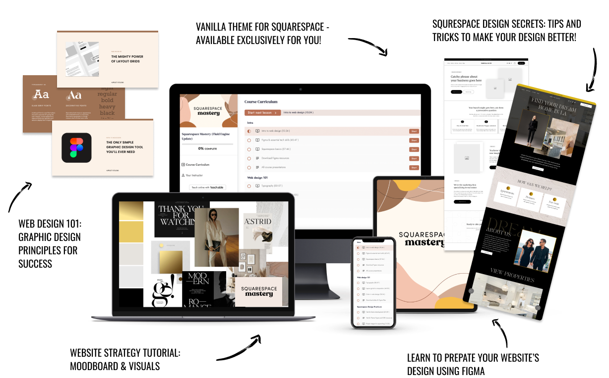
The workshop is jam-packed with design goodness. Inside, you’ll find the following topics:
What size should I design for? Responsive layouts and industry standards
Typography 101: How fonts can elevate your design & look professional
My approach to using colors in web design
Complete Figma tutorial
How to use layout grids to direct the attention of your website visitors
How to create a mood board and plan your website visuals
Squarespace Vanilla theme build-out: Complete walk-through, CSS snippets and Figma wireframe
Massive Squarespace design practicum: We go from a mood board to a finished design on Squarespace in a matter of an hour. Two designs included along with CSS plugins and Figma templates
Redesign 2 real websites with me in real time
How to grow as a designer and how to look for creative inspiration
Plus, there are some really helpful documents included: Complete Squarespace development checklist, copywriting and branding guides, sample client questionnaire and so much more!
Are you in? I’ll see you in Squarespace Mastery!


