How to Flip Content and Background Image on Mobile in Squarespace
How to easily fix the mobile view of your Squarespace banner image
One of the most common problems Squarespace users stumble upon is that text overlaid over an image looks weird in mobile view. It goes like this: you find a good image and put it on the section background, you type in your headline and adjust its position – and you get a gorgeous first screen of your home page (or any other page). You are content with the result until you decide to check the mobile view. Suddenly, you have 3 problems:
image is cropped to fit the vertical screen;
text overlays important parts of the image;
text is now unreadable.
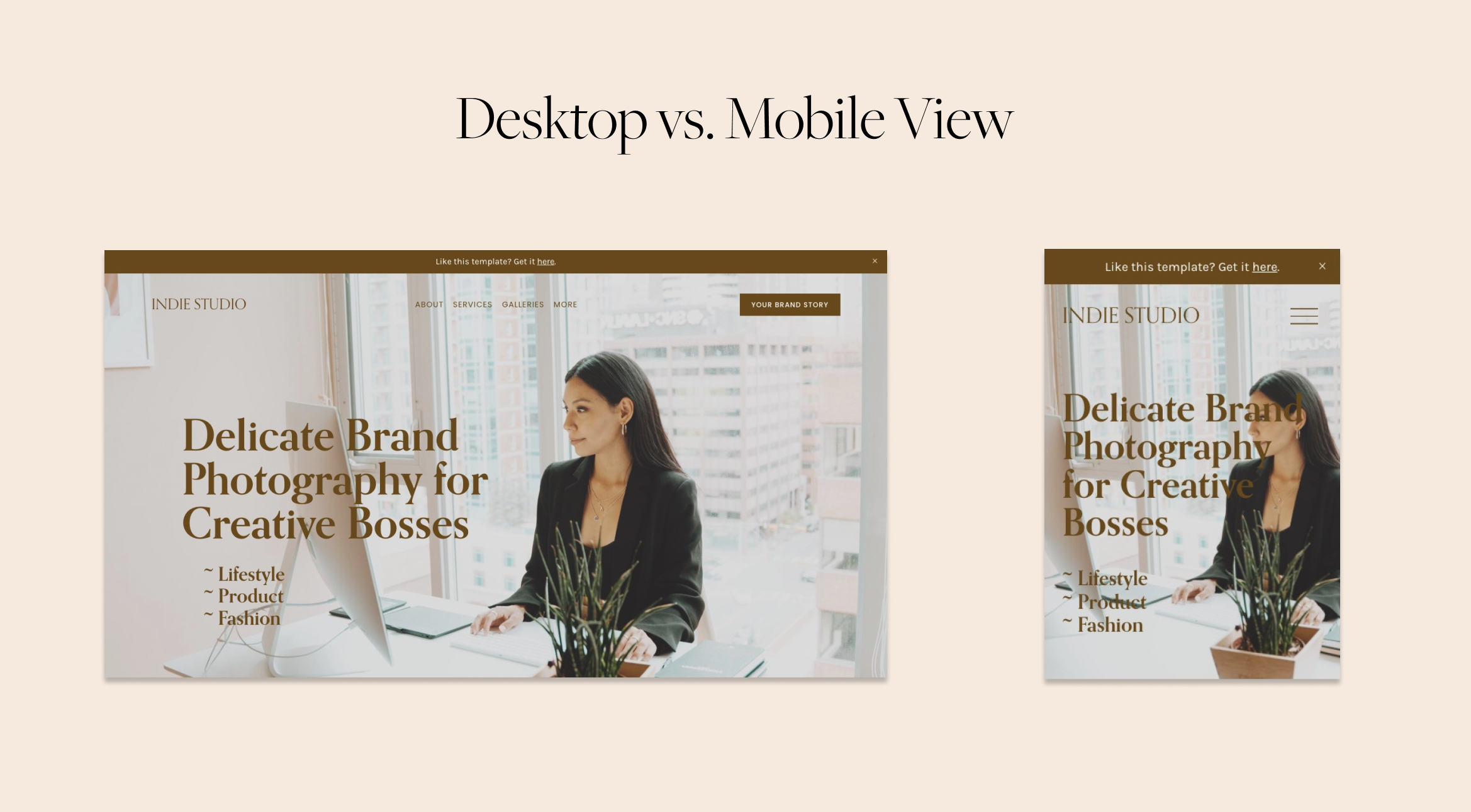
Take a look at the example below – we have a nice landscape-oriented picture here with enough space for the headline and subheadline. In the mobile view it gets cut off and the text slides onto the woman's face. No matter how we adjust the focal point of the image, it just won’t work.
Luckily, we can solve this problem with a little bit of CSS. We will give you the snippet of CSS code to fix the mobile view. This code will:
divide the section in mobile view into two horizontal sections one stacked over the other
show the original proportions of the image
put your text over the solid color background

Here is your snippet of code. You need to copy and paste it in the text window in the Design>Custom CSS.
// Flipping image and content on mobile

@media screen and (max-width: 1024px) {
    .dark-bold.page-section {
        display: flex !important;
        flex-direction: column !important;
        background: #EAC060;
        min-height: auto !important;
    }
    .dark-bold.page-section .section-background {
        position: relative !important;
        width: 100% !important;
    }
    .dark-bold.page-section .section-background img {
        width: 100% !important;
        height: 100% !important;
        overflow: visible !important;
        margin-bottom: -10px;
    }

  .dark-bold.page-section .content-wrapper {
  padding: 17px 17px 17px 17px !important;
    text-align: center;
    justify-content: center;
  }
}
In order for it to work, you will need to make a few changes to the code.
First, let’s find out what the color theme of your section is. Click Edit on your page, then click on a pencil icon, then click on Colors. Our color theme, for example, is Lightest 1.
Squarespace has different names for the color themes in the CSS. Here is the cheat sheet for you in the picture with the list of all CSS classes corresponding with their color themes. For example, if we have Lightest 1, it has a .white class in the code; if it is Lightest 2 it is .white-bold, etc.

Now that you have found your real color theme name, we need you to place it in four different places of the code. Find .dark-bold.page-section, delete .dark-bold, put your color theme name instead. In our case it looks like .white.page-section. You’re doing great, now insert your color theme name in three other places.
Do not drop any dots or hyphens along the way, or the code won’t work.
Now let’s change the color of the background of this section. Find this line in the code: background: #EAC060; You need to place the hex code of the color you need here. Hex code is the color code after the hashtag. You can find the hex code of the color with an eyedropper tool in almost any graphic editor – Figma, Canva, Adobe Photoshop. Or you can use other online tools.
The important thing is to make the heading contrast the background. If your text is dark, use a light background, if your text is light, use a dark background. In the example, we use caramel brown text on the light cream background.
P.S.: The sections and color palette we use in examples to this tutorial are from our Indie Studio template, check it out here.
Creative Workshop Series for Squarespace
The workshop is jam-packed with design goodness. Inside, you’ll find the following topics:
What size should I design for? Responsive layouts and industry standards
Typography 101: How fonts can elevate your design & look professional
My approach to using colors in web design
Complete Figma tutorial
How to use layout grids to direct the attention of your website visitors
How to create a mood board and plan your website visuals
Squarespace Vanilla theme build-out: Complete walk-through, CSS snippets and Figma wireframe
Massive Squarespace design practicum: We go from a mood board to a finished design on Squarespace in a matter of an hour. Two designs included along with CSS plugins and Figma templates
Redesign 2 real websites with me in real time
How to grow as a designer and how to look for creative inspiration
Plus, there are some really helpful documents included: Complete Squarespace development checklist, copywriting and branding guides, sample client questionnaire and so much more!


