Database of Squarespace Color Variables and How to Use Them
How to use Squarespace color variables in your designs
In August 2022, Squarespace introduced a new way it renders colors on sites. Now any color that you can apply to any element (let’s say a button) has its own CSS variable that you can reuse in the site’s CSS. The color will dynamically change based on a color theme you choose and the colors you apply through color theme functionality.
In a nutshell, this means that any color that you apply through the color theme functionality in Squarespace can be reused around the site in the form of a certain CSS variable.
Now, it is important to note that Squarespace said the names of variables might change in the future. We will try and keep the database we’re about to share with you up to date, but it’s just something to keep in mind.
As we build custom Squarespace templates, we find reusing variables instead of hard-coding colors in CSS a more elegant and efficient way to create user-friendly templates. Our clients can just change colors using the visual Squarespace color controls and these colors will update throughout the website automatically - including in sections we adjust using our custom code (which, through variable use, inherits choices made in the site style panel).
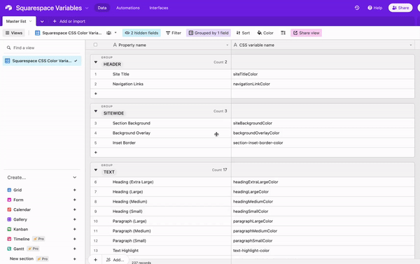
We scraped all Squarespace color variables into a single user-friendly database, which you can now download, completely for free! Of course, you can look up those variables yourself by reading the source code or using the Google Chrome code inspector, but we find it’s really helpful to be able to see all these variables in one place to plan for what’s possible. You can reference any specific color.

* This is an Airtable database which you can copy into your own free Airtable account or download as a CSV file (which you can then open in Google Sheets or with Excel).
How colors work in Squarespace 7.1
Squarespace allows us to add 5 colors to the palette initially:

Then, Squarespace creates ten section themes. Each theme applies individual colors to different elements, such as heading, paragraphs, buttons, etc. We can specify new custom colors for each individual section theme, so in the end, we have well over 200 color variables on the site! We are not limited to 5 initial colors that we put into the palette.

Let me show you three possible use cases for color variables and why you should use them instead of hard-coding colors into your design.
Usecase 1. Adding a background color to social media links in the Squarespace website menu
Sometimes you want to change a color but this option is not available in the default functionality. For example, there’s no way to edit the color and add background color to the social media icons we put into the header area.
These icons inherit the color of the navigation.

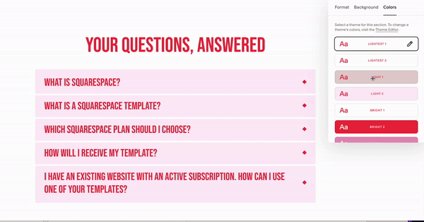
Here’s an effect we are trying to achieve, as you can see, there’s no way to edit these colors directly:

The header in this example is using the Lightest 2 color theme, which is almost completely black and white and is not using my highlight and light colors (beige and pink, accordingly).
Here’s a workaround I used:
I went into the lightest 2 color theme and tweaked one option to my desired color. I changed the website inset border (var(--section-inset-border-color)) to light beige color to use it as a social links background. I knew that I wasn’t likely to use this setting anywhere in the design so I used this variable for some other purpose. I used the var(--siteTitleColor) as a social links color (since it was already colored). See the resulting CSS code below!
What’s great about this method is that I used the default palette colors, so when a client purchases my template and changes the 5 palette colors, my variable will pick up a new color automatically even though I changed it in the color theme.
//Social media links
.header--menu-open .icon, .header-actions-action--social .icon {
background: var(--section-inset-border-color);
color: var(--siteTitleColor);
padding: 6px;
border-radius: 50%;
margin-right: 0px !important;
}
You can look up color variables in your browser inspector or use my database to reference variables available to you in any particular theme!
Usecase 2. Changing the button hover state color
In the Social Motion template, we are using the underline button design. In the regular state, the button is black. We’d like to add a pink highlight color (instead of black) as a hover state.

There are three types of buttons in Squarespace, so we assigned the pink highlight color to the tertiary button and used its variable var(--tertiaryButtonBackgroundColor) in the CSS snippet.
// Changing primary button color on hover
.primary-button-style-outline .sqs-button-element--primary {
&:hover,
&:active {
background-color: var(--tertiaryButtonBackgroundColor);
}
}
Usecase 3. Changing accordion dividers color to section background color
Squarespace accordions are great, but there’s one thing about styling them you might find annoying, especially when dealing with templates. You can set the color of accordion dividers (lines between accordion options), but would have to then only place such accordions on certain backgrounds. But what if you were going for a “transparent” look? Wouldn’t it be nice if every accordion divider simply inherited color from the background color or a section it was in?
And that’s exactly what we achieve via the snippet below - despite its name, the var(--siteBackgroundColor) variable holds the color value for the section background. Meaning if you have one section color style set to Lightest 1, for it, the value of var(--siteBackgroundColor) will be one color, but for a section with Darkest 1 style, that value will be something else, depending on what you set it to be. All our snippet does is makes accordion dividers inherit section background color - now you can have multiple sections with different backgrounds and multiple accordions in those sections all looking sleek!
// Set accordion dividers to inherit color from section background color
.sqs-block-accordion {
.accordion-divider {
color: var(--siteBackgroundColor) !important;
}
}
We hope this tutorial was helpful - let us know in the comments below how you use color variables!
Need help with your website?
Schedule an appointment and we will take care of your website needs. Here’s what we can accomplish some of the following:
Custom CSS writing
Set up your brand fonts and colors, show you how to crop your graphics and replace the content
Repopulate your entire home page with new content and clean it up with CSS on mobile / or do targeted CSS cleanup of 2-3 pages
Styling shop/blog and uploading up to 5 products / blog post
Set up your forms, and lead magnets, and connect them to email marketing platform of choice
Custom Squarespace tutorial just for you!


