How to Create a More Engaging Squarespace Blog Layout (Using Only Native Features)
Why Your Squarespace Blog Looks Boring – And How to Fix It
If you have a Squarespace blog and you feel like the default layout options aren't doing your content justice, this one's for you. In this post, I'm going to show you how to build a more interesting, visually engaging blog page using only Squarespace's built-in features. No code, no plugins, just a smarter use of what's already there.
What You Get Out of the Box
When you add a blog to Squarespace, you get a handful of default layout options: basic grid (which I personally prefer), side by side, masonry, and alternating side by side. You can tweak spacing, page width, image aspect ratios, and a few other settings. It's a decent starting point, but it's limiting — especially if you have a lot of content organized by categories and tags and you want more control over what gets highlighted and how.
The good news is that Squarespace gives you more flexibility than most people realize, once you know what to reach for.
How to Add a Blog to a Squarespace Website
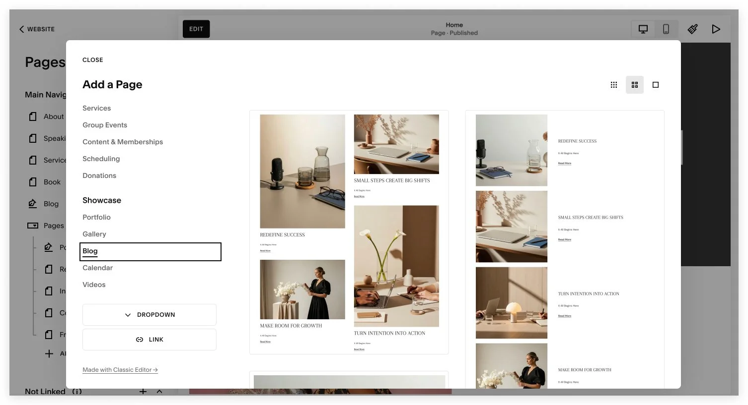
Go to the Pages menu and click the plus sign at the top to make the blog show up in your navigation. You can add a blog either in the linked or the non-linked section of the pages menu. The difference is that it will either show up in your header menu or it won’t. You can always drag the blog between those two sections of the menu if you make a different decision on where to place it later.
Think Beyond the Blog Grid
The blog homepage is a collection page. It is the page that hosts all of your posts. Here's the key insight: your blog homepage isn't just a grid. You can add sections above and below the actual blog feed, and those sections can contain any blocks you want — images, text, summary blocks, archive blocks, carousels. This is where things get interesting.
Instead of one uniform layout from top to bottom, you can build a page that flows: a hero section featuring a specific post, a curated list of popular articles, a browsing-by-topic section, and then the main blog grid at the bottom. Each section looks different, which creates visual rhythm and keeps people scrolling.
Try Squarespace for free – and save 10% when you purchase a subscription with code APPLET10
Build a Hero Section
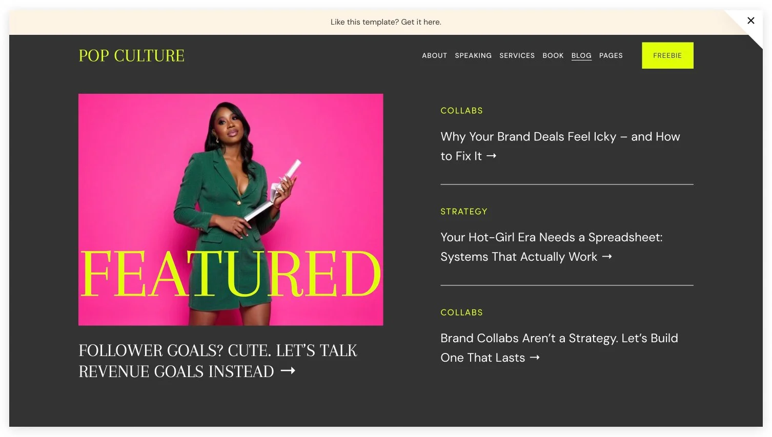
Start by adding a blank section at the top of your blog homepage. Give it a background image, a headline linked to a specific post, and then drop in a Summary Block on the side – set to list view, showing four posts, with category metadata displayed. Just like that, you have a proper editorial hero section that highlights one featured post and surfaces a few more alongside it. This is how the hero section looks in my Squarespace template for bloggers, Pop Culture.
Add a Browse by Topic Section
Add another section below – light background, smaller height – with a centered H2 headline like "Browse the Blog." Then add an Archive Block. Select your blog, switch the display from index to dropdown, rename it "Topics," and group by category. This gives visitors a clean way to filter your content by subject.
One important note: this only works if your blog posts actually have categories filled in. So before you build the layout, make sure your content library is organized. Categories and tags are what make all of this filtering and sorting possible.
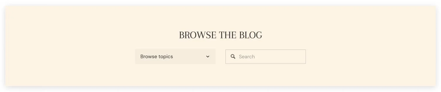
I also added a search field next to the archive blog in case people want to type in their keywords.
Add a Popular Posts Carousel
For a third section, try a carousel of popular posts using another Summary Block. Set it to carousel layout, square aspect ratio, with category as the primary metadata and author as secondary. The carousel is particularly good here because it handles mobile responsiveness cleanly – a grid layout at this stage would require a lot of extra tweaking to look right on tablet and phone screens.
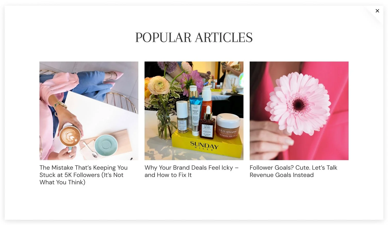
If you want to curate which posts show up, you can mark specific posts as "featured" in their settings, then filter the summary block to show featured posts only. This is a great way to put your best-performing or most important content front and center.
Keep the Main Blog Grid at the Bottom
After all your custom sections, the actual blog grid lives at the bottom of the page. Alternating side-by-side layout works well on the blog page of my Pop Culture Squarespace template because it's visually different from everything above it. This layout reinforces the sense of variety and keeps the page from feeling monotonous.
Set posts per page to an even number that divides cleanly by your column count. If you're running two columns, something like 12 or 16 works well. This avoids awkward orphaned posts at the bottom of the grid before pagination kicks in.
A Few Practical Tips
Mix your layout styles deliberately. Hero → list → carousel → grid creates natural visual progression.
Use sections to promote what matters. Want to push a high-converting post? Pin it in the hero. Want to surface your newest content? Filter a summary block by date.
Static sections work too. Some of the most polished-looking "featured" areas on blog pages are just manually built text + image + button blocks — not dynamic at all. If you have a post you always want to promote, a static section gives you full control over how it looks.
Want a Head Start?
If you'd rather start with a blog layout that already has all of this built in, check out my Pop Culture Squarespace template — it uses exactly the structure described in this post, with a hero section, curated featured posts, a topic browser, and a carousel, all ready to customize.
We have also recently published a list of the top 2026 Squarespace templates for blogging. Check it out.