Use These Tricks to Improve Your Website Design Over a Weekend

Are you also guilty of working on your hustle during the weekend? (Not because you have nothing else to do, but because you are obsessed)!
Today we are showing you 9 quick and unobvious fixes you can do over the weekend to improve your website.
1. Delete your social media icons from the header nav
They do not belong on your website, because your website is the place you want your prospects to stay at. You don’t want to lead them astray, for example, to Instagram. Once on IG, they’ll inevitably go to their feed after checking out your profile. In the feed, they will see cute doggos and co-workers’ vacation pictures. By then, they will be 1,000 mental miles away from you and your business.
So, delete your social media icons from your header and your website pages. The only place to keep them is in the footer.
2. Get rid of the testimonials page
The separate page on your website with testimonials is utterly useless. It looks as if you are inviting people to visit your personal hall of fame. Many will politely turn down the invitation.
The testimonials should be incorporated into the pages that need them. The best place for the testimonials is right next to the products and services you are selling. Those testimonials should coincide with the products next to them.
3. Don’t put text links on your sales pages
Having text links on the key selling pages of your website is a conversion killer. You surely want to sell from your sales page. But by adding the text links to your copy (similarly how you do it in the blog posts), you are leading your prospects away from shopping. You show them a crossroad and they might leave the page by a different path. Block all other roads, leave just one – your CTA.
The same goes for the Homepage, and About page. Don’t make your website visitors roam around without a clear goal. Lead them by the hand.
4. Ditch the FAQ page
The separate FAQ page doesn’t work anymore. There is a long way to it, and only the most diligent website visitors will actually go there to look for answers.
Instead, try to predict at what point of their journey your website visitor might start having questions. Include the answers in the website copy or into the small FAQ blocks on the pages.
5. Change your footer color
Your footer color can be any color you like, as long as it is contrasting to the rest of the website. Everyone’s footer is a contrasting color and it is okay and even necessary to be like everyone else. Website visitors are used to certain website patterns. They consciously and subconsciously know where to look for the information. And if it is not there – they walk through the door.
The footer shows them where the page ends, makes the previous section before the footer look more important, and helps them to know what to expect.
6. Kill the dropdown menu navigation
While you want to organize and categorize your website pages in the neat drop-down menus, your website visitor might not enjoy these care and guidance of yours.
What is wrong with drop-down menus you ask. A couple of things:
They are annoying and confusing
They draw attention away from the top-level pages
They complicate the search process
If you have drop-downs, your website pages might be low-quality with content that has little or no value to the user
Let's redesign what we can together:
Put your drop-down item in the top-level navigation. It should go up ⬆️ if it is important enough. If it isn't, then you shouldn't have had it on your website in the first place – delete it. This works well with one-item drop-downs.
Move the info from your drop-down items to the page in the top-level navigation. In other words, make a long page out of many short ones.
If you have a lot of items, consider using a mega menu. You have seen it many times on the retailer websites, e.g. when you shop for clothes you see: 👨 👩 👧 👠 💼 👚 👖 👑 🧢 👗💍🧦etc. It is easier to navigate and looks better than just a regular (insanely long) drop-down.
7. Add more to your service pages
You might have been taught the mantra: the shorter, the better. But it is not always so, especially when it comes to service pages.
If your service pages are "short and sweet", they might not give enough information about your services. As the result, the prospects are not sure, whether this is what they are looking for.
What do you need to add to the page:
When and how you get back to them after they contact you
How do you deliver your services
Have anyone used your services already and are they happy/satisfied as a result (include social proof, testimonials, and case studies).
Your refund policy, or the lack of thereof
Your prices
On the other hand, if you get too many irrelevant inquires you would want to filter them out to save yourself some working hours. Try adding an inquiry form that your prospects need to fill out in order to contact you. Make it as detailed as possible. This will eliminate empty inquires from people who just curious and not your real prospects.
8. Use your website nav to tell your business story
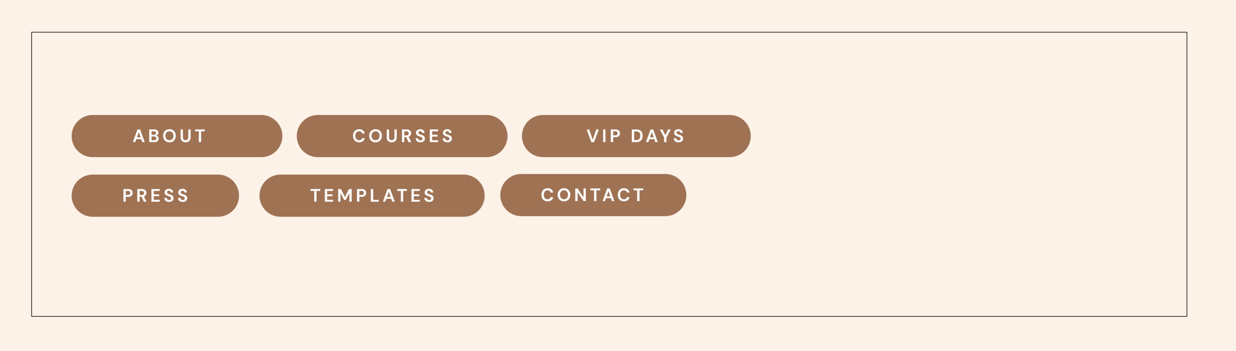
Look at the navigation menu of one of our clients ⬆️ Just by looking at the website nav (and nothing else) you learned a lot about the person. You know that she has expertise in the field to the extent, that she can teach others 🧐 You also know that she is pretty successful – she was mentioned in the press so many times, that there are enough stories for the whole website page 📰 She has a template shop, so she is some kind of a designer (websites? social media?) 👩🎨 She also holds VIP days – some events you can participate in if you are interested.
Now imagine, if her website navigation only had: Home, About, Services, Contact etc. It is ok, but it looks very generic, like millions of other websites. The navigation can do much more.
At the same time give your pages clear, understandable names - “Blog” instead of “Musings or Journal”. I know that especially wedding photographers or business coaches can use the word “Investment” instead of “Pricing”. Try to avoid that - it will make your navigation much clearer.
9. Struggling to decide what to say on your homepage? Try this
Your homepage should tell one big story, the name of which is: “This is how I can help you, my website visitor”. So here is what you put on your homepage:
The problems you can help people solve
Mentions of their pain points and struggles
Benefits of working with you
Subscription to your email list with an explanation of what to expect from it
The homepage of the website shouldn’t be a museum dedicated to your persona. Unless you are a cult. There is an about page specifically designed for it ;)
On the homepage, you should only name yourself or your company and maybe put up your photo and a few photos of your team. Just to say hi 👋
Want more advice? We have a whole course on Squarespace web design.
Creative Workshop Series for Squarespace
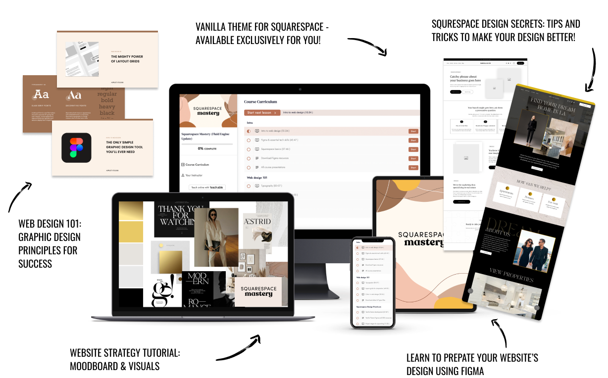
The workshop is jam-packed with design goodness. Inside, you’ll find the following topics:
What size should I design for? Responsive layouts and industry standards
Typography 101: How fonts can elevate your design & look professional
My approach to using colors in web design
Complete Figma tutorial
How to use layout grids to direct the attention of your website visitors
How to create a mood board and plan your website visuals
Squarespace Vanilla theme build-out: Complete walk-through, CSS snippets and Figma wireframe
Massive Squarespace design practicum: We go from a mood board to a finished design on Squarespace in a matter of an hour. Two designs included along with CSS plugins and Figma templates
Redesign 2 real websites with me in real time
How to grow as a designer and how to look for creative inspiration
Plus, there are some really helpful documents included: Complete Squarespace development checklist, copywriting and branding guides, sample client questionnaire and so much more!