How to Stop Squarespace Cropping Your Images Wrong: 3 Fixes
Focal points, true squares, and full control on mobile
Photos on Squarespace can act very unpredictably. For example, you upload a photo, and Squarespace cuts the person's head off. Or you want a square image, and the grid refuses to give you one. Or the crop looks right on desktop, but looks messy on mobile.
In this tutorial, I want to show you how to get your images to show up in Squarespace exactly the way you want them to. These are the three workarounds I use constantly in client work and in our templates.
I'm Olga Kolgusheva, and I run Applet Studio, a Squarespace template shop and design agency, which means I spend most of my week solving problems exactly like these.
Fix a Bad Crop with the Focal Point Tool
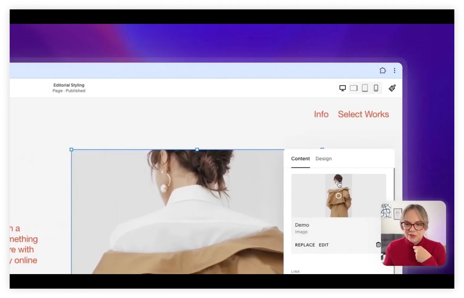
Here I am inside a Squarespace website, and the head of this person is cut off. There's a very simple fix.
Click the image, click the Edit button, and change the focal point of the image.
The focal point tells Squarespace which part of the photo to keep in view when it crops. Move it onto the face, and the face stays visible, no matter how the block resizes. This is the first thing to check any time a crop looks wrong, and it solves most of these problems on its own.
Get a True Square with the Fit Setting
This one comes up a lot: you have a vertical image, and you want it to be square.
You might start by cropping the image itself to a perfect square. That part works. But if you turn the grid view, you'll see the problem. The grid in my example in the video doesn't really allow for square images. No matter how much you tweak it, the image is not going to be strictly square.
Here's the workaround. Go into Design and change the setting to Fit.
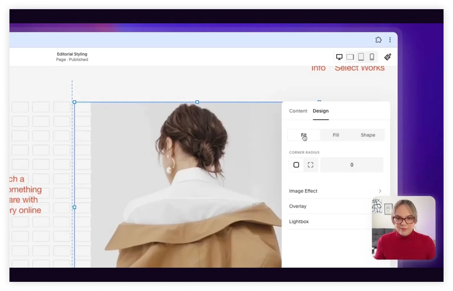
Now you see the actual proportions of the image, and it's square. Fit displays the image at its own aspect ratio instead of forcing it to fill the shape of the block, which is exactly what you want when the proportions are the whole point.
Use an Image Block Instead of a Section Background
This is the one that takes a minute to explain, and it's the most useful of the three.
Say you have what looks like a background image in a section, and you need to show certain parts of that image on desktop and different parts on mobile. A section background won't let you do that. It sits where it sits.
So the trick is: don't use a section background.
What looks like a background here is actually an image block. The section has no margin at the top or bottom. If you turn on Fill Screen, Squarespace adds that margin back, so I keep it disabled and add the image as a block instead.
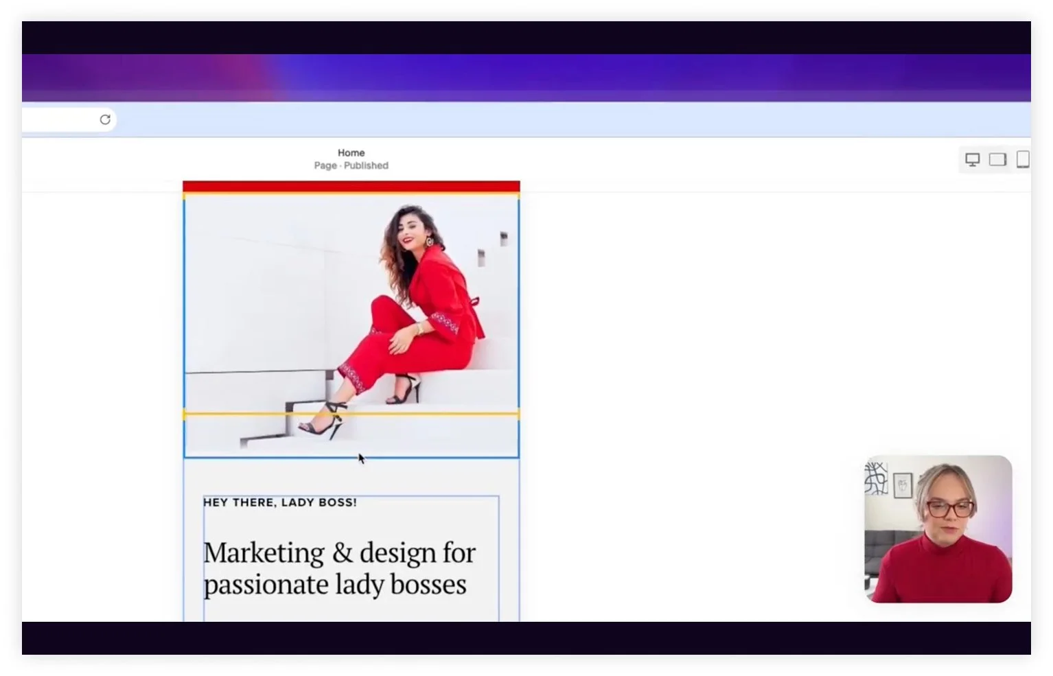
The payoff shows up on mobile. Because it's an image block and not a background, I can move it around. I can place the text and the button wherever I want and make sure the text doesn't overlap the woman in the photo. On mobile, the image stacks first, and the copy and button follow, and everything stays readable.
I also set the focal point inside that image so her head isn't cut off and she sits to the right of the text. Desktop looks right, mobile looks right, and neither one is fighting the other.
These are my tricks for using images inside Squarespace. None of them require code, and all three take under a minute once you know where the settings live.
Frequently Asked Questions
Why does Squarespace crop my images?
Squarespace resizes images to fill the shape of their container, which changes with screen size. When the container is a different proportion than your photo, something has to be cut. The focal point setting controls which part gets kept.
Where is the focal point setting in Squarespace?
Click on the image, click Edit, and you'll find the focal point control there. It looks like a small circle and is situated on the image. Drag it onto the part of the image that must stay visible.
Can you make a perfectly square image in Squarespace?
Crop the image to a square first, then set the image display to Fit in the Design settings. Fit shows the image at its real proportions instead of stretching it to the block.
How do I control a background image separately on desktop and mobile?
Use an image block rather than a section background. Section backgrounds can't be repositioned per breakpoint, but image blocks can, which lets you adjust the layout on mobile without affecting desktop.
What is Fill Screen in Squarespace?
Fill Screen makes a section take up the full height of the browser window, and it adds margin at the top and bottom. If you're building a layout where an image block acts as the background, keep it turned off so the image sits flush.
Building a site right now? Try Squarespace free and save 10% on your first subscription with code APPLET10. Or browse our Squarespace templates – every one comes with a 12-month trial through our Platinum partner status.